With the evolving technologies and trends, it is vital to rebrand and redesign the products in order to fit in the changing environment. Today in this blog post, we will see 10 big companies that had a logo redesign in 2014. Though it might be hard to accept the new changes in design (especially logo) for renowned brand, but after some time, the new design gets into everyone’s head and uses it.
1. Lipton
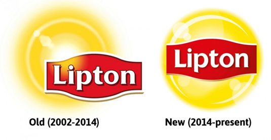
This new logo design of Lipton has enabled readability but few people also claimed that this new design looks much like Lays logo.
2. Reebok
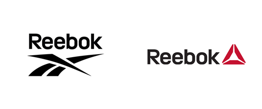
Sports giant Reebok has gone through this logo redesign nearly after 30 years. Redesigned by agency Les Mills, this design is aimed to ‘encourage ordinary people to do sport.’
3. Absolut Vodka
Though the Absolut Vodka logo didn’t changed massively but it has left the ‘Country of Sweden’ and ‘Vodka’ aspects of the old logo. Now the new logo reads ‘Absolut’ followed by a full stop.
4. PayPal
This new logo of online payments service PayPal was revealed in April in collaboration with San Francisco design agency Fuseproject.
5. Disney Channel
In May, the Disney Channel rolled out a new logo design across all its international TV networks.
6. Visa
This subtle logo redesign from Visa took place in January with changing tag line of ‘for everyone, everywhere’ to ‘It’s everywhere you want to be.’

7. Penguin Press
In July, Penguin Press decided to redesign its brand logo and worked with Michael Bierut at Pentagram to create a new identity which is mentioned below.
8. Foursquare
Location-based social networking app Foursquare unveiled a brand new logo and branding in July.
9. Pizza Hut
In November, one of the biggest restaurants in the world announced a major change in its menus and overall look of its restaurants, including a change in their branding and logo designs.
10. Black + Decker
Black + Decker, which was formerly known as Black & Decker, has come up with this new logo design in January with a fresh modern look.
