If you are a freelance graphic or web designer, you should treat your business card like your store front. With your website, it’s one of the first things your potential clients will be visually confronted to. Try to design an elegant and memorable business card, it could bring you some new work.
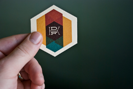
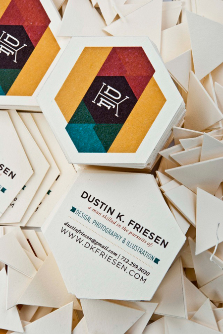
1. Dustin K. Friesen
For his business card, Friesen chose a colorful approach. His initials for a pretty cool logo that stands out on a background of subtle colors. The most unusual about his card is probably the hexagonal format.
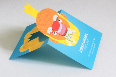
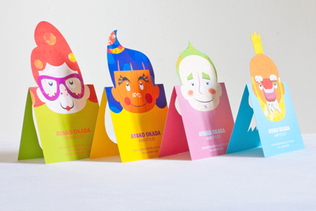
2. Ayako Okada
With flashy colors and cool cut-outs, these cards for a hair stylist really stand out. Each card can also be installed on a desk easily and used as decoration. Cards designed by Silky Szeto.
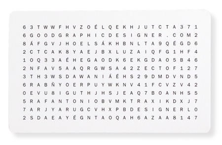
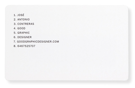
3. José Antonio Contreras
This Brooklyn-based graphic designer lets his clients have a little by turning his business card into a puzzle. He provided the answers in the back though, you don’t want to miss work opportunities because a potential client was too dumb or lazy to solve the puzzle.
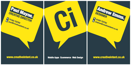
4. Creative Intent
Redesigned earlier this year, Creative Intent‘s new business cards use high contrast and few informations with an excellent result.
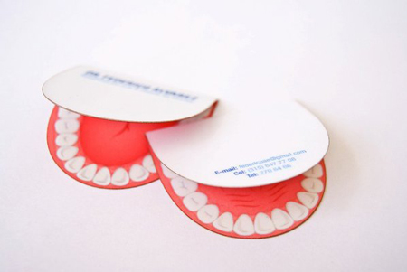
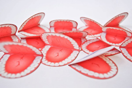
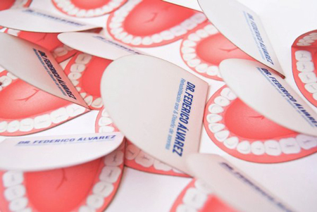
5. Dr. Frederico Alvarez, dentist
Somewhat creepy, but this card will probably be memorized by anyone who receives it. It was designed by La Coctelera, a design studio from Medelin, Colombia.
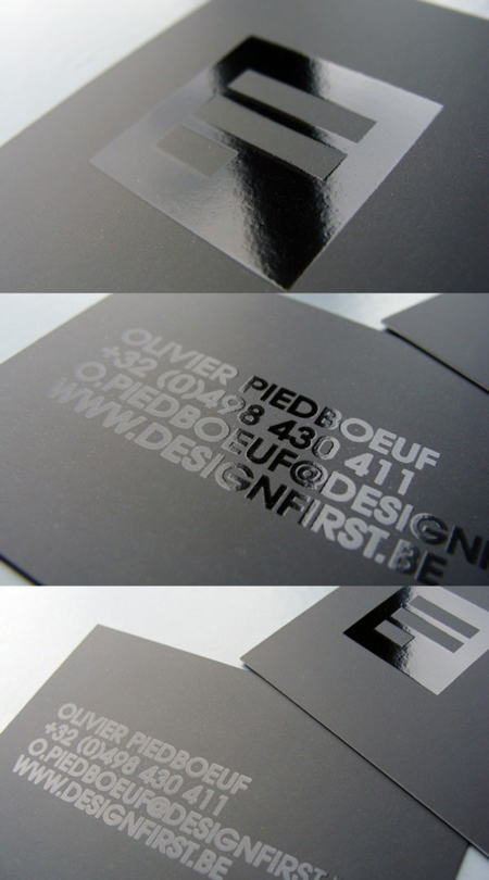
6. Design First
An all caps card, with glossy ink on matte paper. Minimalist and elegant. Created by Design First, an agency from Belgium.
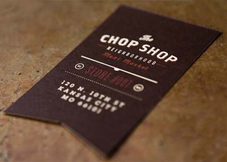
7. The Chop Shop
Unfortunately no butcher will hand you this business card, it is part of an imaginary campaign. This cool typographic project was created by Ptamark.
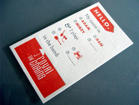
8. The Royal Chains
Conceptually the best card of the list in my opinion. It was designed by Kelli Anderson for a band and can be used by any member of the band.
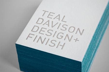
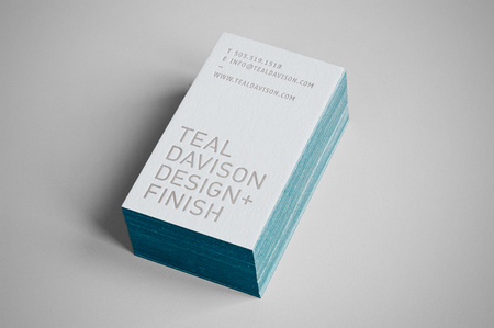
9. Teal Davison
Teal Davison is an interior designer, his business card is simple and minimalist. It was designed by Tim Kamerer.
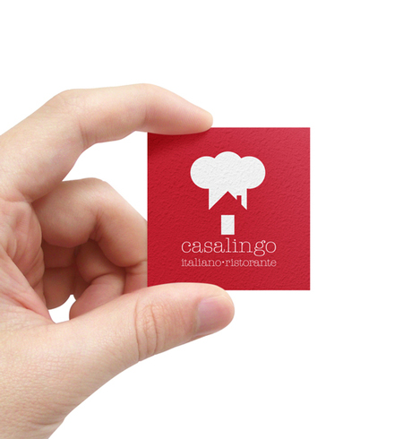
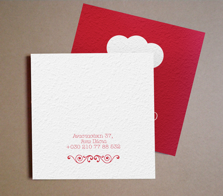
10. Casalingo
A square format for this restaurant business card, the illustration in front makes good use of white space. Designed by Dimitra Karagianni.
