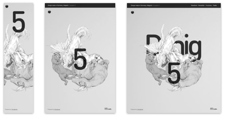
Responsive design is gaining ground nowadays, more and more web designers are aware of the importance of context-sensitive design for websites. In this post I take a quick look at a few gorgeous examples of responsive web designs. Most of those were found on the excellent Media Queries, a gallery dedicated to well-designed responsive websites.
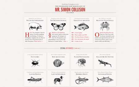
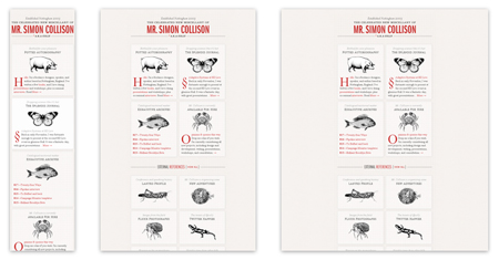
1. Simon Collison
First, Collison’s website is a fine example of gorgeous web design. It is also a very good responsive design, with a grid that evolves when you browse the site in a smaller device.
2. Hello Fisher
Not only the layout changes as size changes, but Fisher’s face is also expressing a different attitude on each device type.


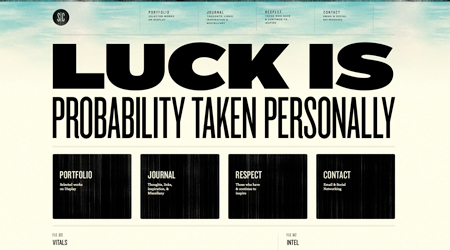
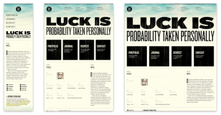
3. Stephen Caver
Two interesting elements in Stephen Caver’s portfolio, the changes to the menu in phone size and the resizing of the justified headline.
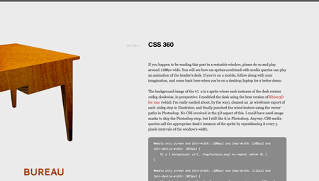
4. Bureau
A minimalist layout that radically changes when smaller, the image header also takes a new angle.
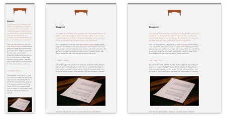
5. Design made in Germany (Issue 5)
The perfect example of removing the right elements when resizing the site.
