![]()
What are the functions of web icons we observe on various websites? How are they used most efficiently? In this article, we’ll guide you through the process of effective icons creation.
Web icons are generally indicators and separators, they help to navigate and emphasize some key ideas of the content. If you drive a car you can easily imagine that icons serve exactly like the road signs, guiding through the website or application. They help to find the necessary tools and information quickly.
These catchy simple signs are usually intuitively recognizable. The majority of Internet users easily discern such icons as a miniature printer, a minidiskette, play arrows, twitter birds etc. This helps to see what action to take and how to play with the content.

Web icons are supposed to convey the clear meaning of the functions they serve. They should be intuitively clear within 1-2 seconds of scanning. Effective web icons don’t distract from the general content, but outline the most important features and make the process of navigation easier.
The key principles of web icons effectiveness are consistent lightning, considering the audience, general project layout, perspective, metaphor and so on.
It would be easier to create great efficient icons for your project using the tips below:
1. Consider the clear metaphor
Smart icons should indicate the common features of the objects they depict. Exact metaphors help to establish the better contact with the website audience. Make the concept be immediately recognizable.
2. Broaden your potential market and keep it simple.
Use flexible, sketchy images instead of detailed clip-arts. The icons should be recognizable to fit into various branches of the same business area. Simple icon means 2-3 objects in its structure. Simple jazzy concepts should be the natural complement to the project environment.
3. Use light sources consistently and carefully
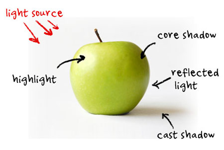
The human eye feels the untruth and wrong perspective intuitively. So if you create the set of icons for the same project, make the light consistent not only for all the icons but also for all the elements of the environment. Try to depict web icons as the objects you observe in your real life, applying realistic shadows and lights. This will make them look more trustworthy.
4. Use nonstandard color combinations.
Feel free to experiment with the colors and tints. Make the icons stand out a bit. Eye-catching colors combined with the nonstandard shapes will bring the visitors attention and arouse the desire to click on them. But surely the icons should fit the general project color scheme to be more pleasant to theeye. Flash colors used for the simple business interface can be irritating.
5. Always consider potential customers.
Make web icons be interpreted in the single way regardless the cultural, national or religious traditions and signs of various groups of people. Use universal metaphors that could be easily recognized by users from any country.
6. Make a plan, create icons step-by step.
Find out the general concept first, make a sketch, choose the shape and colors, work out the details. Ask people about what they see in your image. If it takes them less than 2 seconds to grasp the icon idea, the icon is supposed to be successful.
Be creative and inventive, add some zest to your projects by adding awesome web icons!
The article is provided by IconDemon experienced columnist Helga Weber, enthusiastic about web design and digital arts. IconDemon.com is a great stock icons provider. It offers 5300+ professional web icons of different topical categories and styles. In case you don’t have enough time or skills to create each icons individually feel free to choose any icon set according to your preferences.

