When you think of branding, you immediately think of a logo. There are so many big names out there that have a globally recognised brand. Coca-cola, McDonalds, Nike are a few of the ones you will know as soon as you see their logo. But how far does art and illustration go to demonstrate a point to the consumer? Are marketing campaigns going to become the be all and end all of a brands success in the future? After all, shares in supermarkets shoot up as soon as their Christmas campaigns go live, so people who invest at home using platforms like CMC markets should not only be keeping themselves aware of what the markets are doing themselves, but also what the branding and marketing team of the company they have invested into are doing. With the advent of social media, there are many ways companies can use illustration in a newer, fresher way to get across to customers. Here are a few that have done it really successfully:
Kuoni
People may recognise Kuoni for being one of the most luxurious holiday brands around in the market. They have set themselves aside as a niche, away fro standard holiday operators. When you go in to book a holiday with Kuoni, you are welcomed with a glass of champagne and are taken through the details of your holiday in your own time.
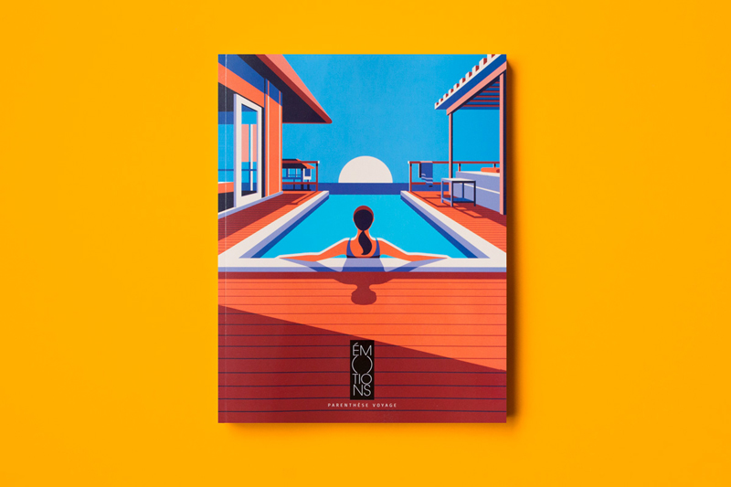
When you actually arrive at the destination, they work around the clock to make sure everything goes without a hitch. Potential customers are used to Kuoni in glossy mags with pictures of luxurious destinations, so it may come as somewhat of a surprise that they commissioned Altavia to create an illustrated campaign for them.

The campaign used bright, bold colours to depict places that they offer holidays to. The campaign was a great success, and it would seem that a resurgence of illustration in 2016 has led to better sales. Maybe the Instagram mad generation we live in are finally bored of photos.

Mercedes
Another luxury brand on the list, and another illustrated campaign. While target audiences are used to seeing Mercedes in television advertisements sweeping through breath-taking scenery, this campaign scaled right back. Mercedes are arguably one of the most recognized brands in the world, so it is of little surprise that they are prepared to make the jump and try new things to really get people thinking with their advertising campaigns.

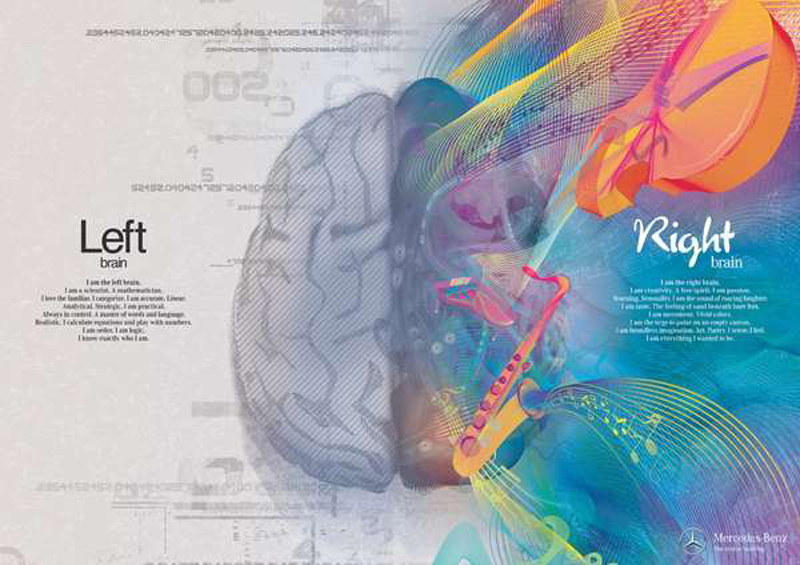
The ‘right side and left side’ of the brain campaign was created by an Israeli company. The illustration is meant to represent the two very different sides of the brain that work together to make us function as a human. This is to link with Mercedes Benz to show how they use opposites to create the ‘perfect’ product. The company completing the campaign wanted to show they match equal amounts of design and innovation to create stylish, but technologically advanced cars.
Nike
Nike are a brand that manage to cross over into many different markets. They provide sportswear and also manage to dip their toes into luxury brands. The Nike ‘tick’ is perhaps one of the most recognised symbols in the world. Nike actually has quite a long standing history of using illustration for advertising purposes.

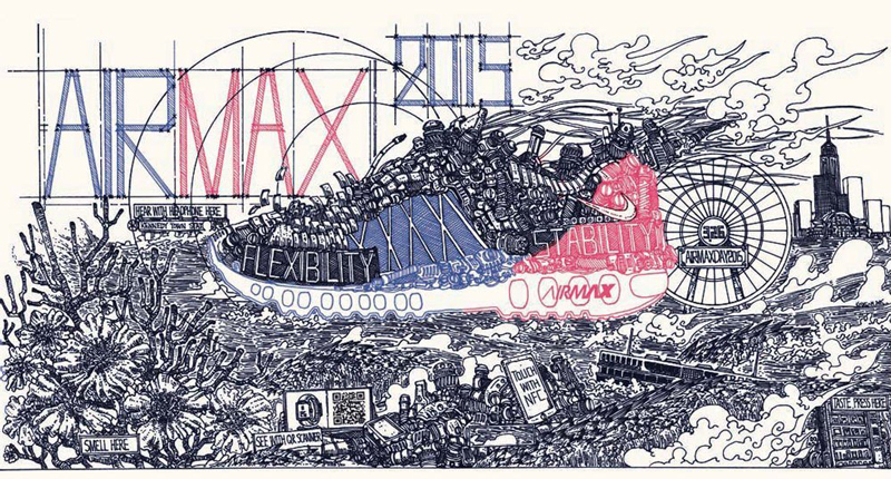
You can always use a search engine to look at some Nike products, and find illustrated campaigns. They one of the brands that perhaps utilize this properly. Knowing that most of their target demographic will react to it, they use a lot of ‘street art’ to advertise their products. A lot of Nike’s products cater for a young audience, so using illustration rather than confusing advertising campaigns benefits them greatly.
Nike are also well known for having the money and the influence to get their campaigns put in really well known places, like Piccadilly Circus and Times Square. For this reason, having a brightly coloured campaign that is pleasing to the eye rather than a lot of bulk text makes the customers look for them. Now they have done it regularly, they have built up enough brand awareness for people to be able to instantly recognise one of their illustrated campaigns as ‘Nike’.

