If you ever need to convince your clients that the design of their website can have a big impact on their business, talk to them about the redesigns of the Gawker network’s sites and Digg.

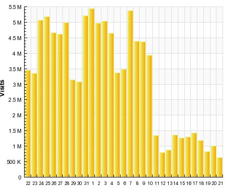
The Gawker network recently launched a redesign throughout its entire network: Gizmodo, Lifehacker, Kotaku,… All those websites suddenly became unusable and guess what? They pretty much lost more than half of their readership overnight. This also applied for me, I was an avid reader of Lifehacker and didn’t go back to the site after the redesign.

It is quite easy to see the difference for the before/after comparison, as the Canadian version of Gizmodo still uses the old design. Before / After. The new version includes, among other things, some totally weird scrolling behavior, unusable commenting system, strange listing of articles,…

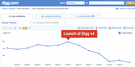
In Digg’s case, the problem was more about functionalities than really about the design itself (but I’d argue that functionalities are part of the design). Right after the launch, the power users lost all influence and left the Digg boat, then everyone else left too.
So next time a client tells you he doesn’t believe his design is so important, talk to him about Gizmodo and Digg…

