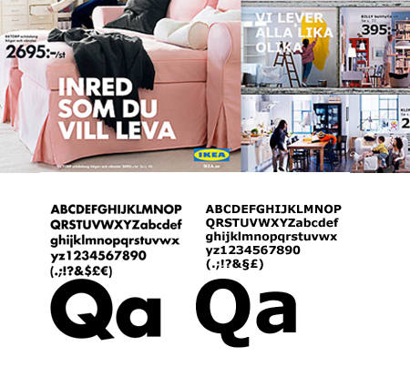
Why did IKEA go from creating cool ads with type to switching its catalogue font from Futura to Verdana? Their official answer can be found on Typophile, here it is.
IKEA abandons 50 years of Futura and Century Schoolbook for… Verdana.
In an interview with swedish design magazine CAP&DESIGN the reason for the change is to be able to use the same font i all countries, including asian countries. Also they want to be able to give the same visual impression both in print and the web.
The design community responded very negatively to this announcement, a petition was created to ask IKEA to get rid of Verdana, a Facebook group was created for pretty much the same reasons and designers have been ranting about it on Twitter. This was already quite bad in terms of public relations, but it get even worst when the magazine Time writes an article about it.

Before and after, image via Please copy me.
So what do you think about this controversy? Personally I think that this kind of font change is a mistake, but I don’t really people get all emotional in their reactions. It’s just a big corporation chosing an inapropriate font for their catalogue, I don’t look at their catalogue, I don’t buy their shit and so should you…

