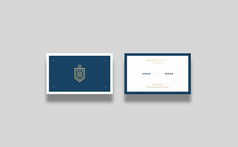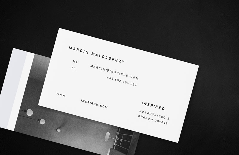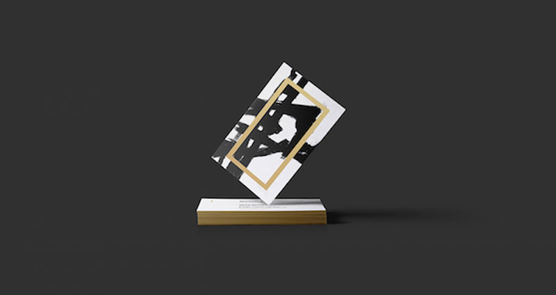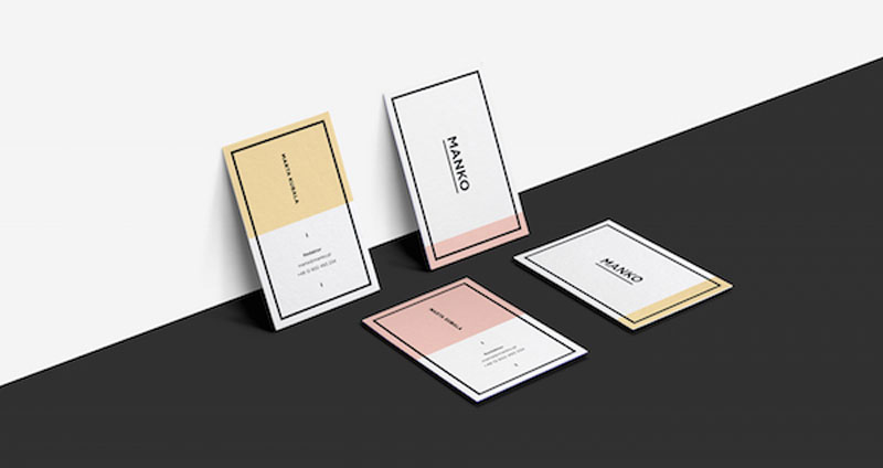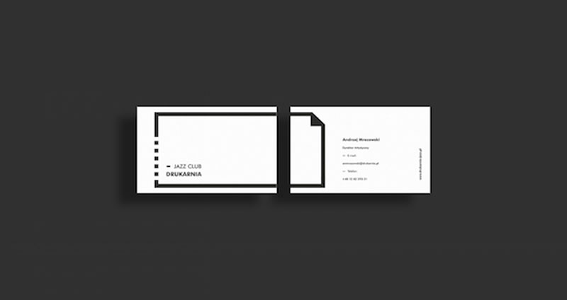
“Less is more”. This is probably the most cited design quote, but we often forget to say that minimalism done wrong is still bad design. On the other hand, minimalism done right can do wonders, like what Polish graphic designer Przemek Bizoń does on a regular basis for his clients. In this post you can see a small selection of his minimalist business cards, but you can discover much more on his Behance portfolio.

