Last week I shared a post where I displayed satirical movie posters by Travis Pitts, pointing at the lack of creativity some movie poster designers showed.
Today I’ll share something even better: mosaics of movie posters collected by a french blogger, Christophe Courtois. He assembled together some movie posters that use some old tricks over and over. Following are a few.
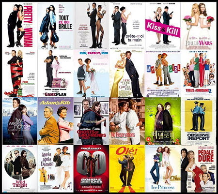
Back to back
Usually a bad comedy with two main characters.
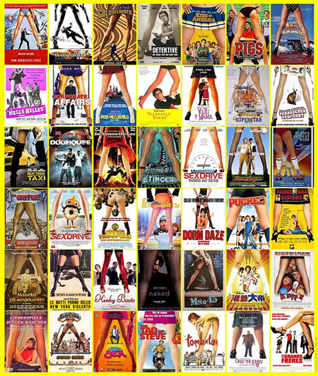
Between the legs
Usually feminine legs. Bad comedies where a strong characters comes and changes the life of a boring family.
Black & White, & fire
Action movies with many, many, many cars destroyed.

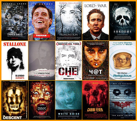
A big head made of many small images
When the movie revolves around one main characters.
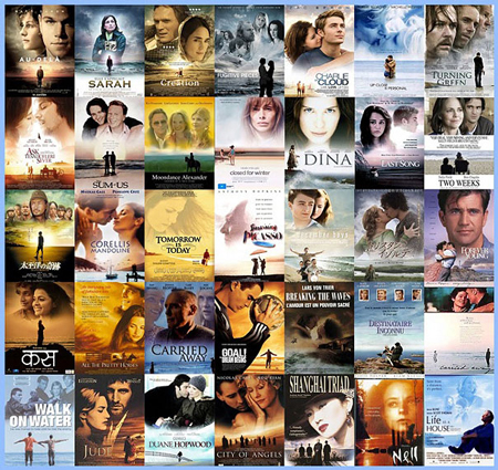
Tiny in people in front, big heads in the background
Movies to avoid, usually stupid romance.
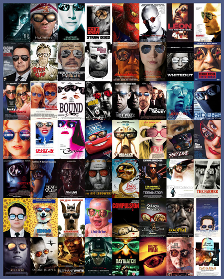
Reflection in big sunglasses
Either a killer that hides behind sunglasses or a stupid animated animal ridiculously voiced by Eddy Murphy.
