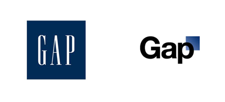
The Gap logo redesign made a lot of buzz on the blogosphere during the past week, and there is a good reason for that: it looks awful.
Two popular design blogs have written extensive posts about the story, so I’ll just link to them:
Idsgn has a good article about the reactions of Gap’s executives or AIGA president. On BrandNew you can read an extensive post about the attention the redesign got from the web and the designers reactions to it.
Many designers reacted to it by sending their proposals or fakes on Dribbble, the very opportunist (and contested) 99designs also launched a contest offering $500 to the best design. Ironically, Gap itself is considering to turn to crowdsourcing. This announcement made Mike Monteiro react, probably the best post about the Gap gate in my opinion.

