The War on Terror, War on Drugs or War on Poverty all have a thing in common: they will most likely never be won. Same goes for the War on Errors, which is the way we could name the daily struggle of designers to hand out graphic design work without mistakes.
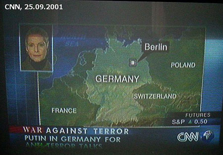
This is obviously much harder to do for infography tasks, especially in the news industry where work has to be done quickly and under pressure, thus leading to hilarious mistakes for the viewers, but not for the designer. Taking a look at some mistakes, it seems that maps set a pretty good ground for errors.

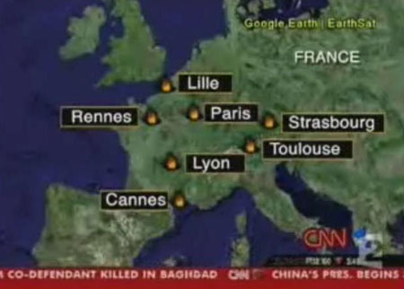
This map has a very loose interpretation of where the major french cities should be and of the size of France.

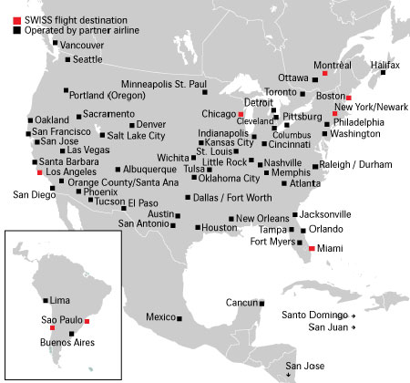
This one is taken from the Swiss airlines website and has a strange conception of where amercian cities are supposed to be. That’s of course far worst than news illustration mistakes, since travelling is the core of an airlines’ business.

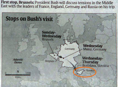
Hey, where is Slovakia? Mmmmh… let’s just put it here, nobody will notice.

