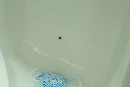
Sometimes you mind wanders in the most unusual places. It happened to me the other day as I was releasing the few extra beers I drank, and found myself concentrating on that little fly in the urinal. Then I thought about how that little insect made life a little better for the cleaning people who probably have less to clean, and for the customers of the place who have had a little more fun while in the restrooms (yes it doesn’t take much for a drunk guy to have fun).
So if you think about it, this simple drawing of a fly improved everybody’s life a little. But how?
- By staying simple.
A common advice for webdesigners is: “Don’t make the user think”. In our particular case, the urinal user doesn’t think and just follows his instinct: he pisses on that damn annoying fly that’s teasing him. - By understanding the user’s needs.
In the urinating situation, all the user needs is a little guidance to focus on keeping the place clean, without even thinking about it. If the user instinctively knows what to do, your design is good. - By making a clever use of white space.
Less is more, every designer knows this sentence I guess. If you designed this, many clients would probably have asked you to make the fly bigger or add more flies, which would in both case be totally useless

