
Whether you’re working for a firm or freelancing on your own, the most efficient way to develop a site is with a layered Photoshop mockup. This allows designers to easily manipulate the design and adjust the color palettes without having to spend lengthy amounts of time coding. Designers show the mockups to their client, gather any feedback the client might have, allow the client to pick which design they have best, and then turn the mockups over to the developer(s).
The good news for developers is that the design is already there for them all they have to do is convert it from the Photoshop mockup file, or PSD file, to a coded version that can be read by internet browsers. In this tutorial we will be focusing on taking a PSD and “slicing” it with CSS and XHTML to develop the front-end of the site. And since the PSD has all of the images and text we need, along with x and y coordinates, it’s just a matter of doing a little copy and paste, and then writing out the XHTML and CSS to make it work.
For this tutorial we will need to download two files. The first is the Photoshop mockup file that we will be converting to XHTML/CSS to create a website. The second file you will need for this tutorial, if you don’t already have it installed, is the Tiza font, which can be downloaded from here. Once you’ve downloaded the font you will need to unzip it and install it by dropping it in to your “Fonts” folder. Mac users can access their Fonts folder by going HD – System – Library – Fonts. Or, if you’re a Windows user, you go Start – Control Panel – (select icon view in the top right corner of the window) – Fonts.
We’ll start by opening our PSD file in Photoshop, Fireworks, or whatever your image-editing program of choice is. Once you’ve got your image file opened, go ahead and create a new CSS and HTML file. We’ll be developing the home page, so I’d suggest naming your HTML file “index.html” and giving your CSS file something basic like “main.css” for easy referencing.
Typically when I’m coding a site from scratch I like to start by zeroing the page out and making sure that there are no default margins or any padding that will screw up the site when I’m slicing it. This can be done by setting everything to zero at the beginning of the CSS file with an opening few lines like this.
body, div, img, h1, h2, h3, h4, h5, h6, p, ul, ol, li, dl, dd, dt, blockquote, fieldset, legend, label, input, textarea { margin: 0; padding: 0; border: 0; }

sh1, h2, h3, h4, h5, h6, p { margin: 0 0 1em 0; }

h1{font-size: 200%;}

h2{font-size: 170%;}

h3{font-size: 140%;}

h4{font-size: 110%;}

h5{font-size: 80%;}

h6{font-size: 50%;}
With everything set to zero, let’s move on to the body. But first, let’s take a look at what’s going on inside our PSD file by having a look at the “Layers” in our PSD file. You will see a group of folders titled, “header”, “home”, “footer”, and “back”. We will be starting with the “back” folder as this contains all of our background images. To make life simple and prevent any unwanted mistakes, go ahead and hide the “header”, “home”, and “footer” folders. The bottom file in the “back” folder should also be titled “back” and if you hide everything else within the “back” folder you will see that this file is just a solid color. One of the keys to creating a website that loads fast is to minimize the images, so we can skip putting this image in the site by setting the color as the background color in our CSS file. To figure out the color of that file select a fill color and hover over the image. The result should be a hexidecimal color code like, #D7D5C3.
Jumping back to our CSS file, create a body tag and set the background color to #D7D5C3. Your body tag should look like this:
body{ background-color:#D7D5C3; }
Next we’ll go back in to our image program and create our background image. With the header, footer and home folder hidden, the only image layers that should be displayed are the ones inside our “back” folder. Let’s hide the one labeled “content area” and leave the rest of them displayed. Now we have our background image. So, go ahead and save the file as “bg.jpg” and place it inside a folder named “images” within the root folder of your site.
Going back in to our CSS file now, we’ll add a line of code in our body tag just below the one defining our background color, to define our background image. The body should now look like this:
body { background-color:#D7D5C3;background-image:url(images/bg.jpg); }
With the background in place, now we’re going to develop our main DIV tag. I usually name mine “#container” as it simply holds everything in place. As you’ll notice on the design comp the main content area is centered, not justified to the left or right. In order to achieve this we must give it a relative position and then define margins with 0 on the top and bottom and “auto” on the sides. And if we take a quick look back inside our PSD file, we’ll notice the only image we didn’t add to our main background image, “content area,” is 960px wide and by checking the y coordinate we learn that it starts about 139px from the top. So, this tells us that our container should be 960 pixels wide and that we should have a header that’s 139px tall before we start our main content. Let’s translate that to CSS and add it to our CSS file by doing the following.
#container { position:relative; margin:0 auto; width:960px; }

.header { height:139px; width:960px;}
Now that we’ve got a few DIV IDs and classes going let’s do some quick work in our HTML file and set it up. In between the head tag we can add the title, I simply put “Hit Machine Music” and we can add the link to our CSS file. Once those are set we can add our DIVs to produce an HTML file that looks similar to this:
<html xmlns="http://www.w3.org/1999/xhtml">

<head>

<meta http-equiv="Content-Type" content="text/html; charset=UTF-8" />

<title>Hit Machine Music</title>

<link href="main.css" rel="stylesheet" type="text/css" />

</head>

<body>

<div id="container">

<div></div><!--end div "header"-->

</div><!--end div "container"-->

</body>

</html>
Best case scenario, you did everything right and if you preview your index page in a browser it should just be a textured background. Like this.
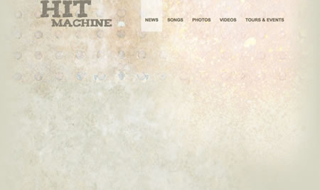
Now that we’ve got the basics taken care of, let’s start on the header. Going back to our PSD file, make sure that the “header” folder is visible and unlocked. Once that’s done we’ll need to isolate the “Hit Machine” logo in to its own image file. There are a few ways of doing this, but I find the easiest to be cutting it, opening a new file with a transparent background and pasting it in there. The header needs to have a transparent background so that it can seamlessly sit on top of the site background, that we created earlier, without interrupting any of the background designs or texture. I named mine “header.png” and saved it to the “images” folder in my sites root directory.
Next we go back in to our PSD file and undo our cut so that our design comp is back to full again. Behind “Songs” link on the main navigation bar you’ll see a faint-white, rectangular box that notifies viewers of which page they’re on. Let’s cut that and drop it in a new transparent .png file and save it as “navHover.png” to my images folder. Though several browsers these days support transparent backgrounds, not all of them do. So, it’s always safest to stick with an image file with a transparent background.
With the header framed up, let’s define the navigation starting with its placement. We need to create a class for our entire navigation bar and have it floating to the right, so that it will align with the right side of our content. To do this we create the following lines of code.
.navBar { width:555px; float:right; }
To define the links within our navigation bar, select the navigation links in our PSD file and, Arial font, bold, all caps, size 17 and the color is #6F6751 appear to be the styles we need to define in our CSS file. It also looks as though our “navHover.png” image has padding on top of 65px, bottom of 34px, and 15px on each side. And, since we’re going to need to move it down from the top, inside the .header tag, we’ll need to set its position to relative and define where we’d like it placed. In the sake of keeping things simple, let’s go ahead and create a new class for our navigation and name it “.navBar” so that I can define its style as follows.
.navBar a { position:relative; font-family:Arial, Helvetica, sans-serif; text-transform:uppercase; text-decoration:none; font-weight:bold; font-size:17px; color:#6F6751; padding:65px 15px 34px 15px; top:65px; }
As to not mess up our navigation bar by placing it below our header image, let’s make our header image float left and give it a slight margin. Like this:
.header img { margin-left:25px; float:left; }
With our navigation set up we should now add in our “navHover.png” class to apply to the correct pages the viewer is on as well as when hovering over links to other pages within our main navigation. To do so we simply create a “.navbar a:hover” and an “.on” class with the only attribute being the background image, like this.
.navBar a:hover, .on{ background-image: }
Now that our navigation bar is all set up, let’s go drop in all of the appropriate code to our HTML page. Working within our header tags we need to place our header image, then insert our navigation. This can be accomplished by doing the following.
<div>
<img src="images/header.png" />
<div>
<a href="index.html">News</a>
<a href="songs.html">Songs</a>
<a href="photos.html">Photos</a>
<a href="videos.html">Videos</a>
<a href="events.html">Tours & Events</a>
</div><!--end div "navBar"-->
</div><!--end div "header"-->
Now that we’ve got the header down, and if you haven’t already, go ahead and preview your index.html page in a browser to make sure that everything matches with the design comp so far. If everything’s good to go, it should look like this.
The first step to creating the body will be isolating its background image. To do that we want to go back in to our PSD file and cut the “content area” file from our “back” folder which we left back at the beginning of this tutorial, pasting it in a new, transparent, image file and saving it as, “contentBG.png.” Then we want to go back to our main PSD file, undo the cut, and inspect the style of the main content area’s text, as well as note the margin between the background image and the start of the text, so that we can define some font styles in our next step.
Going back in to our CSS file we are now going to create and define our “.mainContent” class by writing the following code.
.mainContent { background-image:url(images/contentBG.png); width:900px; padding:25px; font-family:Arial, Helvetica, sans-serif; font-size:16px; color:#3F3D3D; }
Next we need to isolate the text, “See Hit Machine in Concert” along with the picture of the band member and the background texture image. To do this I clicked on the text box inside my PSD file and deleted the links that were below, “See Hit Machine in Concert.” We’re going to add that text back later with HTML so that it functions properly. What I did next was expand the “home” folder inside my PSD file and then selected the first four images, “band member,” “see Hit Machine…,” “flash texture,” and “flash back.” Once they were selected I cut them, pasted them in to a new file and saved it as, “mainImage.jpg.” Since this image has no transparency, there is no need to save it as a .png. While we’re at it we can slice out the rest of time images from our main content body. These include our social media links and the thumbnail for their latest video. I saved my icons as the corresponding social media network, (facebook.png, myspace.png, twitter.png, linkedIn.png, flickr.png and rss.png) and the video thumbnail as thumbnail.jpg. The icons are .png because they have rounded corners across a variant of color, so they need a transparent background, whereas the thumbnail is a perfect square and could be saved as a .jpg.
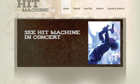
Now that we have all of our images taken care of, let’s go to work on formatting and plugging in the main content, beginning with the main image. Back in our HTML file we need to insert our “.mainContent” div and add our “mainImage.jpg.” To do so our code needs to look like this:
<div>

<img src="images/mainImage.jpg" />

</div><!--end div "mainContent-->
If you preview your work, you should see your page starting to come together and look something like this.
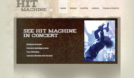
Next we’ll add the quick links underneath the “See Hit Machine in Concert” header within our main image. Referring back to our PSD file we can get all of the styling and positioning info necessary. And even though the PSD file doesn’t show a hover state for the links, we’ll go ahead and add a standard one to let the viewers know it’s an active link. To get everything set properly, your CSS code should look as follows.
.quickLinks { position:absolute; left:115px; top:390px; }

.quickLinks a { color:#fff; font-size:16px; }

.quickLinks a:hover { text-decoration:none; }
Now, going back to our index.html file, we’ll add the links in so that they’re displayed on our page.
<div>

<img src="images/mainImage.jpg" />

<div>

<p><a href="events.html">Schedule of events</a></p>

<p><a href="photos.html">Exclusive backstage photos</a></p>

<p><a href="info.html">Tour information</a></p>

<p><a href="interviews.html">Upclose interviews with the band</a></p>

</div><!--end div quickLinks-->

</div><!--end div "mainContent-->
Preview your work in a browser and make sure that you’re still on point with the design comp. If you’re on the right track, you should be seeing something like this.
We’re rounding the home stretch now and I think the best way to handle the “Latest Videos,” “Hit Machine Blog,” and “Connect With Us” parts of the main content area is to split them in to floating columns. We’ll start from the left and work our way right. So, first up is the “Latest Videos.” Our PSD file shows that from the left alignment point of our video column to the left alignment point of the blog column is 310 px. While we’re in our PSD files let’s check the style attributes for our header and the link text below the thumbnail, before jumping back to our CSS file. Once you’ve noted the style attributes you can go back to your CSS file and define them.
Since all of the headers were the same for our bottom three columns, I’m going to modify the h1 tag that we defined in our reset stage in the very first step. So, going to the top of our CSS file I’m going to find the h1 tag which should only have a size definition and look like this h1{font-size: 200%;}. And I’m going to modify that h1 tag to match the style of our video, blog and connect headers. So that it should now be defined as follows.
h1{ font-size: 18px; font-weight:bold; text-transform:uppercase; color:#3f3d3d; padding-bottom:20px; }
Now that our h1 tag is set we can start defining our video class. I named mine “.latestVideos” and defined the width as well as created a class for the links and their style, so my code looks as follows.
.latestVideos { float:left; width:310px; }

.latestVideos a { color:#3d3f3f; font-family:Arial, Helvetica, sans-serif; font-size:16px; }

.latestVideos a:hover { text-decoration:none; }
With our latest videos column now set up, we can go ahead and put it in our HTML file and drop in our header, thumbnail and linked text by adding the following code.
<div>

<h1>Latest Videos</h1>

<p><img src="images/thumbnail.jpg" /></p>

<p><a href="#">Another video to watch here</a></p>

<p><a href="#">And yet another video here</a></p>

</div><!--end div "latestVideos"-->
Now would be a good time to check our work in a browser and make sure we’re still on the right track. If all is correct, you should see something similar to this.

Next we’re going to add the blog column, which will be quite similar to the video column only according to our PSD file it’s about 90 px wider. So, you can copy and paste your .latestVideo classes, modify the width and rename them to something like “.blog” or you can revel in the practice and write them back out. Whichever you choose, your code should wind up as follows.
.blog { float:left; width:400px; margin-top:30px; }

.blog a { color:#3d3f3f; font-family:Arial, Helvetica, sans-serif; font-size:16px; }

.blog a:hover { text-decoration:none; }
Once the column is set up in your CSS file you can go ahead and add the content to the HTML file. Mine looks as follows.
<div>

<h1>Hit Machine Blog</h1>

<p><a href="#">Loremipsum dolor sit amet consectetur adipiscing</a><br />

Nunc eu mi risus, nec luctus justo. Proin consequat mi lacus, eget commodo mi. Donec ultricies...</p>

<p><a href="#">Bibendum est eu gravida cras dui sem</a><br />

Venenatis a egestas id, consectetur faucibus nibh. Fusce id felis at lorem lacinia pharetra...</p>

<p><a href="#">Aliquam arcu nisi, sagittis at feugiat quis</a><br />

Accumsan ut metus. Mauris rhoncus odio fringilla diam vestibulum vitae vehicula mi rutrum...</p>

</div><!--end div "blog"-->
And if I preview it in a browser, it looks like this.

Now for our final column, similar set up to the previous only slightly skinnier than the rest, is our icon link column. I named mine, “.logoLinks” and added the following code to match with what our PSD is calling for.
.logoLinks { float:left; width:180px; margin-top:30px; }
Next we need to add some code to space the logos apart to match our PSD. We can apply the necessary style strictly to the images within logoLinks by targeting them specifically. Then all we need to do is add a margin-left and some padding to the bottom that will match our design comp. This can be done by adding the following code:
.logoLinks img { margin-left:30px; padding-bottom:20px; }
Now that you’ve got your “.logoLinks” column framed up, go back to your HTML file and let’s drop in all the information we need in order to get the icons to display on our page. Thanks to the defining of the image tag, all we have to do is add in our header and the image links. So, your code should look like this.
<div>

<h1>Connect With Us</h1>

<a href="#"><img src="images/facebook.png" /></a>

<a href="#"><img src="images/myspace.png" /></a>

<a href="#"><img src="images/twitter.png" /></a>

<a href="#"><img src="images/linkedIn.png" /></a>

<a href="#"><img src="images/flickr.png" /></a>

<a href="#"><img src="images/rss.png" /></a>

</div><!--end div "logoLinks"-->
With all of our columns in place, go ahead and preview your work in a browser. It should look almost identical to your PSD file, but be missing the footer.

Last but not least, we have the footer. According to our PSD file, there are only two layers that make up our footer, a bar the width of our content area and then some text. I cut out the bar, dropped it in a new file with a transparent background and named it “footerBar.png.” Next, we need to jump back to our CSS file and create a “.footer” class and define it’s attributes to match those in our PSD file. So, your CSS code should be two simple lines defining the width and center aligning your. My code looks as follows:
.footer { width:960px; text-align:center; }
After you’ve styled your footer, we’ll need to create a class for the image to add a little bit of space between the “footerBar.png” image and your actual footer text.
.footer img { margin-bottom:5px; }
Once those are added we’ll need to style the “contact us” link by defining links within the “footer” class. Your code should look as follows:
.footer a { color:#3d3f3f; font-family:Arial, Helvetica, sans-serif; font-size:16px; }

.footer a:hover { text-decoration:none; }
Now that the CSS is set up, all we have to do is add it to the HTML file and we’re done! So, open your HTML file and we’re now going to want to place our “footer” div AFTER the closing of our “mainContent” div but before the closing of our “container” div. If we were to place our footer inside of the “mainContent” div our footer would have a left margin and not run the full span of our main content. Your HTML code should match this.
</div><!--end div "mainContent-->
<div>
<img src="images/footerBar.png" />
<p>© 2009 Hit Machine Band | <a href="contact.html">contact us</a></p>
</div><!--end div "footer"-->
</div><!--end div "container"-->
If you did it correctly, when you preview your index.html file in a browser it should look like this.

If it does, that’s it. Congratulations, you’ve just converted a Photoshop PSD file to a webpage! Now take your newfound wisdom and allow it to start earning you some money. Good luck and have fun!
If you’d like to see the full source code, you can download it from here.
The article is written by Scott Stanton. With over ten years in the freelance web design and writing fields, Scott Stanton has had his finger on the beating pulse of the industry’s hottest design trends and bends for the past decade. Maria works for website builder Wix.com, a free online platform for the easy creation of customized Flash websites.

