Typography is everywhere: in books, on websites, on billboards, on tv,… and of course on packages you buy at the store. In general, typography on packaging is not outstanding. Designers get limited space, tons of text to add and clients to deal with.
However, sometimes packaging designers use typography as the central element on packages, and the the result can be quite astonishing, like in these 25 examples.
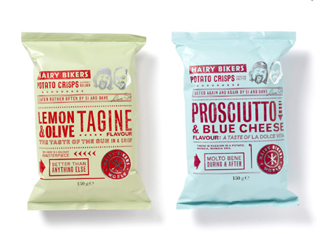
1. Hairy Bikers
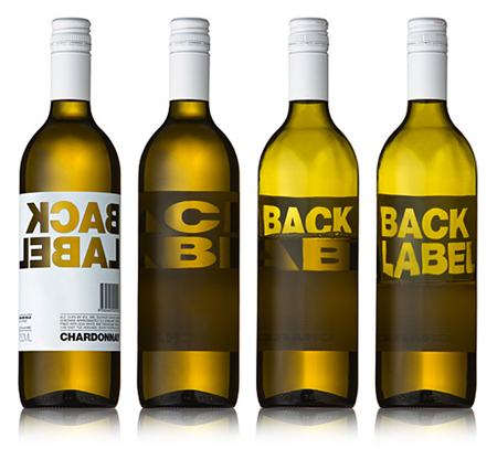
2. Back Label
3. Ms Men
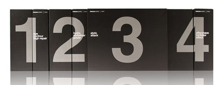
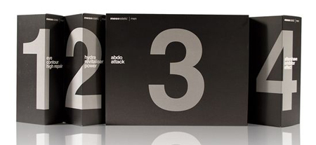
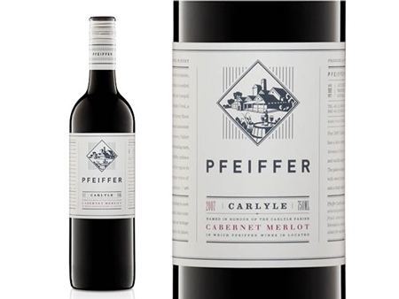
4. Pfeiffer wine labels
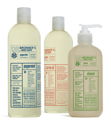
5. Dr Bronner’s Magic Soap (student work)
6. Skeyndor men
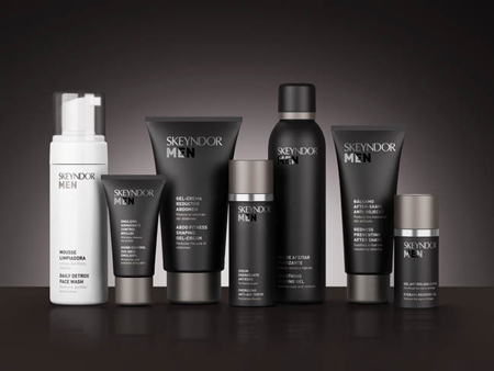
7. QuickOven
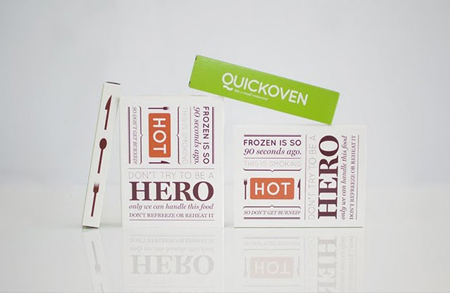
8. Slice
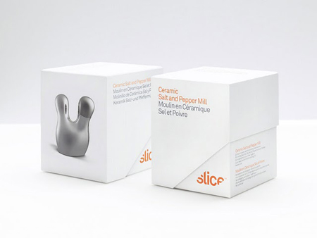
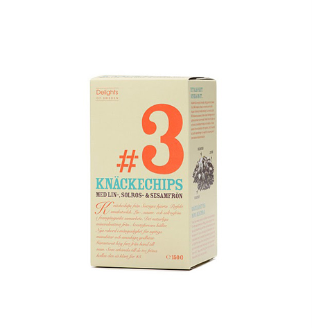
9. Delights of Sweden

10. tej milk
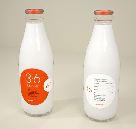
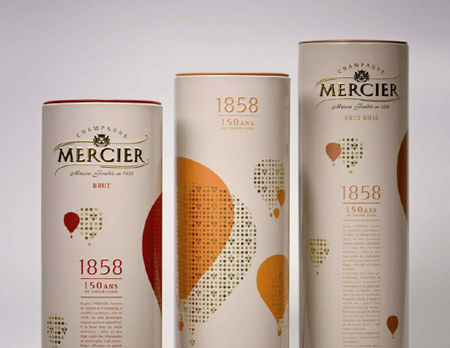
11. Mercier Champagne
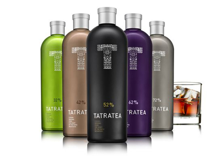
12. Tatratea
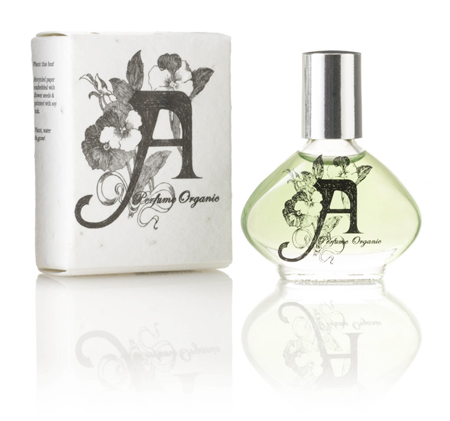
13. A Perfume Organic
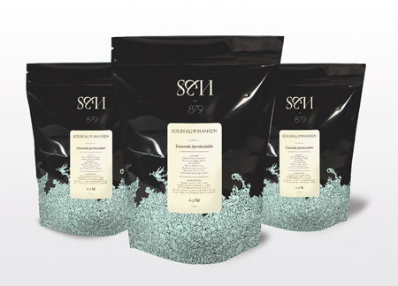
14. Solberg & Hansen Coffee
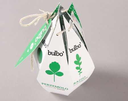
15. Bulbo (student work)
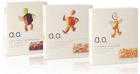
16. a.o.
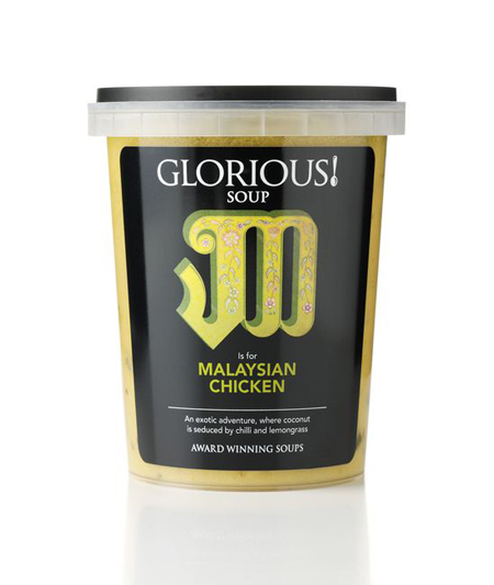
17. Glorious! soup
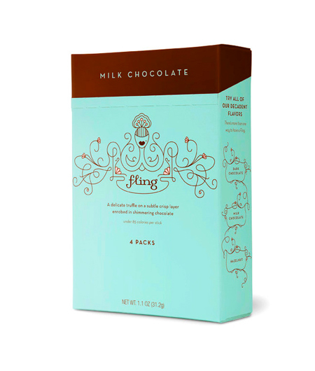
18. Fling chocolate
19. Breuckelen distilling
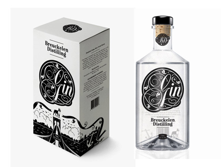
20. Dolce Emozioni
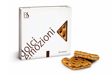
21. Eggs from farm
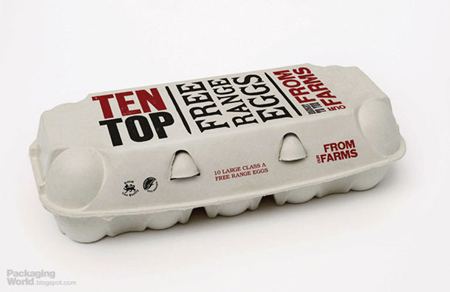
22. Mortlach 70
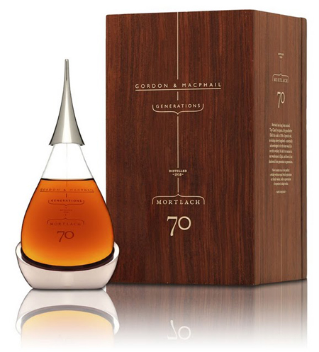
23. Delicia
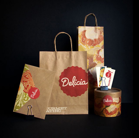
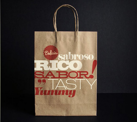
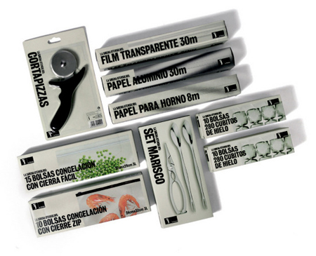
24. La Sirena
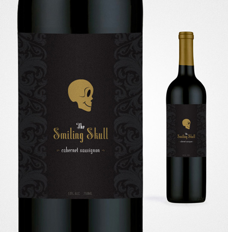
25. The Smiling Skull
