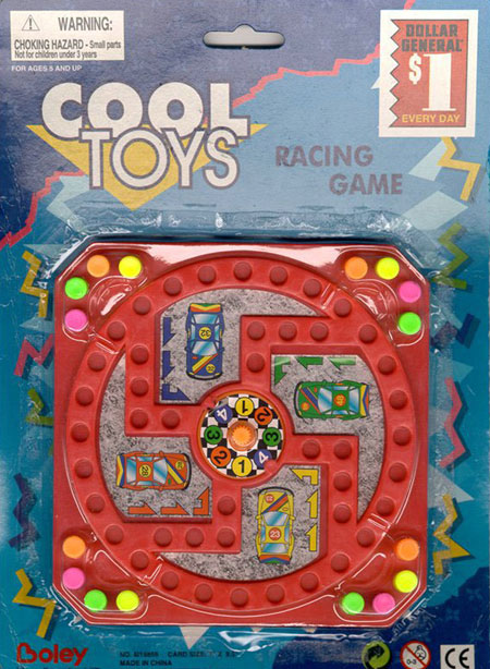
Sometimes designs can go awfuly wrong, just like on the above image where the racing path gives a shape full of painful memories to the circuit. There are other ways for designs to be bad, following are a few examples.
Bad photoshopping

There are many examples of image retouching that was done either too quickly or very badly. Many blogs often talk about this, like Photoshop Disasters.
Phallic logos

The Brazilian Institute for Oriental Studies. Huh!
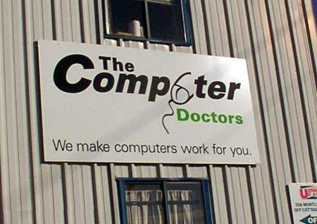
The Computer Doctors, they’ll take a good look at your… hum… your mouse. Don’t forget to check out more on David Airey’s blog.
Other phallic shapes
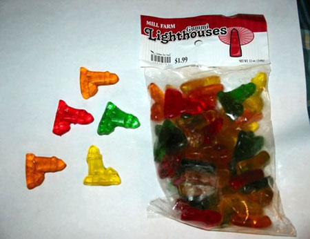
Well… I would just by regular gummy bears instead of those I guess.
Bad advertising placement

I bet that people at McDonalds marketing didn’t like that photo…

Hum… nothing to add on this one.
Things that shouldn’t need to be designed
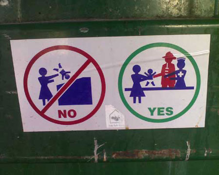
This kind of infography makes me a bit sad about the human race, why on earth would you need to design such a picture? I truly hope that this is a joke.

