The packagings you’ll see in this post are not your average package that you see in every supermarket, these are the ones that will stand out no matter where you put them.
1. Poilu
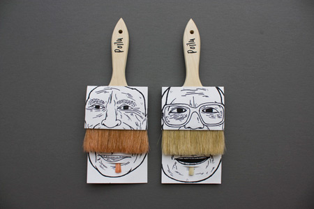
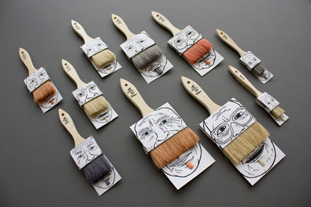
Part of a university projects, these brushes packages are rather amusing and serve as protections for new or used brushes. Created by Simon Laliberté.
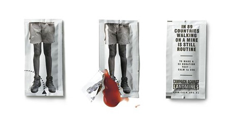
2. Landmine ketchup
Some special little ketchup packets created to raise awareness about landmines. Via The Dieline.
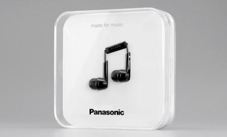
3. Panasonic Note
Created by the agency Scholz & Friends in Germany, this earbuds packaging won a Gold Lion in Cannes in 2010. Via Lovely Package.
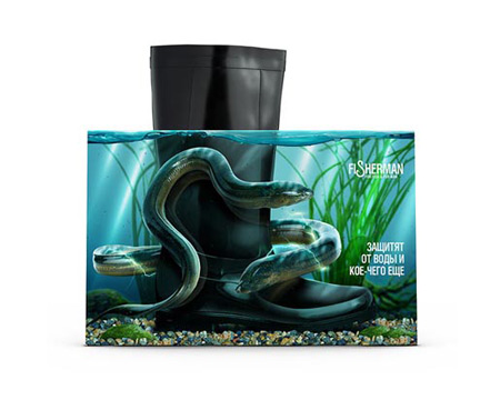
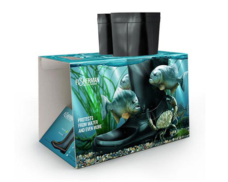
4. Fisherman rubber boots
This rubber boots packaging is just amazing and puts the boots in context, earning its creators an award at the Golden Drum Awards. Via The Inspiration Room.
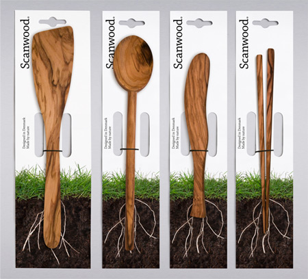
5. Scanwood
This packaging is a great reminder of where the product comes from. Via Goodmorning Technology.
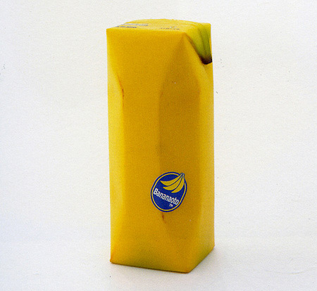
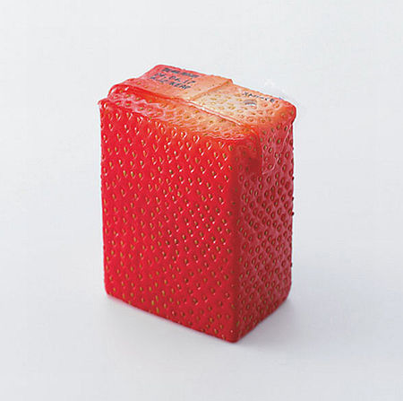
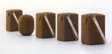
6. Juice Skin
An awesome fruit juice packaging brought to you by Naoto Fukasawa. Via Popsop.
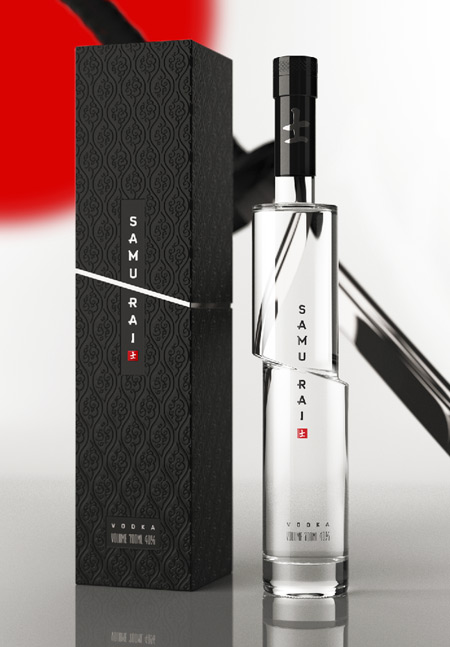
7. Samurai Vodka
A gorgeous concept for some rice vodka bottle, the concept is still for sale so check it out on Behance.
8. Ricola
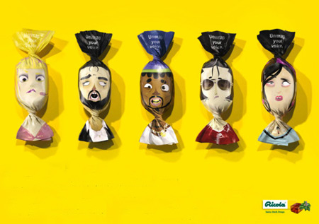
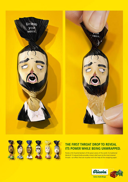
Creative packaging designed by German advertising agency, Jung von Matt. The “Unwrap your voice” campaign illustrates how these candies can clear your voice.
9. Spark
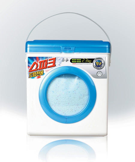
No mistake is possible when seeing this packaging in store. It was created by Aekyung Studio in Korea.
10. WTP Paint
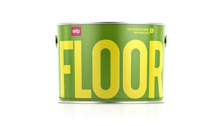
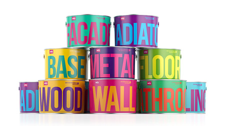
For once, words speak louder than images. These packages by Reynolds and Reyner couldn’t be more simple, but they also couldn’t be more efficient.
