A look at some well-designed packaging to inspire you. Some are just concepts, but definitly deserve to be featured here.
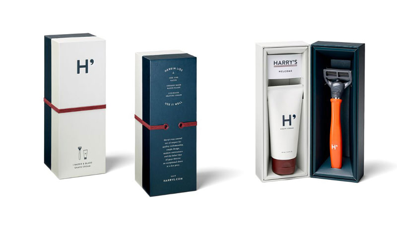
1. Harry’s razor & blade
Minimalist and elegant design (I love the H’ logo) with simple high-contrast colors and a cool closing system. Design by Harry’s.
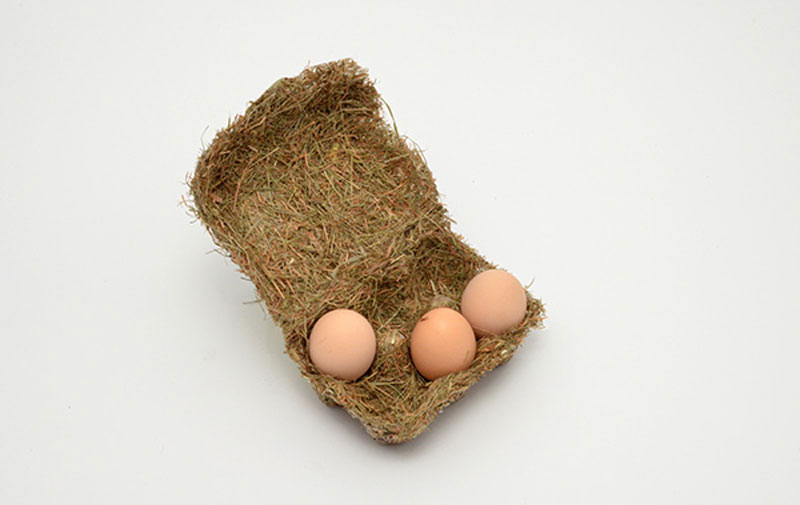
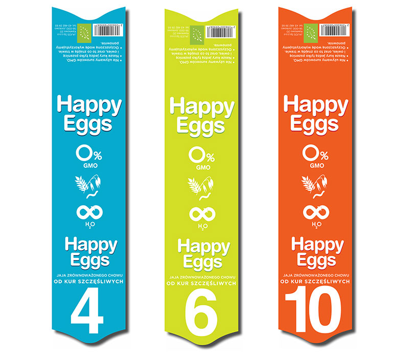
2. Happy eggs
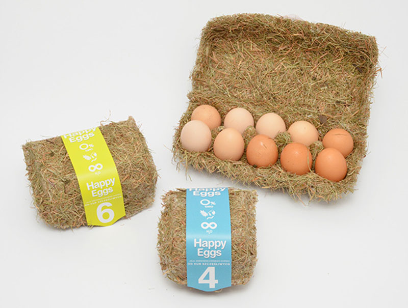
A concept for egg packaging, experimenting with renewable material that respects the environment. It was designed by Maja Szczypek from Poland.
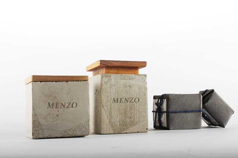
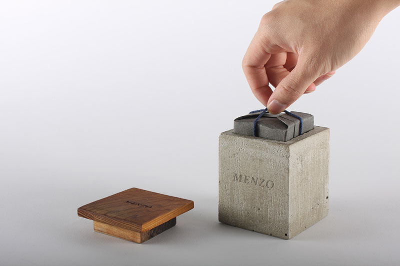
3. Menzo
This men’s soap packaging is made of unusual material: concrete and wood. It looks a bit rough, but the minimalist package works well to reveal a soap that looks like a precious gift. Design by Yu-Heng Lin from Taipei.
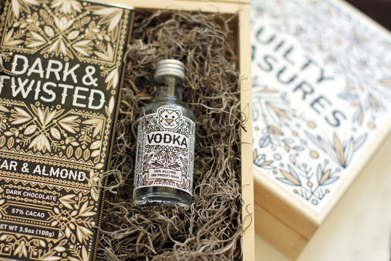
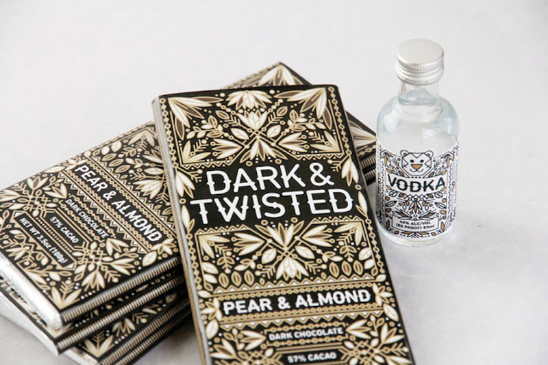
4. Guilty Pleasures
Promotional gift created to give out at the Portland State Graduate Portfolio Showcase. Design by Anna Ropalo.
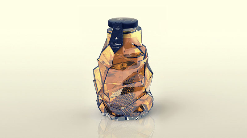
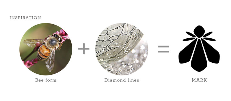
5. BEEloved
A gorgeous packaging with shapes inspired by a bee hive. The designers also did a great job sharing their process for the design.
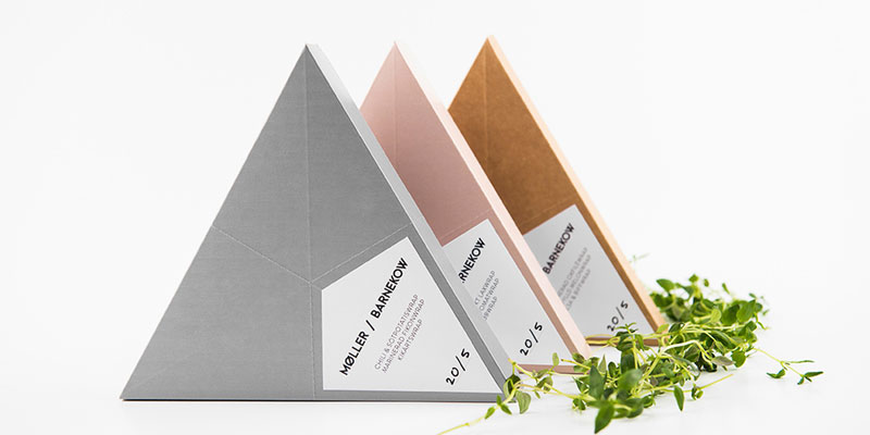
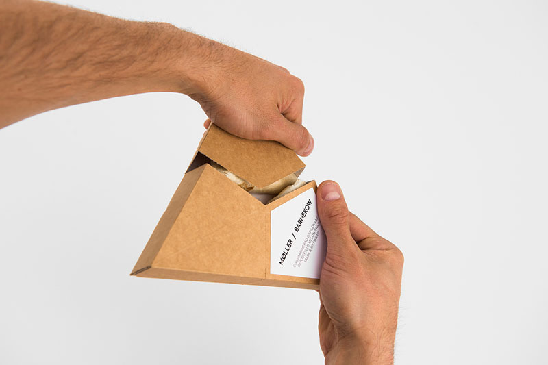
6. Moller / Barnekow
A student concept packaging that tries to create a new way to pack food to adapt to the way we consume nowadays. Design by Rasmus Erixon & Tobias Möller via The Dieline.
7. PURE chocolate
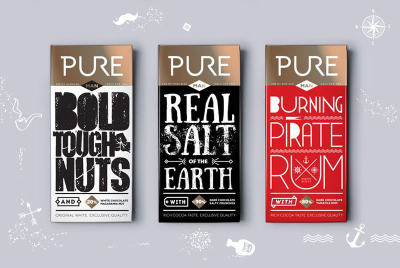
PURE is another concept that uses cool typographic designs to promote chocolate for couples. It was designed by Daria Ksenofontova from Russia.
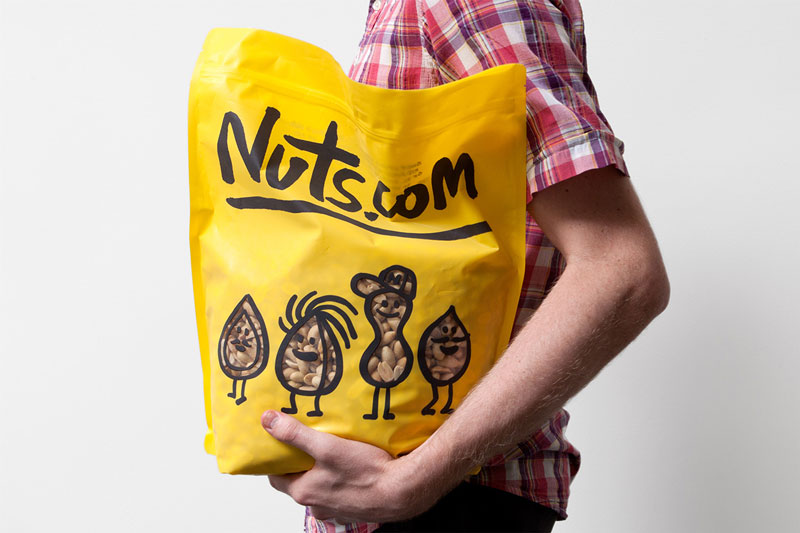
8. Nuts.com
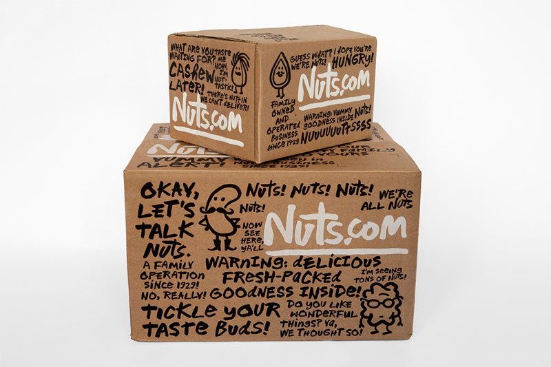
As the domain name suggests, Nuts.com is an online retailer for… nuts. They hired Pentagram to create their packages, and the least you could say is that the agency did an amazing job.
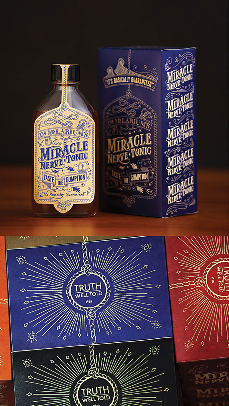
9. Dr. MacLarium’s Nerve Tonic
A vintage-styled packaging created specifically for an advertising agency’s party. It was designed by Sean Mitchell, Regan Fraser, and Mark Lovely for the kick-off of MacLaren McCann’s annual wild west Stampede Party.
10. Staeckler
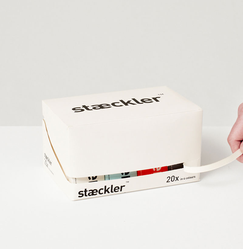
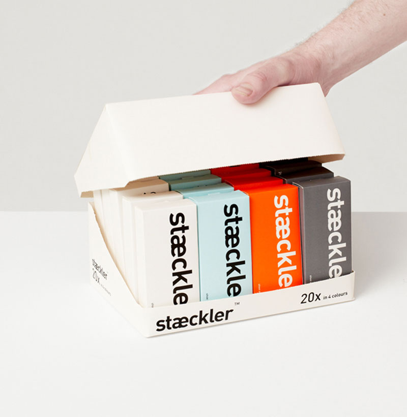
A minimalist packaging that fits perfectly this system of sneaker hooks. I’m not sure about the opening system, but the design is indeed very elegant and uses good type. Design by PostlerFerguson.
