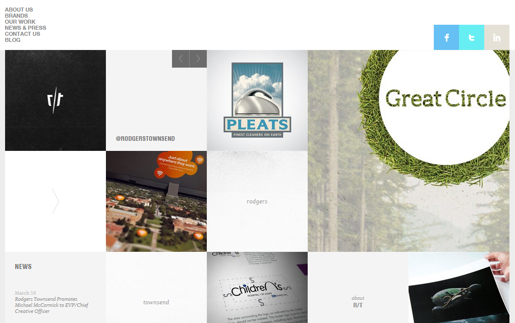
1. Rodgers Townsend
They tailor the process to the particular needs of each client, involving as many creative problem solvers, from as many different disciplines, as possible. View the website here.
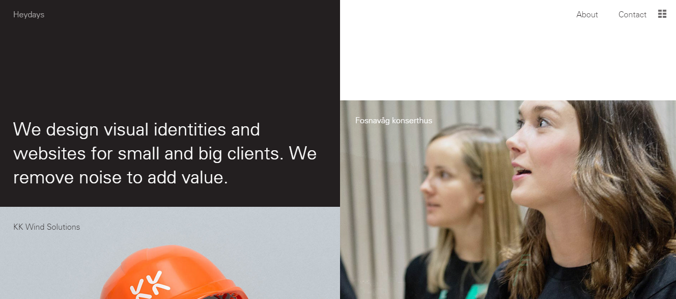
2. Heydays
Heydays use insight, instinct and commitment in their design work and dare to challenge the established truth. View the website here.
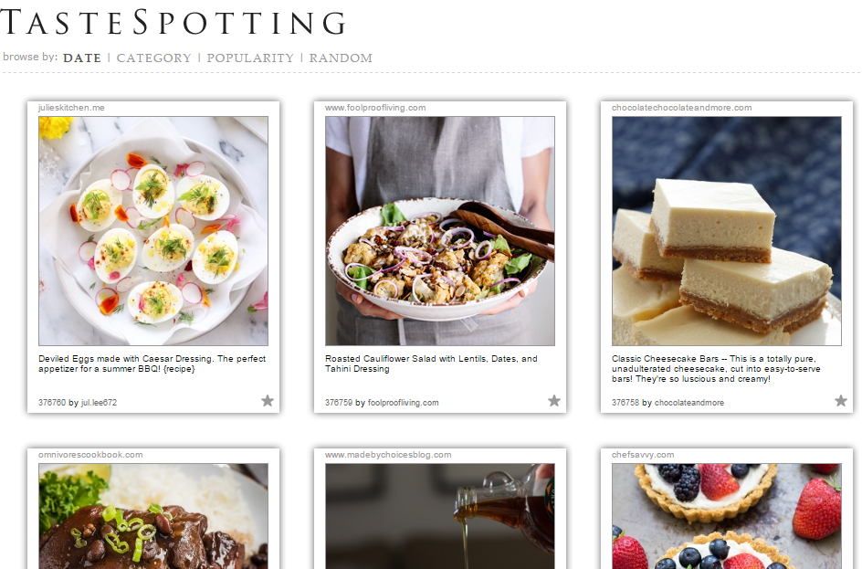
3. TasteSpotting
Get the taste of million dishes available in this grid design. You can view the website here.
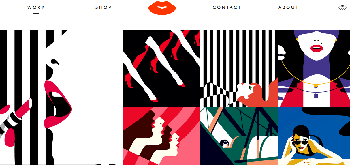
4. Malika Favre
The bold, minimal style – often described as Pop Art meets OpArt – is a striking lesson in the use of positive/negative space and colour. Visit the website here.
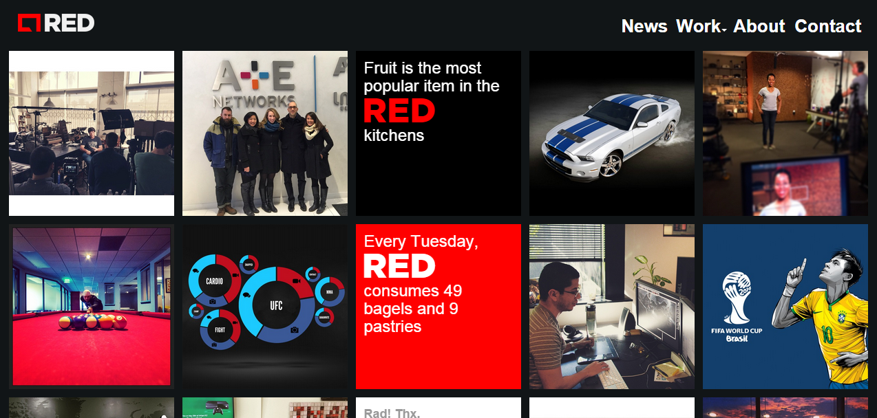
5. Red
RED is a full-service digital agency that is comprised of experienced strategists, creatives, technologists, designers, marketers, storytellers, and inventors. Visit the website here.
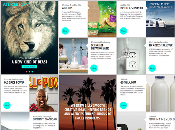
6. SilkTricky
Get the amazing experience of grid layout in this website.
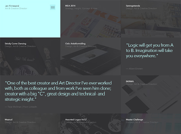
7. Jan Finnesand
Jan uses design, innovation and technology to tell stories and create emotional bonds between people and brand. Have a look at the website here.
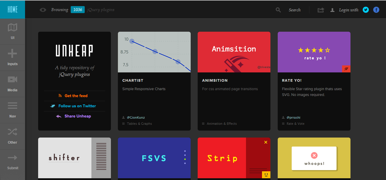
8. Unheap
You can view this grid layout design website here.
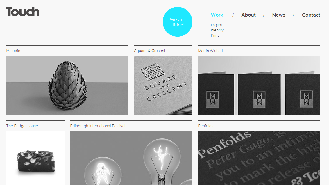
9. Touch
Touch is a creative agency with collective skills that cover everything from brand identity, graphic design and copywriting to illustration and digital design. View the website here.
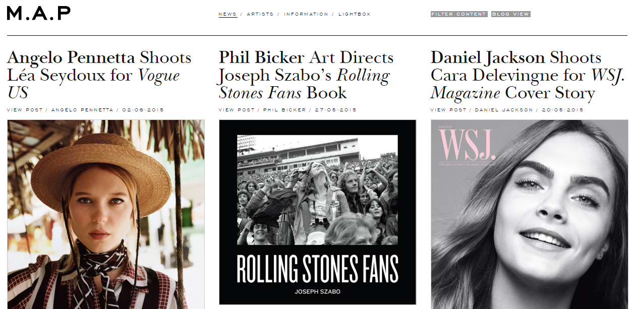
10. M.A.P
You can view this Management and Production (M.A.P) website with grid layout here.
