It is imperative to design an attractive, simple and functional website to encourage visitors to hit the BUY, Subscribe or Download button. There are certain essential elements that every website must have in order to please today’s tech-savvy Internet users. This article takes a look at those essential web design elements you need to incorporate in your site.
1. An effective color scheme
One of the major components of an aesthetically pleasing website is an effective color scheme. Select a color scheme, which complements the logo, banner and other elements of your website. While there are endless combinations of colors that you can use for this purpose, there are two basic types of color schemes, which are widely used by designers.
Analogous colors – On the color wheel, analogous colors are adjacent to one another. Although this color scheme doesn’t provide much scope if you are looking particularly for adding some contrast, it still works if you use it aesthetically.
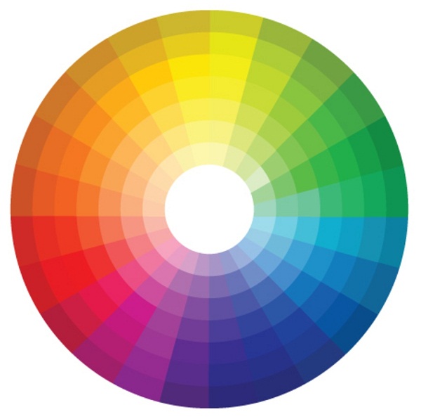
Image credit: Pinterest
Complementary colors – Complementary colors are opposite to each other on the color wheel. Settle for this color scheme to create a bold contrast on your website.
Moreover, you can also create your own color palette using the basics of color theory to get your message across to your target audience.
2. Consistency across all pages
Maintaining consistency across all the web pages is a given and it could be considered part of the site architecture. With the exception of your homepage, which can have a different, striking layout to capture the attention of visitors, you need to make sure that all the inner pages are in-sync with the overall theme of your website. For this, use the same layout, color palette and even placement of logo and other elements on the page. Even the typography needs to be consistent across all the pages, including the homepage.
3. Typography that suits your website’s theme
Typography is one of the main factors, which fuel web design aesthetics. There are endless fonts that you can select and use on your website or even design custom fonts depending on the requirement. Irrespective of what you select, just ensure that the typography aligns to the theme of your website. For instance, typography relevant to a corporate website may not appeal to the visitors for a website that sells clothing for teenagers; you need to go for more casual typeface. So, keep your target audience in mind while selecting the typography for your San Francisco website design.
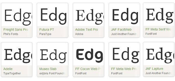
Image credit: Techvigil
4. Unique contact page design
An impeccable website design that does attract visitors on your website is going to be of no use when they do not find the contact information to get in touch with you. The solution is to create a unique contact page, which displays details such as – the phone number, address, email address, map to reach your office, fax number etc. If you provide them to fill up a query form on the page, make sure that it is optimized for mobile screens and has a visible CTA button.
5. A clutter-free interface
A website with an awesome layout, easy navigability and readability is definitely going to be more effective in getting the message of the company across to the target audience than the one, which includes an overabundance of text and image and little whitespace. Eliminate clutter on your website by– maintaining a good balance of image and text, using hero images, going minimalist with parallax scrolling, settling for intuitive navigation, opting for ghost buttons, making apt use of the whitespace etc.
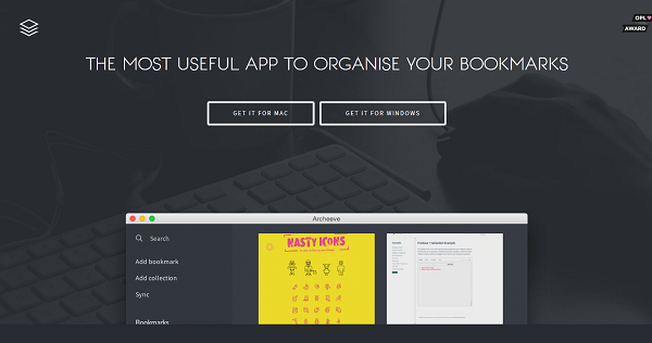
Image credit: Archeeve
6. High quality images
Stock photography or stock images have been used left, right and center on endless websites. More often than not, newly launched websites with low budgets settle for these images. But if you do not have a budget constraint, then opt for high quality, unique photographs or images offered by professionals. Think of the creative leeway you can get by deciding exactly which type of photograph/image you want to use on your webpages. It also adds to the authenticity of your business or brand.
7. Hidden menus
The advancement in technology has led to a tectonic shift in buyer behavior; most of them use their mobile devices to surf the internet and shop online. This is why website designers focus on creating responsive websites, which can adapt to mobile devices with limited screen space. A prominent feature of such websites is – hidden menus, which are visible only when the visitor clicks on an icon on the screen. It is one of the things that help in maintaining a neat, clutter-free interface.
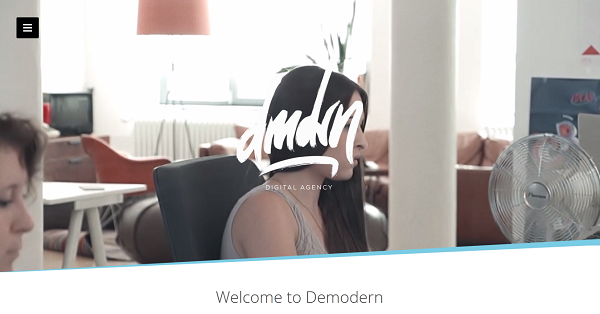
Image credit: Demodern
8. Storytelling
One of the essential components to maximize visitor engagement on your website is through interactive storytelling. For instance, you can create a timeline of your brand and let the visitors learn more with each click or simply via scrolling. You need to put your best ‘design’ foot forward when it comes to creating a flawless story or a theme, which visitors can explore. This helps create a great first impression on them.
9. Social Media Engagement
Social media owns the internet at the moment. Love it or hate it, there is no escaping the fact that it is essential for boosting your business. Allow your visitors to share information on your website by incorporating social media buttons and social media widgets on the pages. This in turn will help enhance your brand’s identity and presence online on various platforms.
Image credit: mkhmarketing on Flickr
10. Flat Icons
Flat web design is the trend these days. However, if you don’t want to change your website from the scratch, you can still use Flat icons, which are a part and parcel of numerous responsive/minimalistic websites. With Apple embracing Flat Design and Google introducing Material Design, Flat Icons will leverage your website’s appearance on two of the most popular mobile platform.
Wrap up
Use these pointers to design an awesome website, which not only impresses visitors but also helps increase the conversion ratio. Do you have any other points that can be added to the list? Feel free to comment on the same.
About the Author: Michael Georgiou, a dynamic business professional and entrepreneurial guru associated with Imaginovation – Charlotte Web Design Company proven his success in creative strategy, online branding, project management, and communication projects in both the public and private sectors.

