There are many rules that design teachers will give their students for logo design creation. Then, they’ll usually show you the logos they love the best, and you’ll quickly notice that many break the rules they just thought you before. In this post, we will not share any logo design rule, just some examples of logo design done right.
1. Bike forever
When you have two names that are easy to represent with an icon each, why not just combine the two to create a unique and cool logo? That’s exactly what the Bike Forever logo designers did, and they did it very cleverly.
2. Old Salt Merchants
Badass is the first word that came to my mind upon seeing the “Old Salt Merchants” logo. The smoking dude’s face is both traditional and modern, and it integrates very well with the cursive font used for the logo. The capital “O” and “S” give a little extra personality to the logo. The whole coporate identity and packaging are just as good and can be seen on A Kitchen Box website.
3. Mt. Baker
This Mt. Baker logo is one of the marketing assets from American West Apparal. All the designs were created by Josh Warren Design.
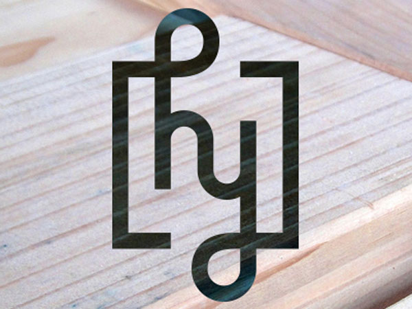
4. Personal logo for Dustin Hysinger
This concept shared by Dustin Hysinger on his Dribbble page is worth a mention. He cleverly combined all the letters from his name.
5. Fujiyama cookie
A cookie brand from Japan, inspired by Japan’s most famous volcano.
6. P
I didn’t find much information on this beautiful “P” logo, apart from the fact that it was designed by the talented Jeff Jarvis.
7. Amy
A cool logo concept that can work both ways for Amy, a fashion brand that specializes in making Italian leather bags. Excellent work by Daniel Balazs from Hungary.
8. Bowling logo
Kind of obvious once you see it, but still a clever and well-executed logo concept by Ron Lewis.
9. 35 mm
The most square looking logo in this list, with simple similar shapes for each letter or number. Gorgeous logo by Tom Creighton.
10. Mito Media
How to you blend two capital “M” together? Easy, you just turn them into a gorgeous logo. A design by Berger & Föhr.
11. Motor City Chop Shop
A motor shop with a gorgeous motorbike logo, created by Company Folders.
