Coffee packaging seems so ubiquitous in designers’ portfolios that it could almost be a design field in itself. For that reason, getting noticed with packaging design is a difficult mission, as you are competing with multinational companies as well as graphic designers who start importing coffee in their village. In this post, we take a look at a few packages that truly stand out in one way or another.
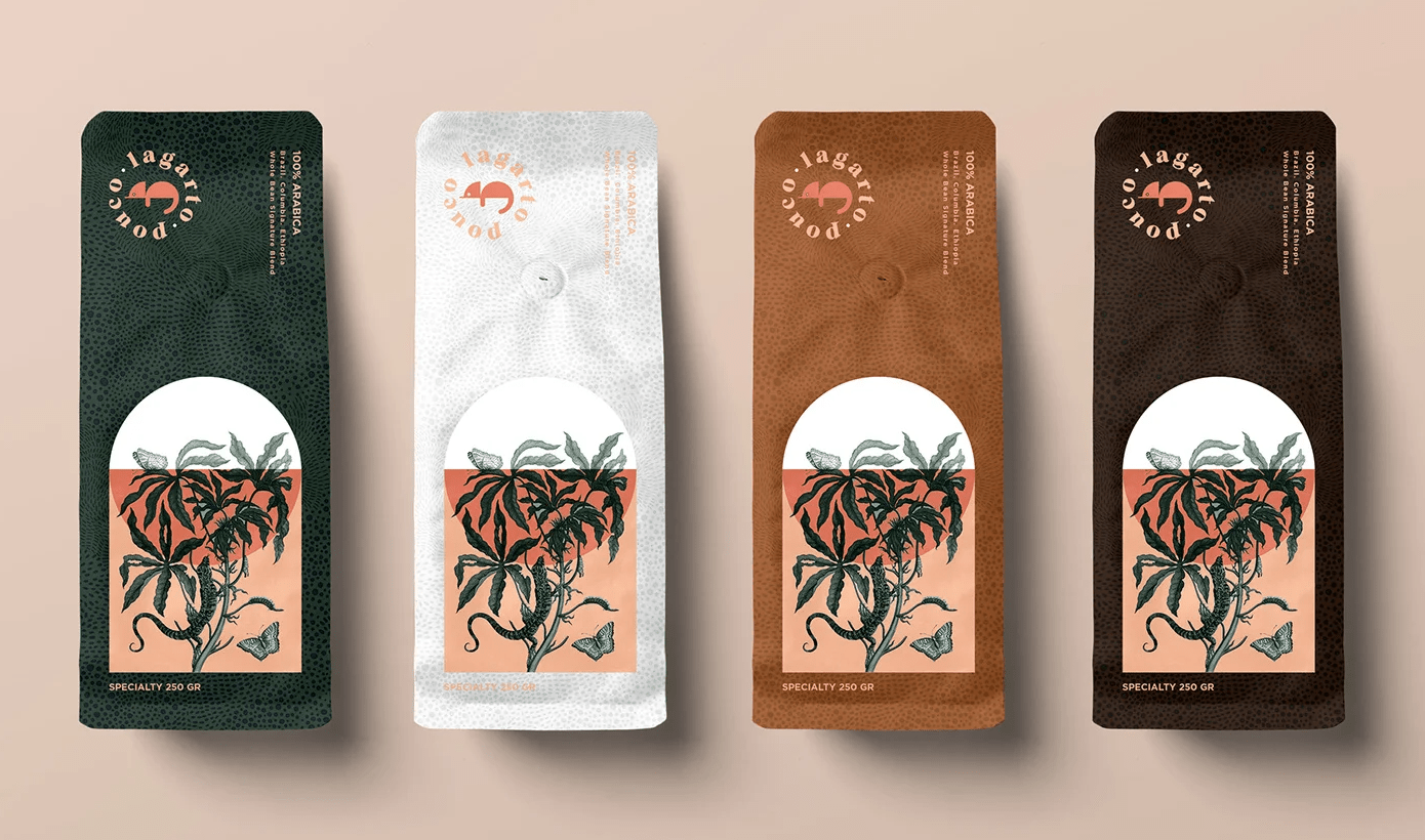
1. Lagarto Coffee Packaging
Gorgeous packages with a subtle color scheme and delightful illustrations, excellent work by FiveStar Branding.
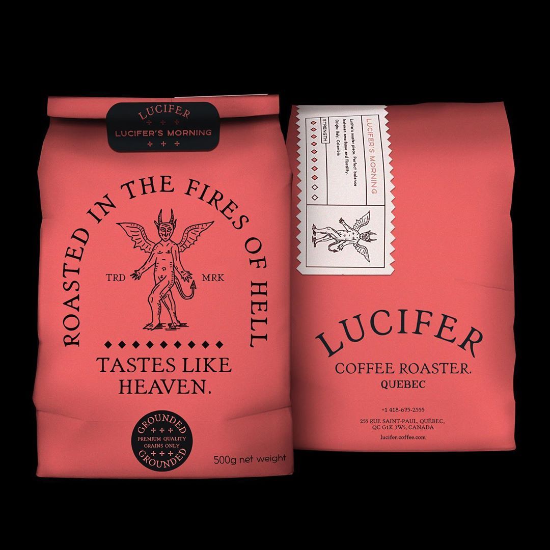
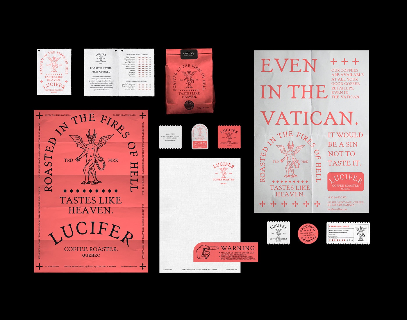
2. Lucifer Coffee Roaster
A project that will gather instant hate from the more literal Christians out there for its blasphemous name and slogans. One should probably not see any bad intention there, only good graphic design by BIS Studio Graphique.
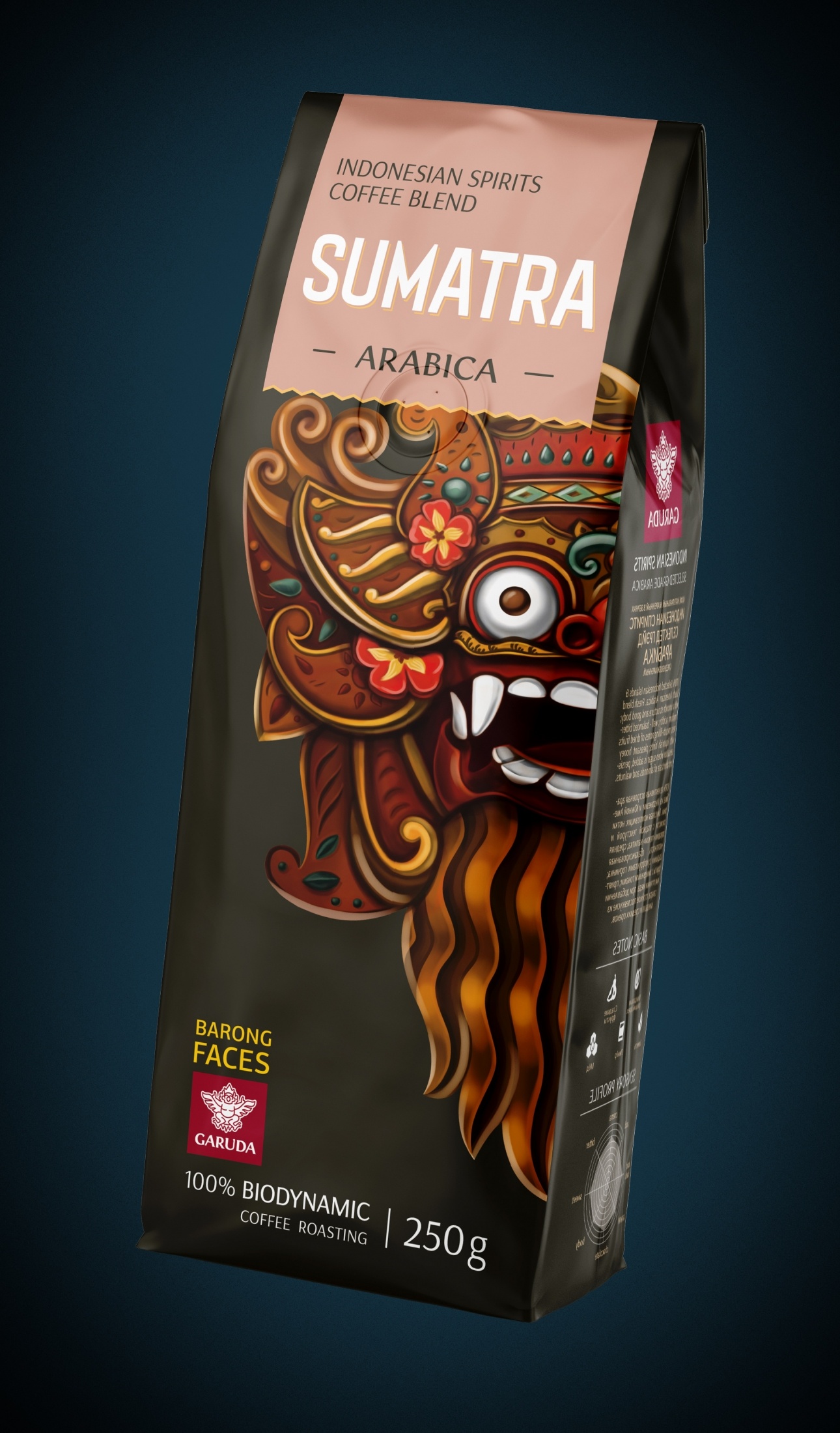
3. Garuda
Designed by Up Brands, a Russian studio based in Moscow, this coffee packaging built the brand on the impressive traditional masks of Indonesia, where the coffee sold comes from. Somewhat scary, this package is sure to attract a lot of attention in the store’s display.
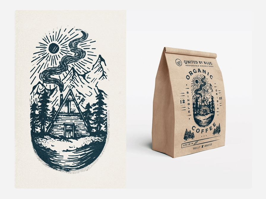
4. United By Blue
A friendly-looking project with little information about it, but such a great use of illustration that it had to be included in this post. It was designed by Lindsay Muir.
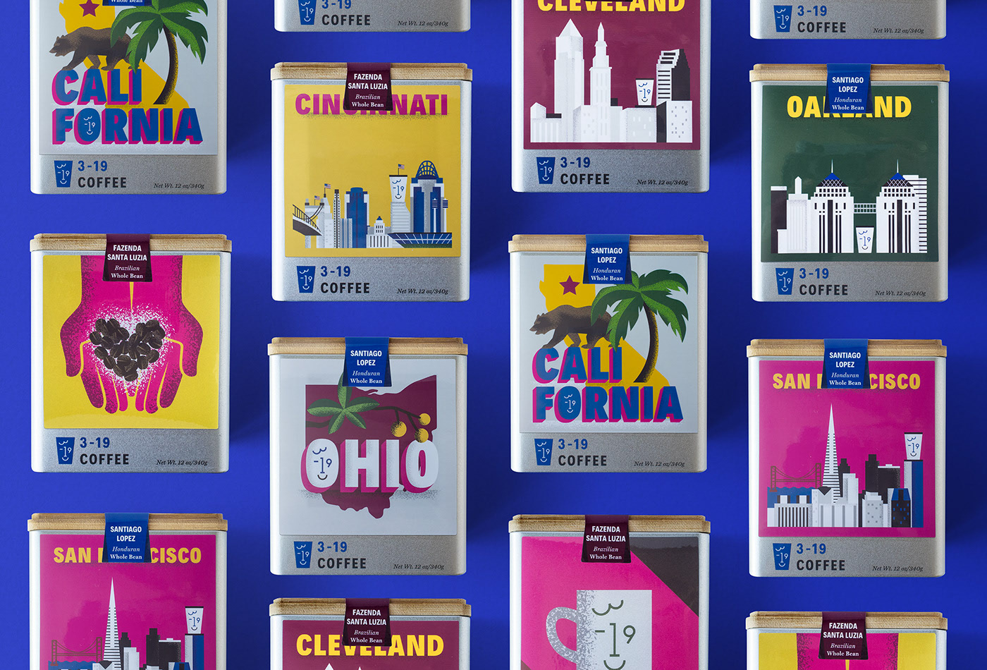
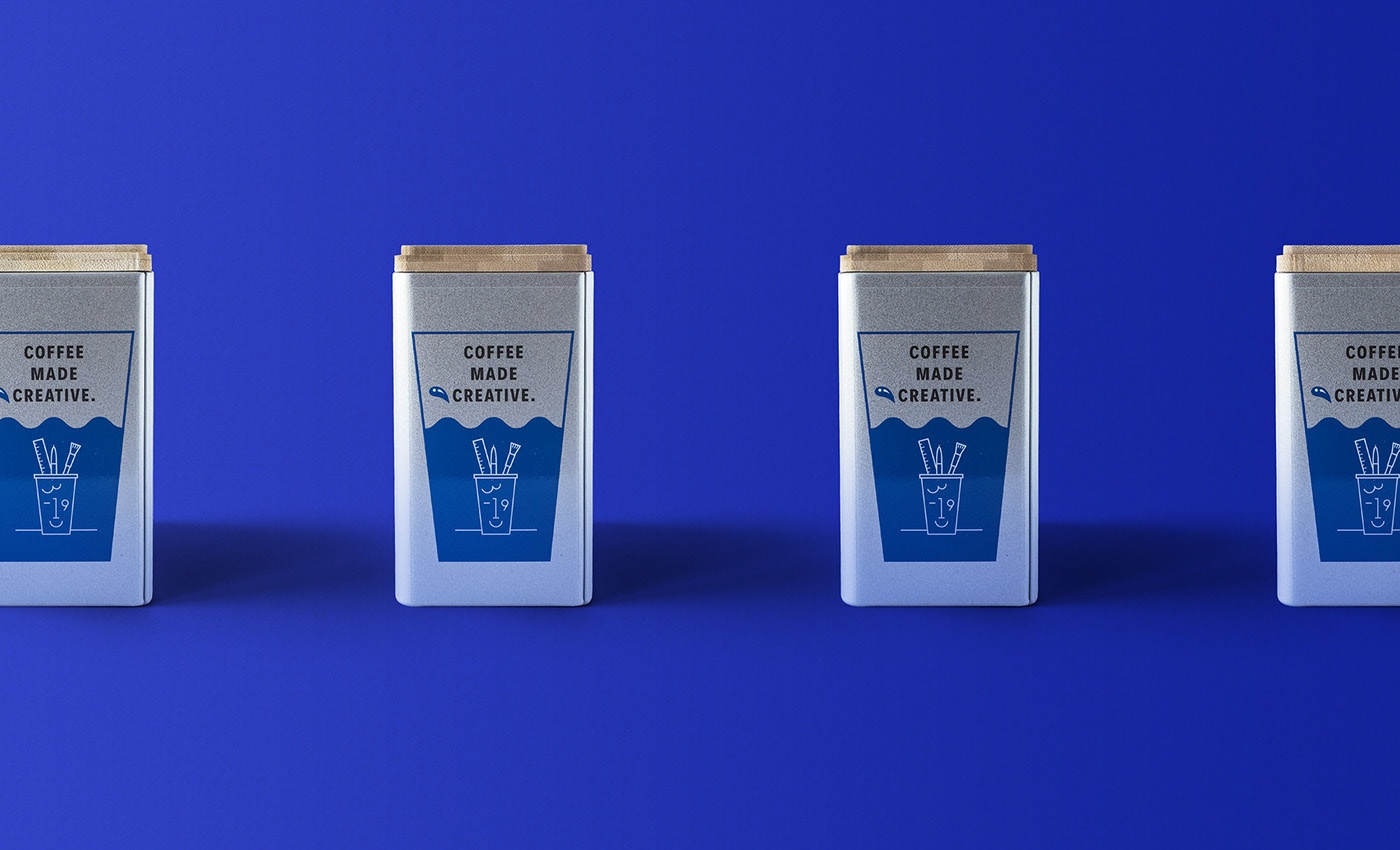
5. 3-19 Coffee
For a special coffee company that combines coffee, community, and art (3-19 Coffee), a special collaboration was necessary to create the perfect branding and packaging. This is what Outfit Branding and Public Marking Creative did together with this colorful visual identity. See more on this Behance page.
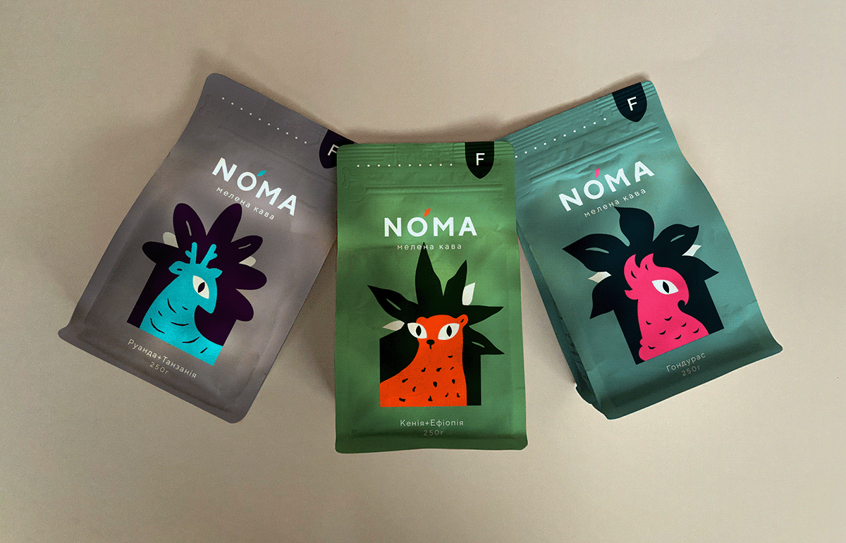
6. Noma Coffee Packaging
What happens when tropical animals and plants are featured together on coffee packages? Lovely coffee packaging happens! Unfortunately, this is only a design concept, but we thought the work of Nadiia Miller deserved a feature too. Check more on this Behance page.
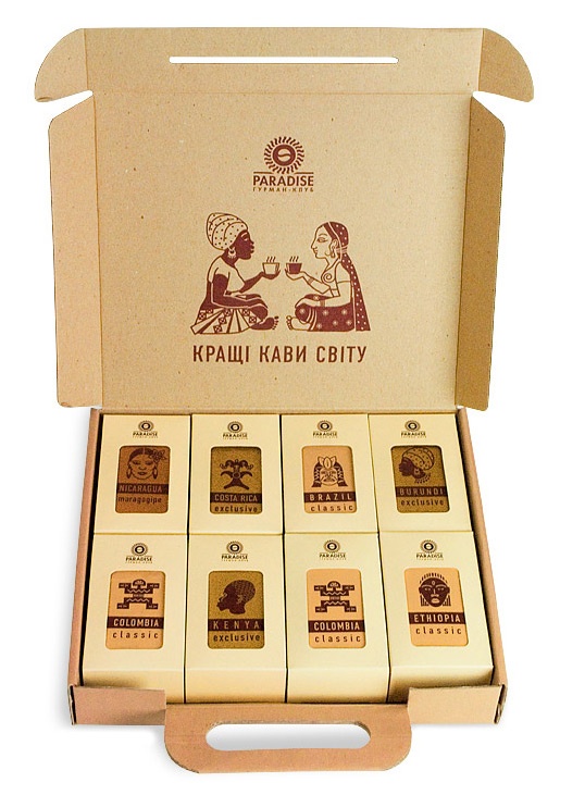
7. Paradise. Gourmet-Club Coffee
A special coffee packaging for a gift set designed by Artel Artyomovyh, a Ukrainian designer. The design was meant to symbolize a traveller’s suitcase and built for demonstration.
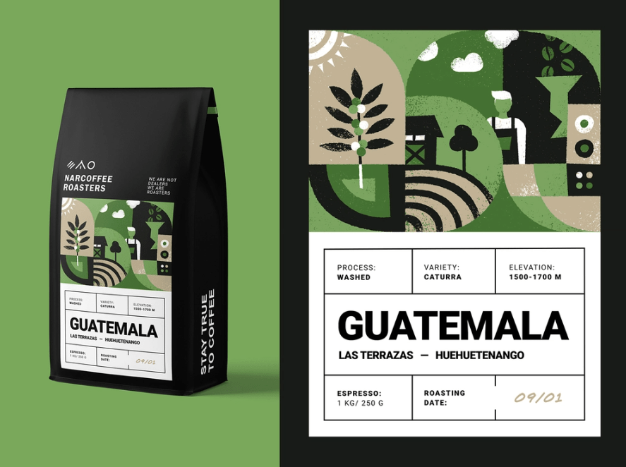
8. Narcoffee Roasters Packaging
The illustrated story of the brand is right on the package, with different colors for each coffee type’s location. A subtle design by Alexandra Necula.
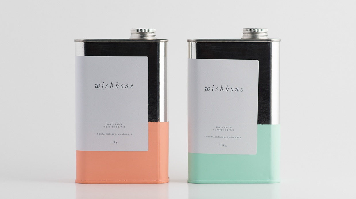
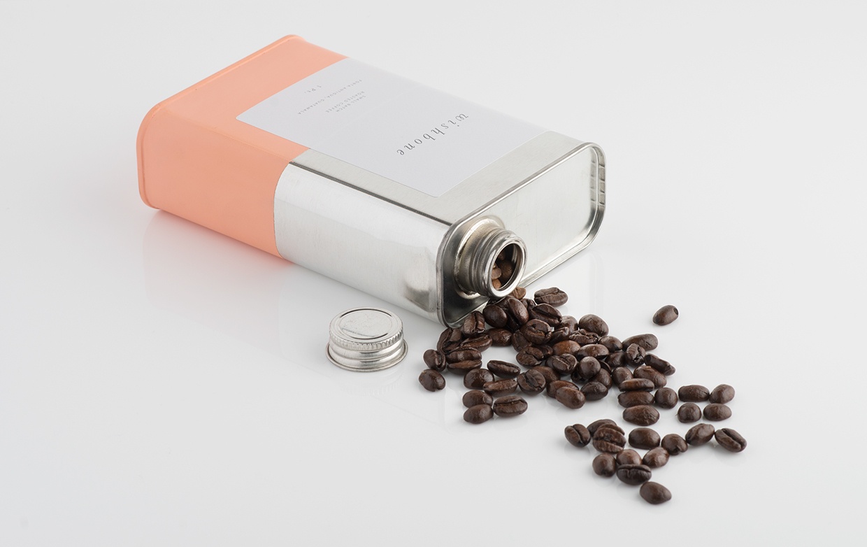
9. Wishbone Brew
An attempt at rethinking the coffee package design by Also Known As Studio. Honestly, unless told, we couldn’t have guessed it was coffee packaging, but still feature it for the creative effort.
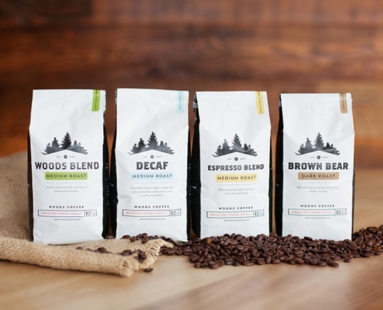
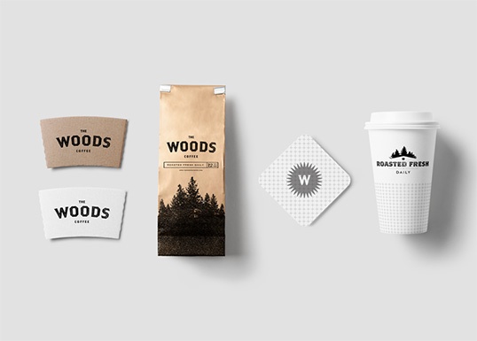
10. Woods Coffee Packaging
Nothing says camping and adventure like a pine forest and a hipster logo. The sparse use of color and wild minimalism does wonders for these packages of coffee for Woods, designed by Man Man Van.
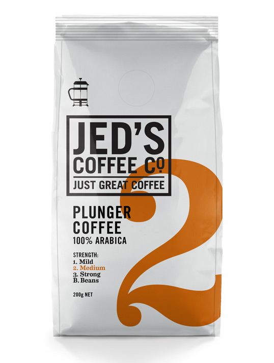
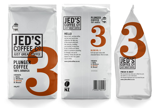
11. Jed’s Coffee Packaging
A real typographer’s coffee packaging, uses only typography, a bit of color, and one icon. Designed by Shine, a design studio based in New Zealand.
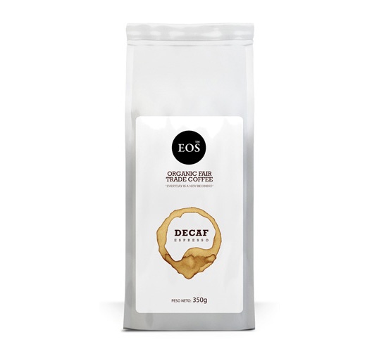
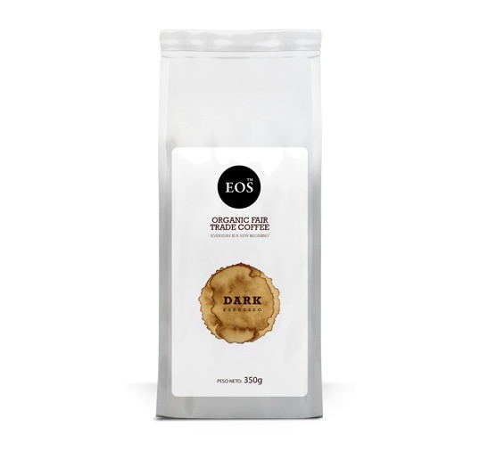
12. Eos Coffee
A coffee stain for coffee packaging may not look like a very innovative idea, but Noem9 Studio managed to give it a special twist by making it evolutive.
Conclusion
As you can see, diversity is there in the coffee packaging industry, with plenty of great graphic designers to compete with, and this is just a tiny glimpse of all the coffee packaging that there is out there.

