Big typography for web design has been very popular and trendy for a few years already. Its main advantage is the powerful impact it can have on the readers, and the efficiency in getting simple messages accross.
In this post we showcase some of the best examples of big typography in web design, an inspiration if you are thinking about creating your own.
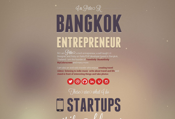
1. The Pete Design
Website – A multi-disciplinary designer that uses narrow headline fonts to shout important keywords to the readers.
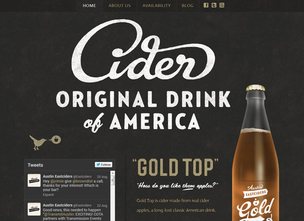
2. Austin East Ciders
Website – A gorgeous website that uses the style of its labels, rough script type, for beautiful titles on its front page.
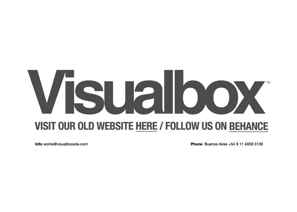
3. Visualbox
Website – A minimalist title for this website, with tight kerning and quick directions to important links.
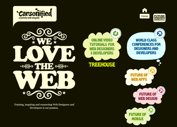
4. Carsonified
Website – Big rounded type for one of the most popular web design companies.
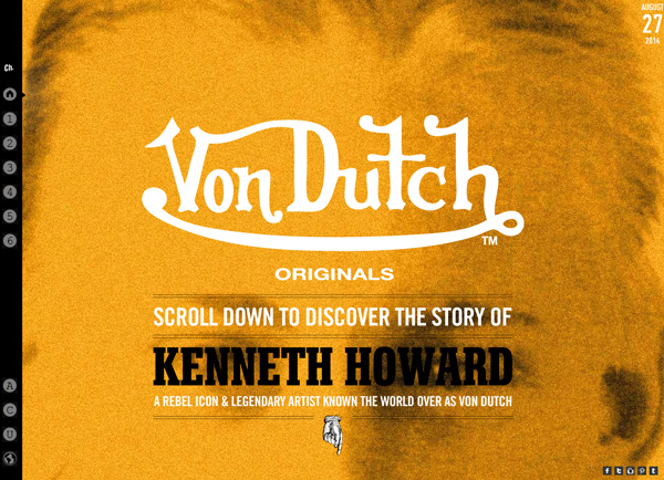
5. Von Dutch
Website – Big type and an animated scrolling, a gorgeous website.
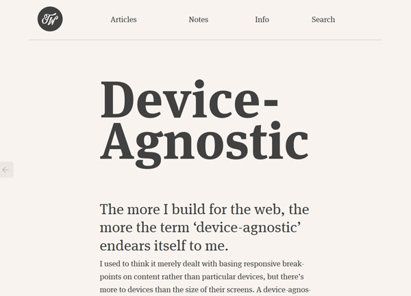
6. Trent Walton
Website – The web designer’s website uses huge type for titles, and big type for body text. An excellent idea that makes the site extremely readable.
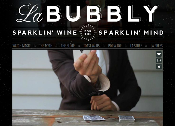
7. La Bubbly
Website – Beautiful and well-decorated typography for this website’s titles.
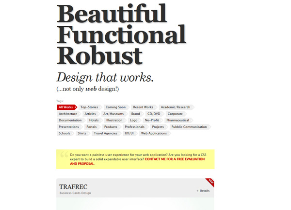
8. Lorenzo Ciglioni
Website – The key selling points of this designers are the first thing you will see, the second is a neat effect on scrolling.
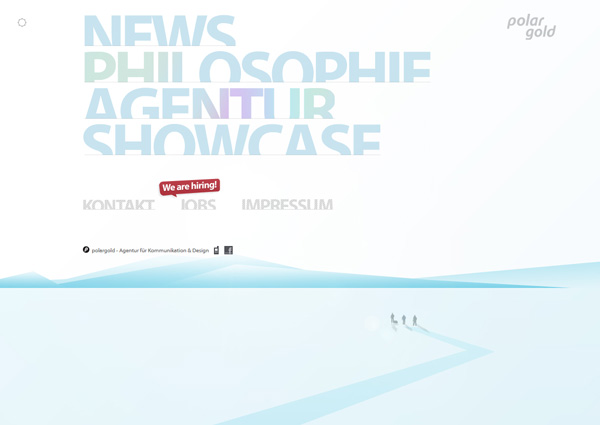
9. Polargold
Website – The big words have the lower part cutted, and a cool effect on hover.
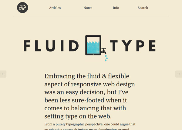
10. Fluid Type
Website – A beautiful layout for an article about fluid type in web design. Published on Trent Walton’s website (also featured above).
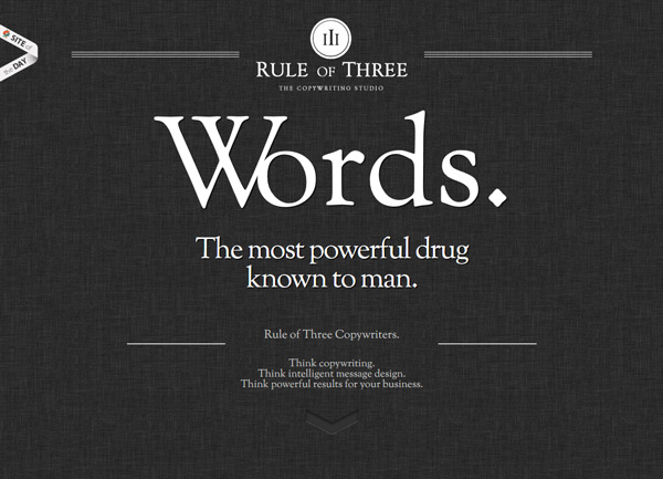
11. Rule of Three
Website – When you sell words, it’s good to make these words beautiful on your website. That’s exactly what Rule of Three did.
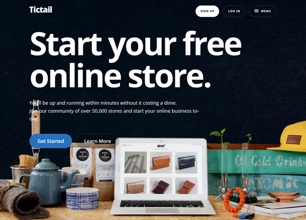
12. Tictail
Website – An online store creation tool that goes straight to the point on its website.
Did you use big typography on your website?
If you did, share your website in the comments, we’d be happy to check it out.

