Using animals can be a great way to add character to your logo designs. People will identify the company’s logo to the characteristics of the animal on the logo, a great way to transmit unspoken information.
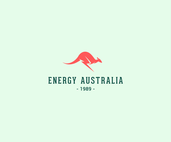
1. Energy Australia
How do you represent Australia and energy in the same logo? Easy. You take one of the country’s iconic animals and replace its legs with a lightening. The idea may sound obvious, but it’s very well executed by Shibu PG.
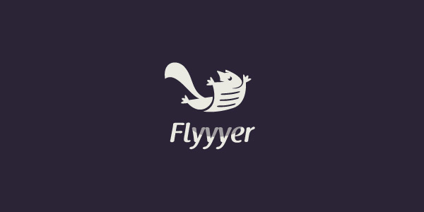
2. Flyyyer
When a squirrel meets a flyer, the result is pretty cool. Designed by Stevan Rodic.
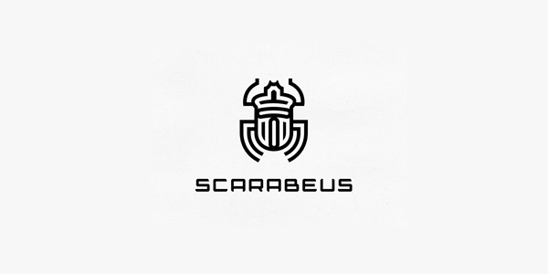
3. Scarabeus
Not the cutest animal, but definitely a cool logo for a web design agency. Unfortunately it wasn’t used.
4. North Inlet
A bit hipsterish, but this logo featuring a pelican still looks pretty cool. Designed by Jay Fletcher.
5. Brutal steakhouse
I think I’d be a bit scared to step in a steakhouse with that name and logo, but it looks very good nonetheless. Designed by George Bokhua.
6. Inkshares publishing
Octopus produce ink, which makes it the perfect animal to feature on a publishing company’s logo. Designed Kyle Anthony Miller.
7. Armourpark
Logo for a company doing autmobile protection, a rhino is the perfect illustration for that. Designed Eezo.
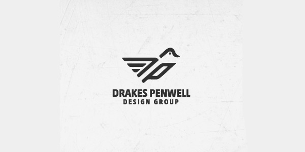
8. Drake Penwell design group
More stylized, bird meets a pen in this logo for a design company. Designed by Stevan Rodic.
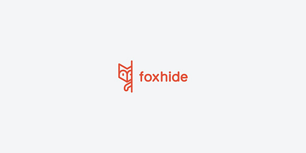
9. Foxhide
Not much information about this logo, but I like this stylized fox hiding behind whitespace.
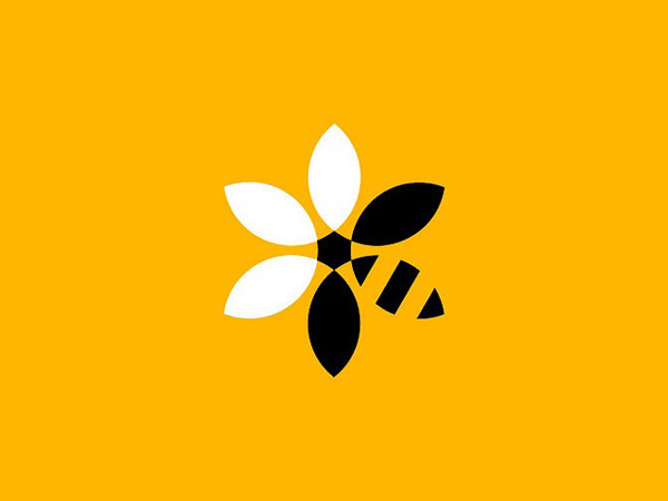
10. BeeBank development
“BeeBank Development” for Greenpeace. Designed by Studio Paradise, UK.
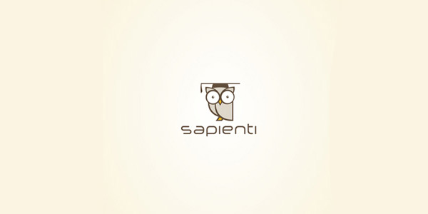
11. Sapienti
Not an angry bird, but a quite sever owl. Designed by Luis Adelino.
12. Kitchening
Another cute octopus logo. Designed by Stefano Slomma.
