Designing a great logo is good, it makes you little designer’s heart feel a bit warmer for a while. What’s even better is when you can extend your logo to be perfectly suited for every possible use, then you can talk about having done your graphic design work properly. In this post we’ll look at some logos that have been well adapted for other purposes.
1. PagePro
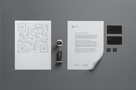
A beautiful typographic logo inspired by a sheet. The whole identity nicely integrates icons with subtelty.
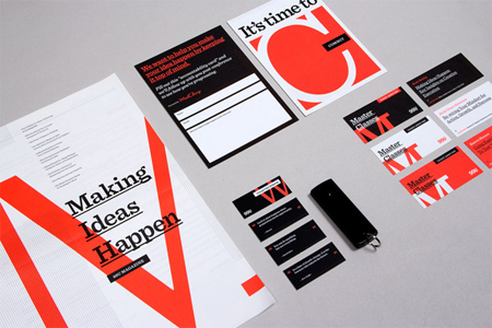
2. 99U Conference
The latest 99U Conference did an amazing job on its latest edition’s branding.
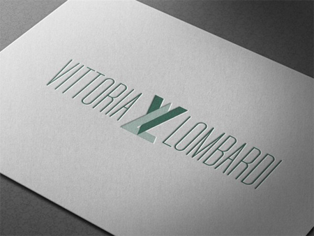
3. Vittoria Lombardi
A nice use of initials with the right choice of printing techniques, good job Vittoria Lombardi.
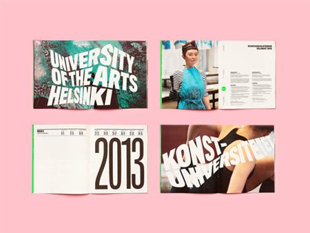
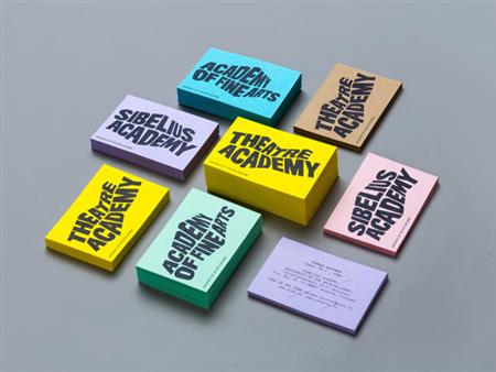
4. University of the Arts Helsinki
An amazing distorted logo that is changed for all departments and communication.
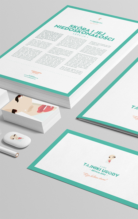
5. Beauty Secrets
Awesome illustrated branding for Tajniki Urody. The green frames work very well.
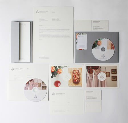
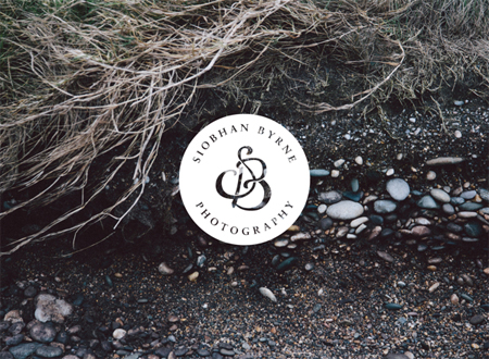
6. Syobhan Byrne
Elegant and classic, photographer Syobhn Byrne’s corporate identity works very well and allows for easy photography integration.
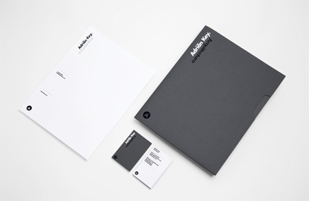
7. Adrian Key
Identity and Stationery design for an architecture firm based in San Pedro, an upscale district of Monterrey, Mexico.
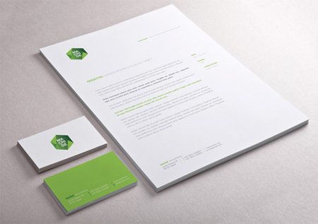
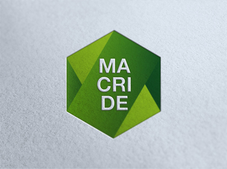
8. Macride
Macride is the acronym of Maurizio, Christian and Denise, three young students of advertising that you know during their courses ILAS of Naples and decide to work together. Their idea is to specialize in advertising for the launch of new products and activities.
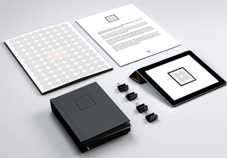
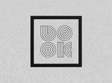
9. Book
A simple and geometric looking branding project that led to the development of the font Strabilio.
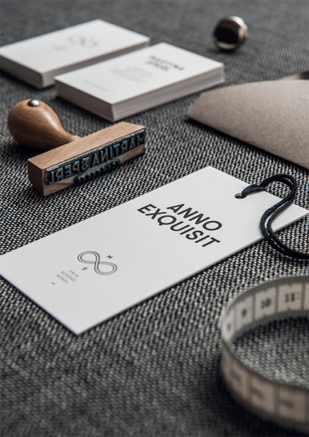
10. Martina Sperl
A great logo that works very well with a simple layout and a lot of white space. Excellent choice of type also.
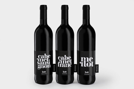
11. Pastor winery
Beautiful identity that works very well when the typographic style is adapted to wine labels.
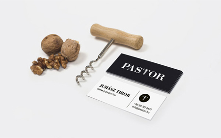
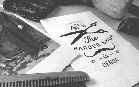
12. The Barber Shop
Old school branding for a barber shop.
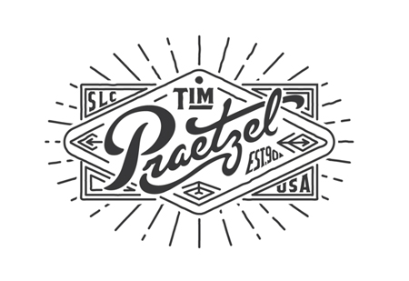
13. Tim Praetzel
Personal branding for Tim Praetzel, a graphic designer from Salt Lake City.
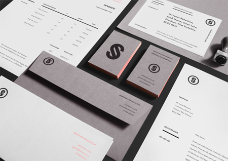
14. Jonathan Shackleton
Personal identity and self promotion consisting of a simple, structured logo and various design assets.
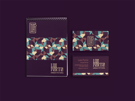
15. Lui Porto
A nice branding project for Lui Porto, an architecture studio.
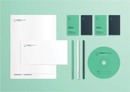
16. Mariam Abou Ouf
Branding with a nice color scheme for Mariam Abou Ouf, an Egyptian film director.
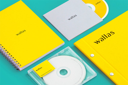
17. Wallas Inc.
A very simple corporate identity that matches yellow and white space perfectly.
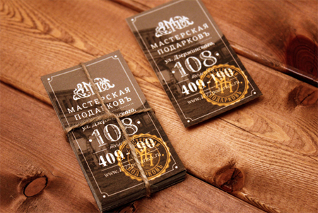
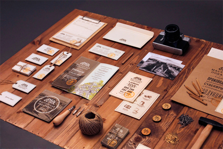
18. Gifts Workshop
A crafty identity that makes great use of typography.
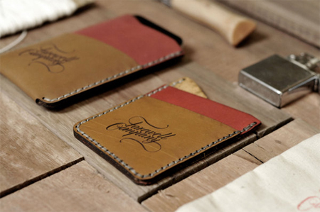
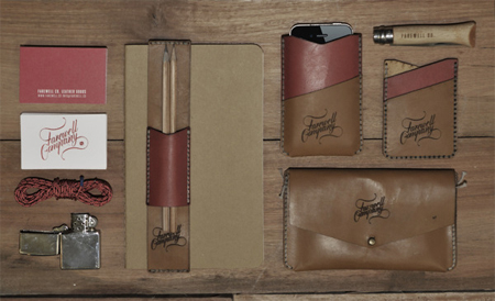
19. Farewell Co.
A corporate identity that makes splendid use of materials like wood or leather and matches it with a beautiful script font.
20. Batter Home Bakery
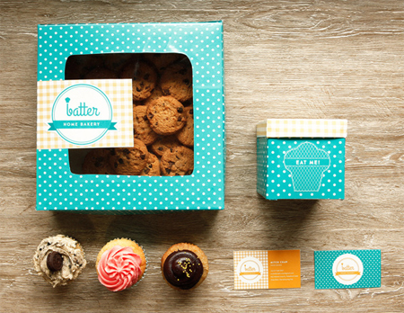
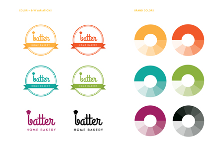
What happens when you take a well-designed logo and add a cool color scheme to it? It becomes a very cool corporate identity.
