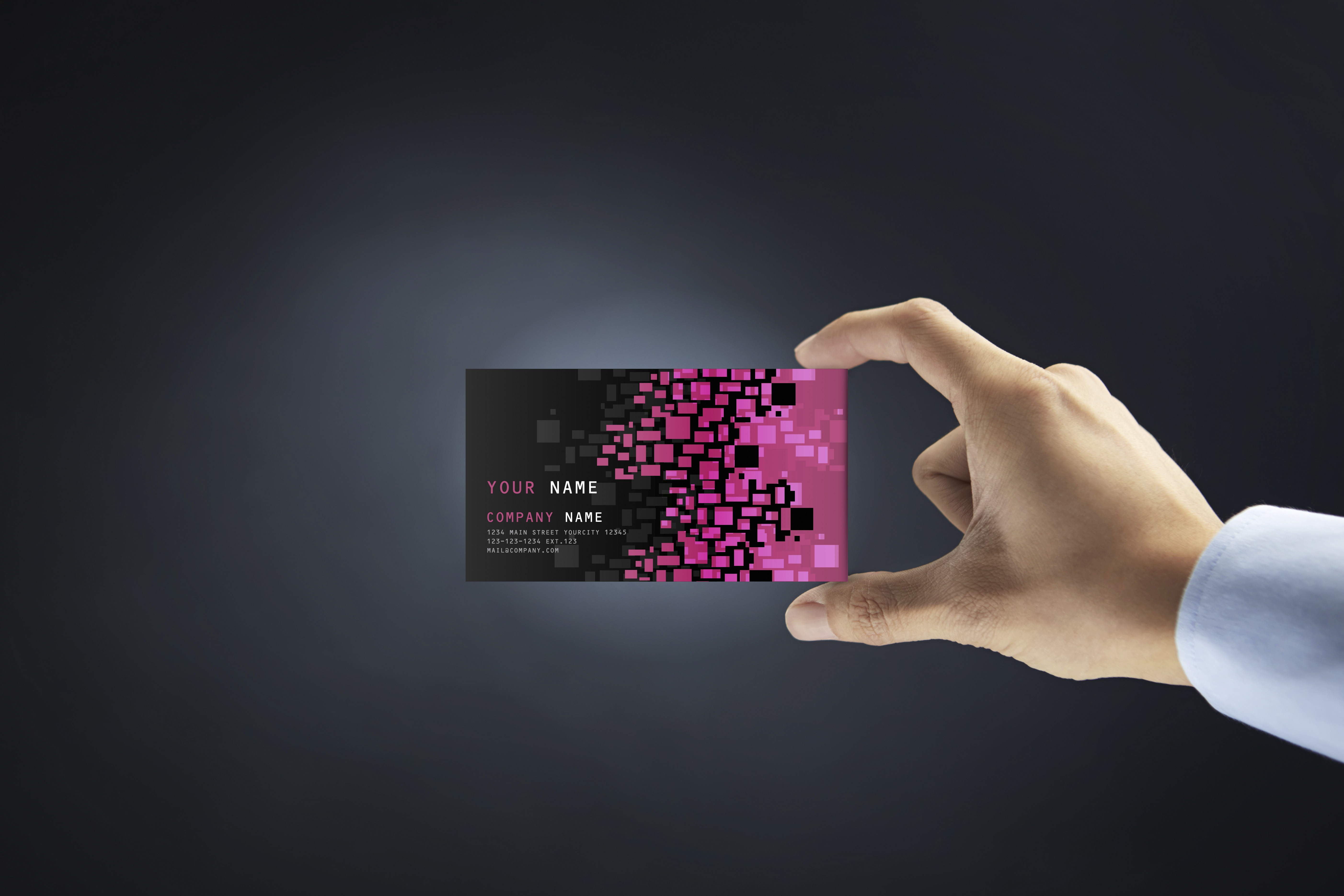
If you want to position your brand, it’s not just enough to make a good face to face impression. Make no mistake. I don’t mean that face to face impressions aren’t important. But you often have to follow them up with a business card. As a matter of fact, a business card sometimes doubles up as a first impression and also as a follow-up reminder as to why customers should pay attention to your brand in the first place.

The danger though is that with more and more businesses creating business cards, it has become a lot harder to stand out and that could lead to fewer eyeballs looking at your business card. To help solve the issue, I will walk you through 5 awesome tips to help you come up with a better business card design for your next card. By the end of this post, you will have a clear sense of what you need to do to create stunning business cards.
Sounds good?
Let’s begin.
5 Awesome Business Card Design Tips
Experiment with Your Colors
Yes, you want your business card to right off the bat define your value and differentiate you from your competitors, but you also want to appeal to your client’s emotions. And nothing appeals to people’s emotions better than color. I’ll admit there are two sides to this argument. Some people believe colors draw people and appeal to their emotions while others argue that if you use the wrong colors, you lose your audience before you even get a chance to sell them your ideas. The jury is still out on this one. But the truth is color impacts everyone.
So you will want to get a deeper understanding of color psychology so that you can use that knowledge to predict people’s responses. For example, psychology tells us that black is somber color and is often associated with death. So if you want to make an impression, then you might want to use black sparingly or completely forget about incorporating it into your business card design.
In contrast, white sends a different message altogether. It says elegance. It says sophistication and is often associated with high-end luxury brands. On the other end of the spectrum, pink comes across as being more feminine. It represents sweetness, love, warmth, and sexuality. So once a customer sees a pink shade, it tells them that they can get female apparel and female necessities.
Switch Up the Texture
The card’s texture is a priceless business card design asset. You know how people are said to be visually inclined to like something from the onset. Well, the same principle applies to texture. Only that with a textured card, you are engaging multiple senses.
This means that customers can create more memories with your brand and will, therefore, be more likely to give you a call or make an order.
The question is: How do you give the card texture? Simple: change the paper stock. Instead of using convectional paper stocks, look for a more modern paper stock with a unique feel to it. Something crisp and witty but still professional.
Another way to switch up the texture is to go for an entirely new manufacturing material. This gives you the chance to surprise your audience in a whole new way since no one will be expecting a card made out of cotton, leather, wood, crackers or chocolate.
Use Unique Shapes
You may not realize it, but shapes have quite an impact on our daily lives. I mean think about it. There are shapes everywhere. And just like colors, they have their own set of psychological associations. So for instance, when we come across the octagonal shape on the road, our first instinct is to stop while the cross symbol denotes first aid. Again, you will want to do a little research into the psychology behind shapes so that you influence the correct response. After all, you don’t want to send the wrong message, do you?
Enhance your Layout
I’d venture to say that the business card layout is the most important aspect of creating a stunning card. That’s a pretty big claim, right? But it makes perfect sense when you think about it. The whole point of creating a business card is so that people can read it. If customers cannot read what is on the business card, it’s a complete waste of time. So you will want to ensure that you leverage the power of readability by enhancing the layout.
Space It Out
Very closely tied to the layout is space. Just as with any other kind of design, spacing up elements on your business card unclutters the card and gives a little more breathing space to enhance readability. However, remember you also don’t want to put in too much white space and make it seem like elements are floating all over the place. You will need to ensure that there’s a balance to ensure cohesion.
Wrapping It Up
There you have it, folks! A comprehensive blog post on what you need to create stunning business cards. Of course, there’s a bazillion of other tips I could have included, but these are the most important yet. Be sure to leverage different colors and creative textures to come up with a better business card design for your card. Also, ensure that you enhance the layout and space out elements for maximum readability.
As always I hope that this information has been helpful.

