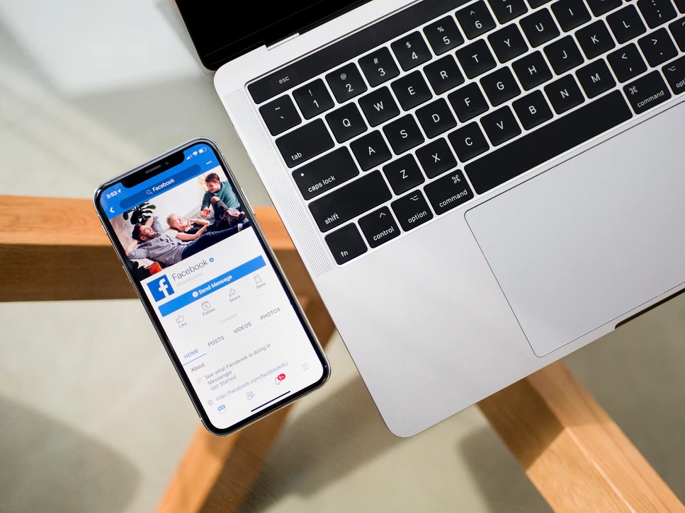
Modern businesses can’t afford to ignore Facebook. Over a quarter of the entire world’s population currently uses the platform, with an almost unimaginable degree of penetration in English-speaking Western countries.
Your Facebook page is the hub of your social media presence. It’s where users come to learn more about your company, consume content, and get in touch via messenger. A well-designed page is an effective tool for engaging leads and turning them into long-term, repeat customers.
In this post, we’re going to cover five practical, proven design tips that you can use to boost the quality of your Facebook page and ensure that it stands out in the crowd.
1. Use Appropriate Colors When Choosing Images
Advertisers and marketers have known for a long time that colors elicit different emotional responses. When you think about recognized brands and the feelings they evoke, it’s easy to see that color plays a significant experiential role.
Consider your response to the balanced, steady grey of the Wikipedia logo compared to the optimistic yellow of McDonald’s golden arches, for example. Yellow and orange tend to be seen as friendly and joyful, while red is energetic and strident. Medical and health companies often use blue to communicate stability. And grey is associated with balance and even-headedness.
Whenever you choose images for your Facebook posts, it’s a good idea to think about the psychological reaction that you would like your customers to feel. Keeping a color chart, which provides a quick overview of the “emotional schema” of widely-used palettes, close to hand when picking images will enable you to evaluate options quickly and pick the ones that are likely to have the intended effect.
2. Post Videos and Use Animated Features
Your Facebook page is, first and foremost, a tool for building engagement with your existing and potential customer base. And you achieve this by creating compelling, interesting content. Production of content, however, is costly. And premium-rate videos and images are beyond the budgets of most small and medium businesses.
That’s why it’s important to package existing content intelligently to make it as entertaining and attractive as possible. And there are various ways of doing this. One is to make use of Facebook’s native features, which include carousels, live-streaming, picture animations, “feeling posts” where you can express your mood, and more.
You can also use third-party tools to access even more content repackaging features, enabling you to push the quality of your posts above that of the competition. Slideshow makers with music features are excellent examples of this, allowing you to leverage templates to create engaging videos using your existing pictures and with very little production work on your part.
3. Choose an Eye-Catching Cover Image and Use Custom Menu Templates
Your cover image is the first thing that visitors to your Facebook will see, so it’s vital that it makes a positive impression. Think about the kind of message that you want to communicate to both new and existing followers. Also ensure that you use the right dimensions, so that your image doesn’t appear distorted and pixelated. Different devices and browsers often have their own way of rendering images, so this is also something you should account for.
Alongside your cover image, you have the option to include a special “page button”, like “Sign Up”, “Book Now”, “Contact Us”, and more, in the main header area. What’s more, you can access customizable templates for changing the navigation tabs just underneath. Make sure to configure these so it’s easy for customers to book an appointment, visit your site, learn about events, and so on.
4. Create a Pinned Post
All businesses can include a pinned post at the top of their page. This is an opportunity to introduce your company, give users an idea of what kind of content to expect, and direct them to your website or sign-up page.
From a design perspective, it’s a good idea to include a personal image, either of you or your team, alongside any text. In this way, users can form an emotional connection with your brand.
It can also be worth testing different variations of your pinned post with paid advertisements to see which connects best with your followers.
5. Allow Visitors to Message You
This is a straightforward but essential point. Ensure that you configure your page’s messaging options correctly. A “Send Message” link will appear in your sidebar, enabling visitors to contact you. It is usually also good practice to display an email address.
Conclusion
Running a business is hard work. And the events of the previous months and often-disastrous consequences of the COVID-19 pandemic haven’t made things any easier. Because of this, it’s vital that small and medium-sized enterprises take full advantage of all the lead-generation opportunities available to them.
Setting up and running an engaging Facebook business page isn’t difficult. And while it does require a little time to tweak the various elements and produce engaging content on a regular basis, the rewards far outweigh any time and cost inputs that are required.
Once you start to see the results of a well-thought-out business page design, you’ll wish that you had given this part of your online presence more attention sooner.

