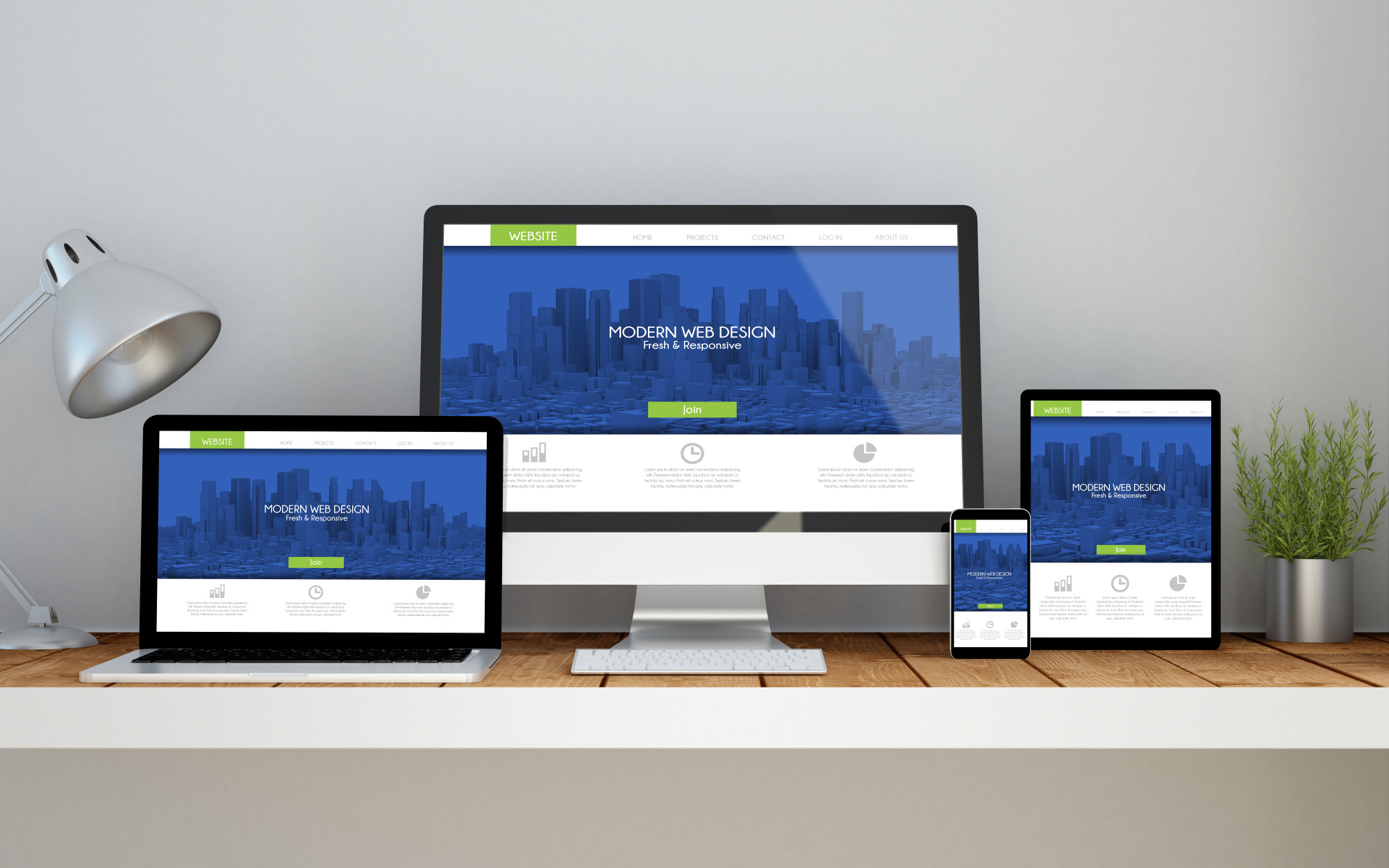
Need a new, higher converting landing page design? These landing pages already have it.
The landing page design you choose can increase conversion rates by 2.35% if you do it right. There are schools of thought that argue that landing pages don’t convert. This is only true if you don’t get the basics right.
Here, the focus is on the landing page design. Crafting a landing page that’ll convert isn’t as hard as it sounds. There’s no standard menu to creating a landing page that converts but a touch of creativity will work fine.
Here are some landing page design examples you can incorporate.
1. An-Eye Catching Headline
The headline is where everything starts. It captures the attention, creates interest, and influences the readers’ understanding. The heading will make your visitors stay and learn more about what you offer, or it’ll make them search elsewhere.
An excellent headline captures the attention of the reader and as well tells them what the service or product is about. It should be short, but also very captivating.
Some examples of companies that have created captivating headlines are:
- PictureMarketing- Capture Photos of Consumers ate Events
- Monsoon- We are Product People
- MailChimp- marketing Automation for Everyone
The headings for individual services can be more specific.
2. Pictures
Site visitors are now more inclined to visual marketing than marketing based on text. The images on your site will immediately affect the visitors’ decision about your product or service. As you select images for your landing page, go for large, high-quality ones that are relevant to what you’re offering. The primary purpose of the image should be to capture the attention of the visitor and demonstrate relevance. An example of excellent use of pictures is on Mixpanel and PictureU, where they grab attention and explain intention.
3. An Explanation
In addition to the headline, your landing page should explain what you’re offering. If the content doesn’t match the headline, you’ll lose your visitors. Keep in mind that
- You can integrate the explanation with the heading
- The functionality of the explanation should be tilted in favor of the reader
The images you use can help with your explanation. Examples of well-done explanations are on Asana’s product page.
4. Methods of Contact
If your business is legit, then you want customers to contact you. Make that clear on your landing page. The details should include several contact methods on your landing page. If possible popups where customer service representative extends help to customers. This is a strategy that many businesses are now adopting. Check examples at TasksEveryDay and ThirdLove.
5. Give a Guarantee
Guarantees are assurances that the services or products you offer will meet the needs of your customers. A guarantee improves the likelihood of conversion and hence take in mind that
- A warranty can take many forms
- Position the guarantee statement as close as possible to the call to action statement
Remember that you don’t need to delve into the legalities of the guarantee. Check examples at Help Scout.
Creating a landing page that converts is no rocket science. There is a myriad of ideas you can borrow to capture the interest of your site visitors. When you check across many websites that are doing well, their landing page design will capture your attention. Among the ideas to incorporate are short but precise headlines and an explanation of the business. Remember to use images to enhance the description. It’s also wise to let clients know how they can contact you. If you can give a guarantee for your products or service, you increase the chances of conversion. Be sure to share this post on social media if you like it.

