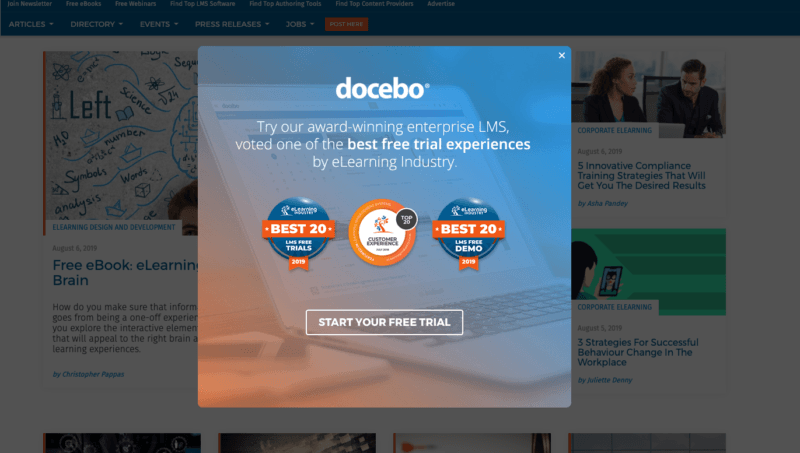
While you’re so engrossed in reading about the best practices for popup banner ads for your elearning business which are prevalent all over the internet, let me draw your attention towards something more important. And that is, how not all of these best practices work well for you and why you must give up the one-size-fits-all approach right now. Surprised much? Well, you must understand the fact that each elearning brand is unique, and so should your marketing strategies. That being said, read on to find out the 5 practices which might be killing your conversions.
Using bright colors draws users attention and generates clicks
You must have probably come across numerous articles online which state that you must always use bright colors when it comes to CTA of your popup banner ads. Like, green or orange which increases clicks and encourages action respectively. However, this approach does not always work and must not be aligned with every elearning business, as no two web pages are alike. As one elearning campaign of selling a new ebook may find that a red button beats a green button, there might be another of opting for a free course trial with blue button which beats the orange one. Hence, there is no color which will maximise conversions. Actually, it’s far more important to stick to your brand guidelines; hence, follow the same approach and use colors which resonate with your brand.
Use photos of people to boost banner performance
As it is said that you must use photos of actual people to boost banner performance, you must always bear in mind that while using the right photo can do wonders for you, opting for the wrong picture can definitely be a major turn off for your prospects. For instance, a consumer brand opting for this approach will definitely attract success while an elearning B2B company might not go down well with it. Hence, it is vital to understand the best practices and see whether they are relatable and relevant to your market and then opt for it.
Rely exclusively on CTR to measure your performance
You must have often heard that CTR is the only way to measure your performance but this isn’t the case every time. Every business has different marketing objectives hence, performance metric shall also differ. For elearning businesses whose marketing objective is branding and increasing awareness, CTR does not serve as a valuable tool at all. On the other hand, CTR is great for measuring traffic, but when it comes to measuring the amount of revenue generated, it is not an ideal solution. Hence, success should be measured on the basis of your campaign’s overall goal. So, don’t get caught up measuring clicks when you’re looking for sales.

Always show urgency when it comes to CTA
Any popup banner ad is incomplete without a compelling CTA, and it is wise to include one in each. Surely, there must be some sense of urgency in your CTA (examples include: ‘Download your free ebook today!’, ‘last few hours for the discounted price, hurry!’) as it will grab the audience’s attention even more and they will be enticed to take action. However, it is again true in the case of elearning businesses other than B2B companies, as a gentle and more subtle approach will work for them. Including CTAs like ‘learn more’, ‘sign up for a free trial’, and others alike are best suitable for their scenario. Hence, for elearning popup banners that convert, craft your CTAs keeping in mind your customer base.
Flash banners are more effective than static banners
Most marketers have reported that flash banners are more effective than static banners and the former continues to outperform the latter. This is based on the simple analysis that marketers use only CTR as a tool to measure campaign performance.
However, as already stated above, if conversion and revenue are your ultimate goal, CTR is not the way to go. Relying on it is completely pointless. Hence, you must always prioritise your marketing goals and test by different means to check if flash banners are actually more effective than static ads.

