Your client doesn’t know what he wants in terms of design, so you have a blank screen to work on. The whole point of an e-commerce site is to sell, so all your design decisions must focus on what works for the final customer. You know what works, but you have to explain your choice to the client who is only interested in sales figures.
1. Understand the Target Profile
This is the one area where your client knows more than you. Listen and listen hard. Ask questions about the age, gender, education, and motivations of the target customer. Then go away and do your own research. This will include mobile use and color/font preferences. Look at other sites that are competing with your client’s and see what works for them.
The font you choose and layout also play a large part in any decision to stay or click the ‘back’ button. First impressions count, and you have only a fraction of a second to convince a website user that the site is reputable and aimed at them. A Stamford study showed that people’s decisions regarding a site’s trustworthiness depend on visual cues like the header, rather than logical ones such as a good privacy policy or generous returns conditions.
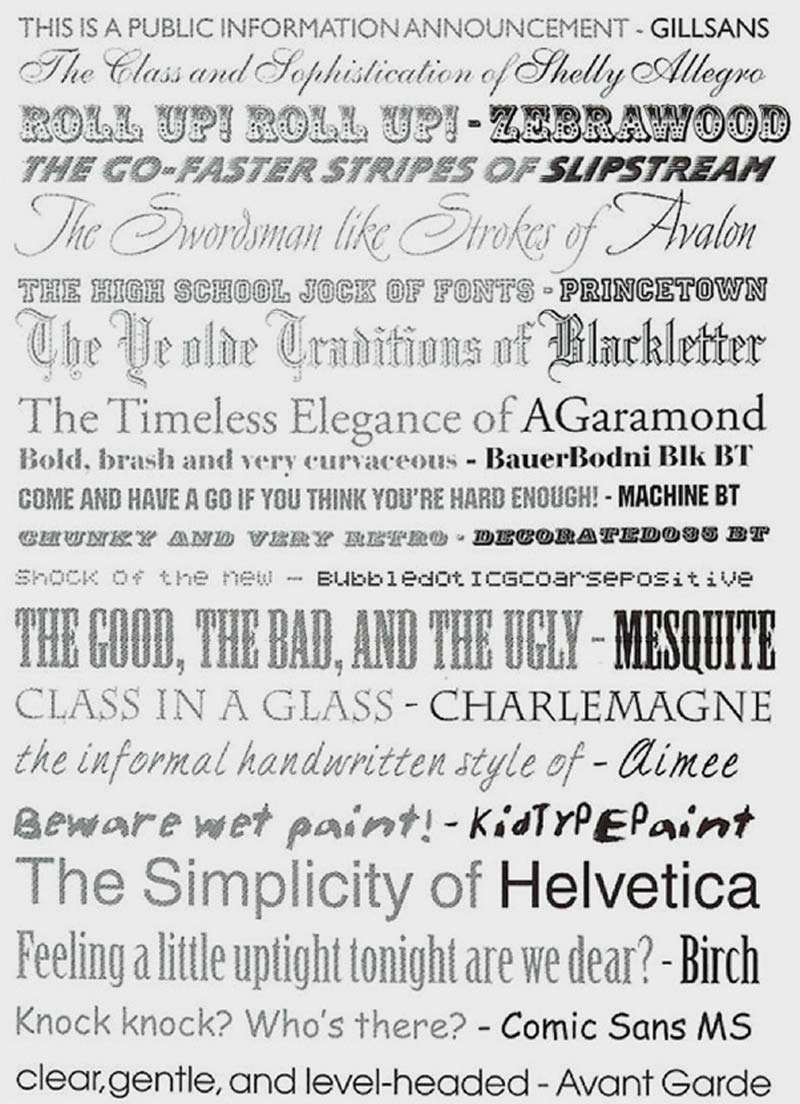
People read emotional meanings into fonts, and these are linked to the common usage types of each font. The image above from Graphic Design School by David Dabner illustrates this.
2. Understand What the Client Wants
Expand the brief to include the client’s expectations and preferences regarding layout, color, number of products to a page, product categories and total number of items. Failure to set down in black and white what the client expects can lead to your design being rejected and you not being paid for your time.
3. Choose a Theme
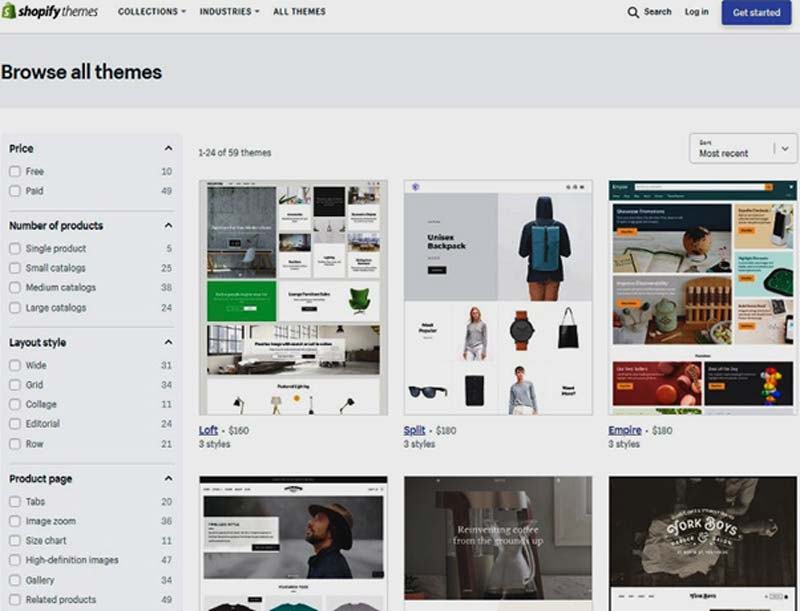
Just looking at Shopify themes, there are 59 themes to choose from. You can narrow your selection using the filters on the left of the screen, but you still have too many to choose from.
Start with this great guide on choosing an e-commerce store theme that will help you to narrow your choice down to one or two.
4. Choose a Layout
Most themes can be customized and come with two to four style options that allow you to change the layout. Use your brief to decide on the best option for the client’s customers, but be prepared to change the layout if the client demands you do so.
Mobile First Design Principles
Most users will be on small phone screens, so your design needs to work for them. Buy Now, and Navigation links should use large buttons, rather than text links.
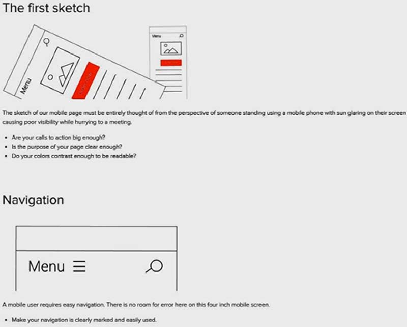
The screen shot above from Varvy illustrates a few mobile-first design principles, but the page itself is a prime example of how this design philosophy makes desktop users’ lives easier, too. There is lots of white space, fonts are large, and contrast is good, all of which benefit everyone, no matter what device they are using.
5. Choose a Color Scheme
This Designer Daily article explains the psychology of color in detail.
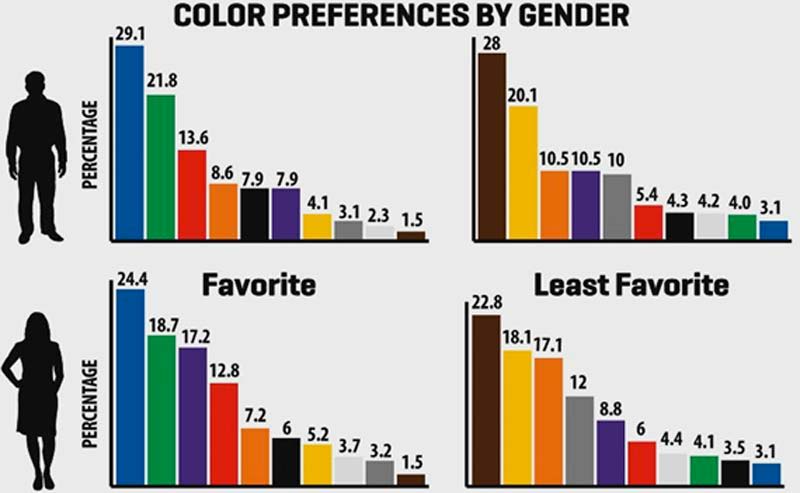
Color plays a large part in customers’ decisions to stay on a site, as this chart from HotDesign.com shows. It gives a clue as to why most websites use a blue design. Your color choices will be guided by the preferences of the target profile. Female users have a preference for more subtle shades as shown in the diagram below from Entrepreneur.com.
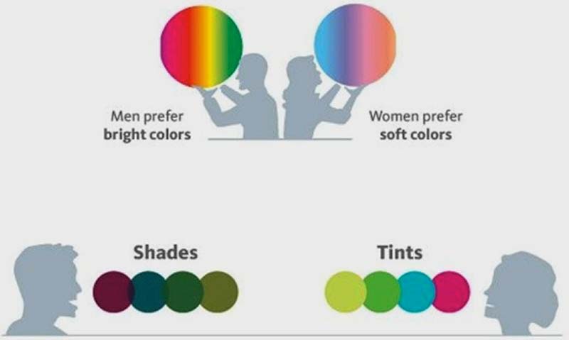
Build a unique color palette to suit your client’s customers using a tool such as the one from Paletton.com shown below.
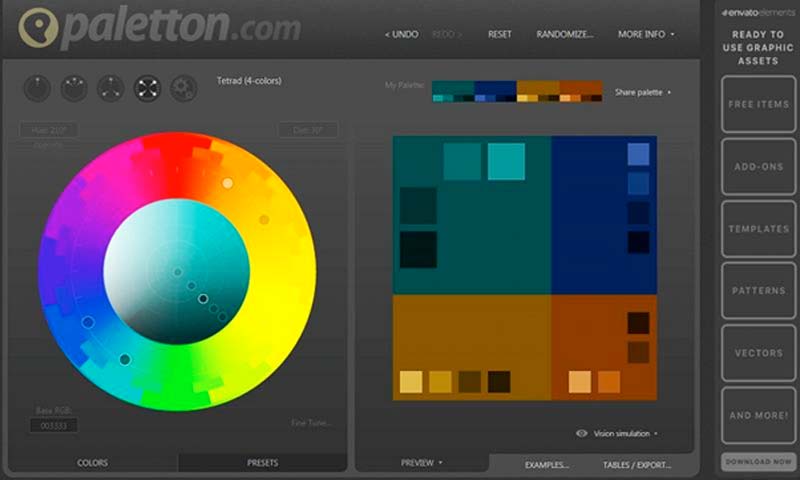
The Paletton tool allows you to choose different numbers and different color wheel relationships of colors.
In Brief
Avoid giving the client more than two options in your presentation. It is for you as the designer to decide on colors, layouts, and fonts, and to explain your choices to your client so he is happy enough to pay you. You have to justify your design decisions and relate them to your brief. Your final theme design may well differ from what the client was expecting, and he or she must be happy with that before you are paid.
Ultimately, it is your client who pays you, so you might have to compromise between what you think is the best design and what your client wants.

