Having a knock out site design is no longer enough to convert browsers into buyers. Your users must see your site as one in a thousand regarding quality, appearance, and usability. Conversions only happen if a site user is bowled over and knocked out by the page on their screen.
Wake Up Your Visitors
You need a telepathic connection with each guest. That’s not possible, but you can see what they are doing and interpolate their thinking and intentions from their actions.
Sometimes you can wake up someone who is browsing in an absentminded fashion with the right stimulus.
One of the best ways to wake up your visitors is to install OptinMonster.

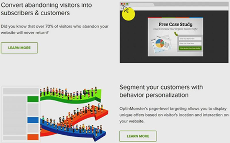
OptinMonster will help you send wake-up calls to everyone visiting your site. In addition to customer segmentation options and exit pop-ups, OptinMonster lets you convert any image into a two-step opt-in process, eliminating the need for a landing page. The software also includes A/B testing, floating bars that no-one can ignore and mobile-specific pop-ups, all of which add up to a complete marketing suite.
Wow Your Visitors
If your website is boring nobody will hate you, but nobody is going to love you either.
Even you cannot be all things to all people. Some people are going to hate you.
Bland is never going to win the conversion game. Be different, aim your website design at your target profile and people in your target group will love you. Those are the only ones who matter to your business, and the haters will fade into insignificance.
Consider using different fonts from the standard Arial, Times, Calibri and Verdana. Your audience might love your eccentricity. This Designer Daily article will give you a few ideas.
KISS
Clutter is bad news, even on a 28-inch monitor. On a phone or tablet screen, a cluttered web page is a disaster. It is hard to have too much negative space on a display because it helps the important things like CTA buttons to stand out. Use large buttons for all important links so that mobile users can click more easily.
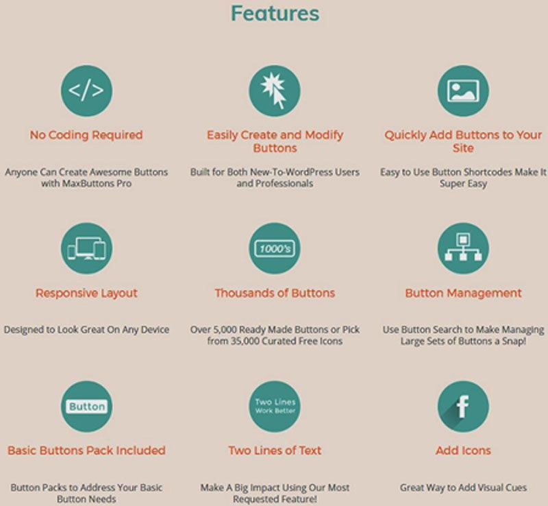
Make your buttons unique by downloading MaxButtons’ customizable web buttons collections.

Some of the MaxButtons collections are free, but the whole deal, including every collection, is a steal at $19.
One Action per Page
Avoid confusing visitors over what they should do. Each page should have one purpose in your sales process, and you must make it clear to visitors what you want them to do.
Some pages will have valuable content and others will have articles where you share your high-level expertise or your take on industry news. All will increase a reader’s confidence in your company. The desired user action on these pages might be to have them sign up as an email subscriber, which is a big step in the conversion process.
Worship Your Visitors
Your business exists to serve, and you had better remember that.
You need your visitors more than they need you.
Make guests feel important with photos of previous customers. You could link to your YouTube channel of former clients’ stories.
Use case studies (with pictures) to show how you have helped other customers and be sure to include testimonials.
Get Your Visitors to Worship You as a Hero
Every hero has personality, so include headshots and other photographs. You don’t need to bare it all, but bare enough that people can see you are a real person who has feelings and problems occasionally.
Mentioning your triumphs will help visitors see you as a hero, so don’t be shy about any awards you may have won or your membership of trade organizations. Include press mentions and any books that reference you and your work.
If you have published ebooks, then use their images to boost your credibility. If you have photos of you at industry events, either as a speaker or an attendee, then include them on your website.
If you don’t have photos, you can hire a headshot photographer like Hero Shot Photography,
who can take professional-looking headshots for you. Hero Shot Photography is Brisbane’s
best headshot photography studio. You can hire them if needed.
Spread Manna to Your Tribe
Mobilize your website to deliver solutions to your visitors. They will love you for it, but ordinary content won’t work. Only the best will do, so discard regular and even high-level content and replace it with sky-level writing and photos that wow.
Every word and image on your website must solve users’ problems.
Leaders have always used gifts and bribes to persuade people to join their tribes, and if presidents can do it, so can you.
Offer incentives for people to sign up to receive your emails, but also offer free downloads and giveaways as rewards for visiting your page.
The Short Version
No site will appeal to everyone, but make sure yours appeals to individuals who fit the target profile.
The best websites do not resemble text-rich throwbacks from the 1990s; rather, web users have learned to expect pages to react to their actions. They expect pages to do things, not just ‘sit there.’ Plugins that personalize the web experience like OptinMonster and MaxButtons are the only way to convert browsers into buyers.

