When designing websites, you should never lose sight of the ultimate goal of the website you are working on. This translates in conversion optimization, which is all the ways you can use to reach that goal
In this post, we share five simple ways that you can use to improve the conversion in your website designs.
1. Keep it simple
Yes, this seems obvious for a designer, but too often you are requested to add more and more information on your websites, which leads to a loss of efficiency for the website.
To keep things simple, your objectives should be very clear, and the information hierarchy should be easy to navigate by anyone. Make good use of white space to make call-to-action elements distinct and easy to find. You should also know that your website’s visitors don’t read your text unless absolutely necessary. Remove any unnecessary text and replace text with images or videos anywhere you can.
2. Use the right colors
As you know, color matters when it comes to web design. There is a whole psychology of color that you should know about, and you should understand which colors are commonly associated with what.
According to studies, the color of your website accounts for more than 60% of the first impression your visitors get from the site. It also matters greatly for brand recognition, obviously.
The color choices for your design should also include thinking about your audience’s age and cultural background, young people or older ones get different perceptions of the importance of color.
3. Test, Test, Test!
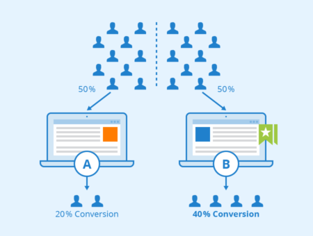
As a web designer, you are probably already familiar with A/B testing, but don’t always take the time to setup two pages to compare performances. This is usually the case because you lack the time, but it’s too bad, as A/B testing can truly increase your conversions drastically when done right.

If you are working in a highly competitive industry, for example if you build a casino website, testing is a must. It is also important that you do user testing to see how they react and if they are able to achieve tasks give to them on your website.
4. Keep It Real
As much as possible, you should use real pictures and texts on your website, or your users will feel like it’s fake. Stock photos can be ok to use sometimes, but you shouldn’t abuse the use of stock photography and go for real photos whenever possible.
Same obviously goes for text and illustrations, don’t lie to your visitors, it’s useless and deception will only bring trouble later on. On top of that, search engines are getting smarter everyday, and they may very well be able to tell fake texts from real ones some day.
5. Make it responsive
It should not be necessary to include this point, but your website should be mobile-friendly. Conversion should be optimized for every platform, and what works for desktop will not always work when browsing on a mobile phone or a tablet. Keep that in mind for all your websites and landing pages!

