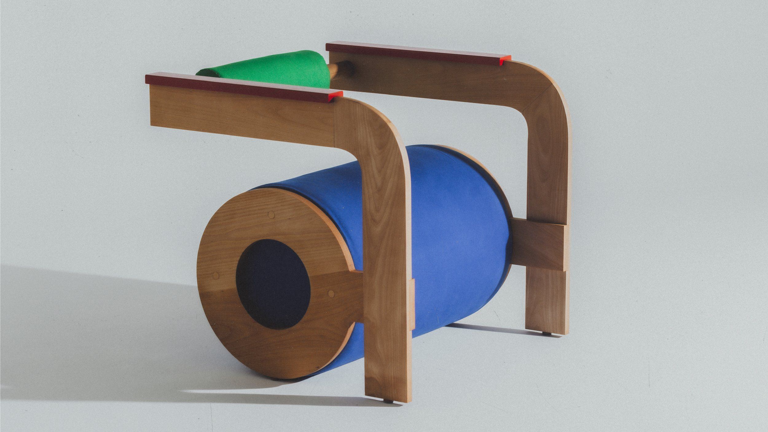
This sculptural chair is the result of a collaboration between Mexican industrial designer Rodrigo Méndez and Mexican art director Andrés Higueros.
The two designers teamed up to create a seat reminiscent of the first letter of our alphabet. And with good reason: the lower-case letter “a” was their inspiration for this creation.
Typography in 3 dimensions
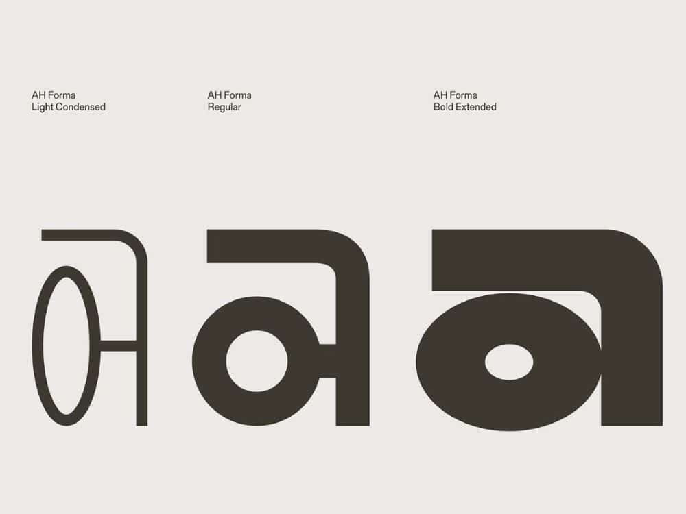
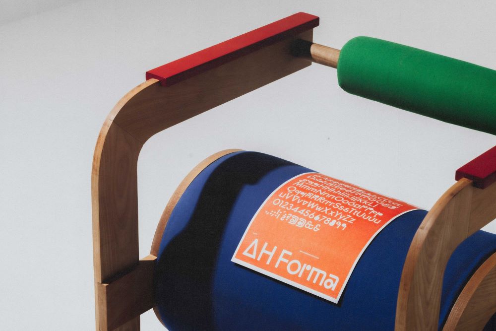
To design this chair, the two designers were inspired by the AH Forma font, and more specifically by the lowercase letter “a”. The idea was to move from two-dimensional typography to a three-dimensional, functional object: the chair.

The aim was also to show how variations in typeface according to context (bold, italic, etc.) can be transposed into everyday objects. The ORMA chair thus explores functionality through a single basic shape: the a.
The designers had fun proposing two models based on the same font. The “light” version of AH Forma becomes the ORMA chair light, a chair with slender, light lines. The “regular” style gives life to the ORMA chair regular, a comfortable piece with a balanced style. The designers did not propose a Bold version, but it would be easy to imagine a large chair in the “bold” style with thick lines.
A colorful and original seat
Created for Design Week Mexico 2024, the ORMA chair is intriguing. It resembles the letter from which it was inspired, offering the user the possibility of sitting on a letter of the alphabet. To add even more playfulness to the final piece, they played with colors. The ORMA regular version features primary colors in different places to emphasize the lines and shapes.

With its cylindrical shapes, this model also invites you to sit in different ways. It can be approached in two different directions, depending on the desired use. These chairs show how designers can play with furniture in the same way as they play with fonts in graphic design. It’s a new way of approaching typography, and a fusion of two design worlds: graphic design and furniture design.

