Editorial design is my favorite part of my work as a graphic designer. Laying out magazines and books is much more satisfying than it looks to the non-designer. In my opinion the harder part is probably the book cover. Unlike for magazine design, you don’t have a featured story to pick an image for, you have to take a key point out of the entire book and make it attractive. The book covers selected in this post did a great job in my opinion.
The Human Factor
A subtle and beautiful book cover with a clever illustration by Bill Bragg.

Great dictators
Part of a series on dictators, this cover with Chairman Mao on it makes perfect use of colors and layout. See the others here.

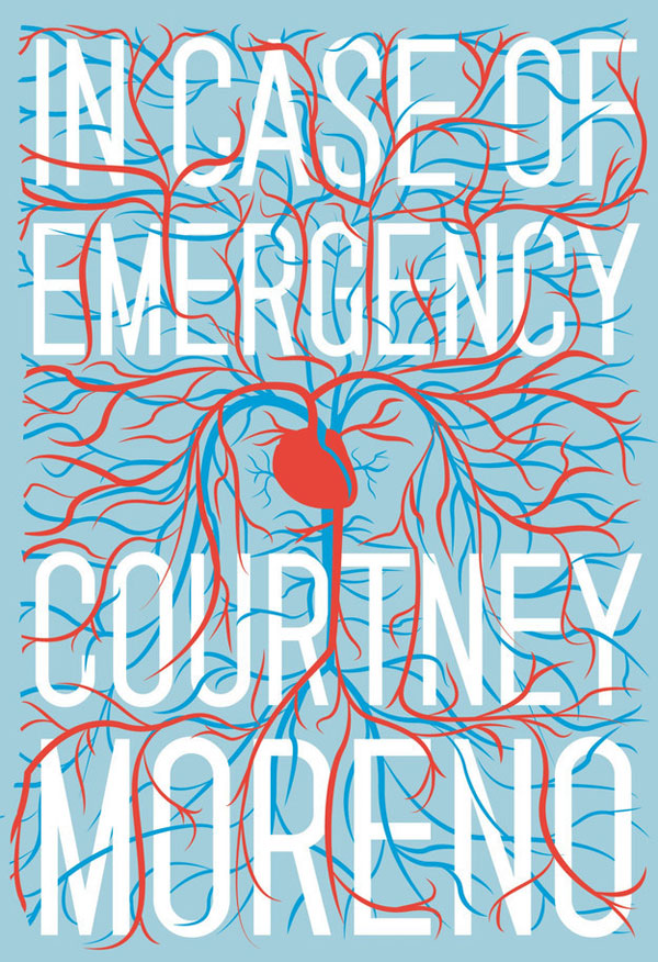
In Case of Emergency
Clever use of a heart, that symbolizes emergency in many ways, and great visual integration of the veins and vessels with the type. A gorgeous book that you can purchase here.
California
A simple book cover that works very well. The photo is displayed sideways and goes along with the title perfectly. This book was published by the Hachette Group.

You
This thriller has the perfect cover. Using watercolor, the look-and-feel of the title and decoration will make you think of blood. A minimalist way to get the reader involved, which is the least you could ask from a novel titled “You“.

The Martian
Another simple cover with beautiful photography and colors that give a beautiful and warm space atmosphere. Published by Penguin Random House.

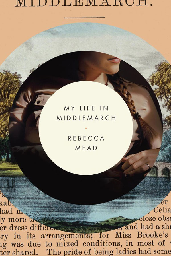
My Life in Middlemarch
A collage-style cover that gives some hints of what the book contains. Gives a good look-and-feel, thanks to a nice color selection and pictures that are just revealing enough.
1984
A minimalist typographic cover that keeps an eye on you. The whole play on the look with the number “9” is an excellent idea. A good concept by Adronauts Vienna.

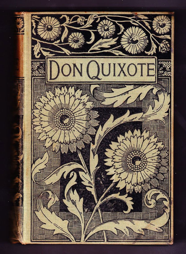
Don Quixote
To change a little, a gorgeous book cover from the past. This Don Quixote cover dates from 1605.
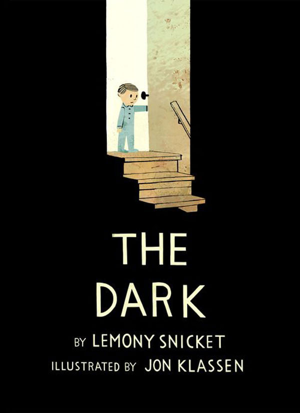
The Dark
Excellent use of white space (in black!) in this cover to show the dark. The illustrative style is perfect to subtly suggest our childhood fear. This is the kind of cover that makes you want to read the book.
Farenheit 451
A smart illustration for a powerful book cover.
