I remember one of my first classes in design school, when our teacher started to explain about the elements of graphic design: the dot, the line, and the surface. In this post we look at some logo design work created by graphic designers that thought that the line is enough.
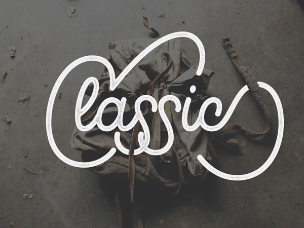
1. Classics
A beautiful logo with just a couple of lines, it’s also surprisingly readable. It was designed by Scott Smoker.
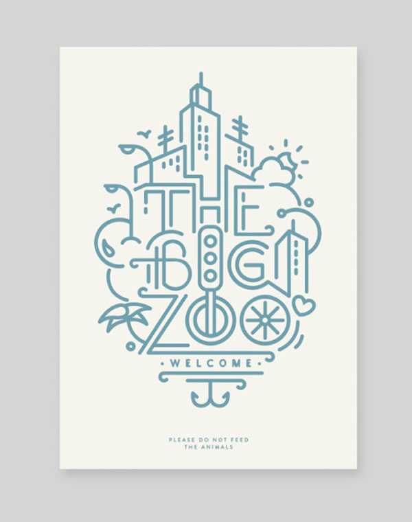
2. The Big Zoo
A bit difficult to read, but still a wonderful logo and illustration designed by Javi Bueno.
3. Lighting
An early logo idea for a New York lighting company by Matthew Gordils. A bit hipsterish, but very well executed.
4. Lei
Two lines only are needed for this cool personal branding for Lei Goldner.
5. AC
A simple but clever logo design with one line by Luis Dubon.
6. Finley & Alice
A gorgeous logo that looks like a tapissery by Lea Coubray.
7. Orient & Occident
Orient & Occident is an online store, they have a beautiful logo that mixes the initial letters of both words. It was designed by Port Clarendon.
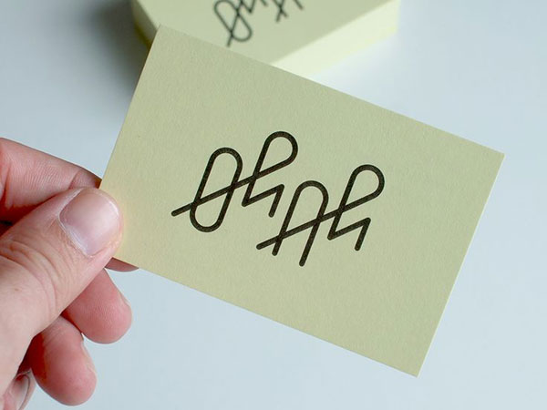
8. Oh+Ah
Simple, not so readable, but lovely logo by Timo Meyer.
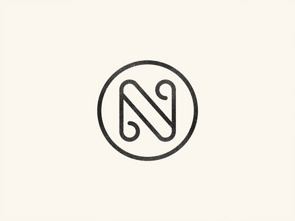
9. N monogram
A nice looking monogram featuring the letter “N”, early logo work by José on Dribbble.
10. Little Black Book
A brand identity project for London based Little Black Book – the online creative resource for the global advertising community.
