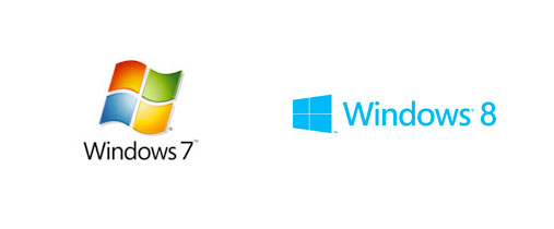
You probably have already seen the new Windows 8 logo by now. I did see it about a week ago, but didn’t publish an article because I thought it was a fake.
Now, it seems it’s not a fake, but part of Microsoft’s effort to implement it’s new Metro design language. I have mixed feelings about this. I have to say that I like the idea to make the Windows’ logo more minimalist and coherent (aka it looks like a window). The problem is that it seems poorly executed to me.


The thing that really bugs me is the windows icon, the perspective feels wrong and awkwardly placed next to the text. I don’t like the color too, but that’s just a matter of personal taste.
Another thing, is it just me or the Windows text is poorly kerned?
Anyway, if you are looking on more explanations on how this logo was created, you should read the official announcement on the Windows Steam Blog or Pentagram’s presentation of the new identity, make sure to watch the video of the logo in context, that’s certainly the most important use of the logo.
How about you? What do you think of this new Windows logo?

