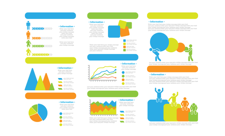
Information is powerful stuff — knowledge is power, a little information is a dangerous thing, and so forth. But most people find raw information rather bland and hard to remember. The birth of the infographic was an attempt to re-dress the cold data in a form that appealed to multiple parts of our brains — to make something both intellectually understandable and aesthetically memorable.
Creating an infographic, then, requires a unique blend of comprehension and artistic sense. You can’t create one if you don’t understand the information at hand. In addition, because the concept of infographics has skyrocketed in popularity, you have to step outside the box if you want your information to catch the eyes of bloggers and press.
Step 1: Build a Flowchart
The first step in designing an infographic is to get all of the information on paper in the simplest of visual forms: a flowchart or, if it’s more relevant, a mind map; words, arrows, and basic shapes indicating how you’re supposed to interact with each bit of information. Once your flowchart is complete, you’ll have a much more robust framework around which to build the graphic.
Step 2: Devise a Color Scheme
Before you begin drawing any graphics, you need to examine your flowchart and determine which items ought to be part of which ‘thought cluster’. Then assign a related color to each cluster. This will help guide the reader’s eye and brain toward which concepts are related and which are opposing or at least irrelevant. It’s important to keep the color scheme in keeping with the purpose of the infographic. For example, having sunny yellows and cheery greens on an infographic about human trafficking isn’t likely to convey the right attitude.
Step 3: Create the Graphics
There are two graphical elements in an infographic: the theme elements and the reference elements. Theme elements are defining visual aspects of the design, and should be directly relevant to the overall information the infographic wants to convey. Reference elements are smaller icons that go near individual bits of information to provide a visual context for that bit. They’re not ubiquitous, but most infographics that convey multiple dimensions of information should use reference elements for the reader’s ease.
There’s an entire school of thought that says one should use as many reference elements and as few words as possible to convey the information at hand. Either way, the graphics need to resonate with the demographic the infographic is intended for, as well as providing the visual clues necessary for readers to make rapid sense of the information.
If you’re not a great graphic designer, fear not! Consider utilizing stock images and filter by vector, which will enable you to manipulate the images to fit your data.
Step 4: Research and Data
Obviously, at this point, you know what you’re going to say and how you’re going to say it, but there’s one step that any good researcher will tell you has to be performed; verification. You have to establish that your numbers are accurate and come from an authoritative source, or multiple if you can.
Step 5: Synthesis
Now that you’ve prepared all of these elements individually, it’s time to bring them all together and create the actual infographic. In general, if your infographic represents a mind-map style spread of ideas, a concentric layout with the most important information in the center is best. If you’re comparing two different items, a simple left/right layout with the most important information at the top outer corners and working downward also works well.
If you have several groups you’re comparing, start each group at the top, arrange them in columns, and work down. Of course, a skilled designer can easily turn any of these on their heads. However, these layouts are intuitive to the human brain, conveying the information in a way that’s simple and easy to understand; the main goal of the infographer. For this reason, overturning them just for the sake of doing something different can be detrimental to the entire project.

