Hello, my name is Bram, a brand strategist, hacker and typophile. I’ll be guest blogging for Designer Daily during Mirko’s vacation week.
Consider this fact: today, we have more typefaces than ever designed, yet most designers chose to stick with their Helveticas, Gills and Caslons. This isn’t bad, per se; after all, going with the familiar guarantees predictable outcome. But with typography, the subtlest of choice can make a big difference—and sometimes, you want to add just enough character to the type, without making abrupt change.
In other words, if you know that you want something “along the lines of Garamond, but more contemporary/whimsical/serious/robust,” this guide is for you.
Stephen Coles write about alternatives to Gill Sans and Helvetica, and the latter received plenty of coverages, but what about alternative to well-but-less known typefaces, like Jenson, Bembo, Futura, Optima or Gotham?
This series will discuss just this, and we’re going to start with serif fonts.
Let’s get to it.
Jenson
Jenson is a Venetian or Humanist oldstyle, a style of serif that was a precursor to Garalde oldstyles like Garamond or Bembo, and was designed right around the turn of the Renaissance century (late 1400–early 1500.) Thanks to this, the font’s “scribal” quality is more evident, and its x-height relatively lower.
Alternatives
Eason
Eason, from Fountain Typefoundry. It retains some of Jenson’s characteristics, like slanted bar on ‘e,’ while normalizing some other, like italic and x-height. The result is a contemporary relative to Jenson that’s readable down to smaller sizes.
Vendetta
Vendetta, from Emigre. While this typeface may be inspired by Jenson’s model, it has a rougher, more pronounced stroke quality that’s reminiscent of Aldus
Centaur
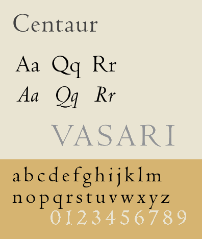
Centaur. Bruce Rogers designed this classic font in early 20th century to use as an ALL CAPS titling face. Centaur may look anemic on high resolution print and smaller sizes, but this means that its subtle details will shine when used in headlines, and it can stand on its own on a letterpress printer.
Garamond
The font we now call “Garamond,” like all classics, had been revived and reinterpreted so many times over the course of history—and even misattributed for a while, so while there are classics that could be used as fine substitutes to the face, like Bembo, Sabon or Jannon (if you like to be ironic,) I’ll focus instead of presenting modern alternatives to this face—all of which were cut by relatively young type designers not very long ago.
Alternatives
Maiola
Maiola, by Veronika Burian. Think of Maiola as Sabon’s postmodern cousin with more Eastern European touches. But its sharp strokes and strongly calligraphic italic mean that Maiola looks and reads more dynamically.
Fabiol
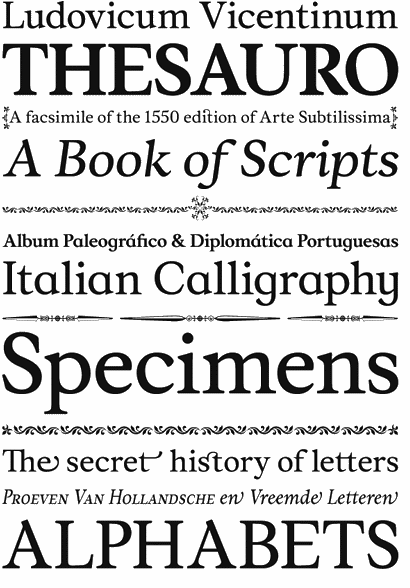
Fabiol, by Lazydogs Typefoundry. Fabiol’s model is much closer to Bembo, a typeface that borders the line between Jenson and Garamond, only with quirky details (like its italic ‘z’) and robust serifs that will make sure that the type will look good even when set small.
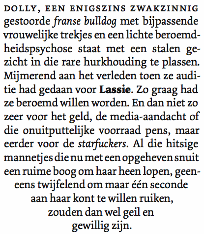
Dolly
Dolly, by Underware. Dolly reminds me of many serif fonts designed between 2006–08 (for example: ones that that MATD graduates made.) It’s softer, chunkier and is more suited to modern printing process (in most case, offset litho) that for reasons of economy are usually done faster and in lower quality. I find that you can set Dolly a full point smaller than most traditional Garalde fonts, on long text situations, while still retaining the same optical size and readability.
Times New Roman
It goes without saying: don’t use Times New Roman unless you really have to—and even then, don’t use Times New Roman. Try these typefaces first, and you may be surprised at the result.
Alternatives
Plantin
Plantin. Plantin was what Times New Roman was designed off of, so it’s no surprise that, while it retains the transitional characteristics that made Times New Roman Times New Roman, it’s also more classical than the latter.
Musee
Musee, by Dino dos Santos. Much like Eason was a modern interpretation of Jenson, Musee was one of Plantin. Its cursive may be whimsical and wide, but its upright italic actually makes your emphasized text stand out without calling attention too much onto itself.
Lido
Lido, by František Štorm. Lido is the closest typeface, both in spirit and form, to Times New Roman that I’ve seen. Not only was it modeled after TNR (it was originally designed as a minor modification of it,) it’s also free to download and use. Free as in “free beer.” There. I just gave you a reason to never use Times New Roman again.
Optima
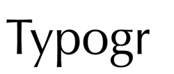
In my opinion, Optima is a typeface that sits right at the line between the display/text, linear/angular and serif/sans borders, and thus is rather hard to be used well.
Alternatives
Beorcana
Beorcana. Think of Beorcana as Optima with less rigidity and more: 1) classical serif touches (look at the ‘a’ glyph and heavier broad-nib pen influence on bolder wieghts) and 2) different optical sizes that will make the type unique at display sizes, and remain readable at micro sizes.
Hypatia Sans
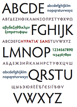
Hypatia Sans, by Thomas Phinney. If Beorcana is Optima with more serif, then Hypatia Sans is one with more sans. It may look like Gill Sans, Futura or even Scala Sans, but use it, and it will display its subtle line contrasts and “Greek”ness (as opposed to Optima’s “latin”ness.)
Neohellenic
Neohellenic, by Greek Font Society—while we’re on that subject. Sure, Neohellenic is even closer to Gill Sans, Futura and Scala Sans than Hypatia Sans was, but its capital forms and scales are more than enough to demonstrate that this typeface is based off the same model. The inclusion of little serifs along the edges actually help make the text read better. And better yet, it’s downloadable for free.
Next Up: Alternative To Your Favorite Sans Typefaces
Do you have a sans serif that you’d like me to suggest an alternative to, or a serif that you’d like to see featured on the next round of article?

