Businesses compete for consumers’ attention everywhere they go. From bus stop advertisements to laptop stickers, it’s all about being seen – getting noticed. Keeping the viewer’s attention is just as vital, if not more difficult. These elements are as important for websites as they are for advertisements, and you can achieve both with movement.
Many improvements and disruptive breakthroughs have occurred in website design. Web animations are being used by web designers to provide life and motion to static website layouts. Websites with animations are an important component of visual storytelling. Check out these nine examples of websites that have mastered the art of animation by using complex design effects. The main purpose of using animation is to improve usability.
Simple animations may be excellent guiding aids for helping visitors understand which buttons to click or where to go next on a website’s map. This article discusses the many forms of online animation that may improve the effectiveness of a website, as well as the best practices for implementing each.
Welcoming Animations
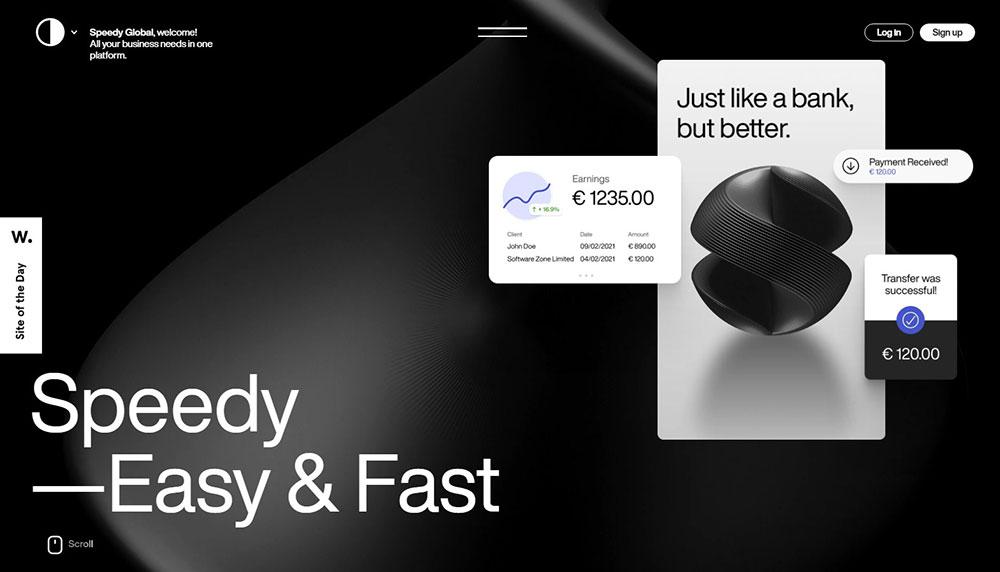
The initial user’s impression of a website is critical since it almost quickly builds a brand image. As a result, it is recommended to employ thrilling greeting animation to attract users and pique their interest in a business from the start.
Onboarding user animations are another name for them. This animation method is often used to greet website visitors and artistically introduce a business to a target demographic. This approach entertains users and encourages them to return to your brand’s product or service.
Loading Animations
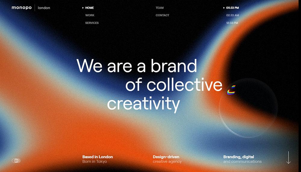
Even brief loading animations offer a touch of sophistication or at the very least amusement during the downtime. Loading animations are popular in flat design, minimalism, portfolios, and one-page websites, which are all fundamentally basic.
Keep in mind that loading animations work best when they are basic. Forget unnecessary elements such as sound and extravagant designs. The personality of the site, whether playful and cartoony or professional and exquisite, should be reflected in the animations.
Hover
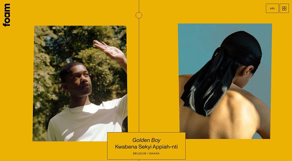
Hover animations are quite useful for expressing the fact that an element is interactive. In certain situations, this may be the sole indication that a button or piece of text may be clicked. When a user is unsure about how an element works, they prefer to move the mouse over it anyhow, thus hover animations are very straightforward.
Navigation
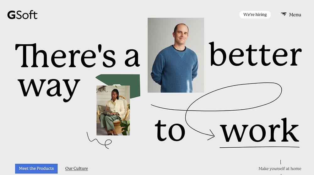
One of the most popular animations on websites is navigation. Hidden navigation is particularly popular today since it provides a more seamless user experience. To go to the next step, simply click on the symbol. This approach is used by designers to conserve extra whitespace on the screen. Website navigation animations are intended to maintain the user’s attention on the primary section of a website.
Dynamic Backgrounds
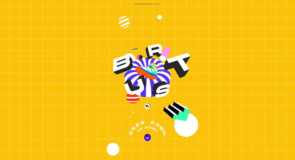
A nicely animated backdrop can help your website stand out from the crowd, however, the same rule applies here as it does with loading animations. CSS background animations should supplement your site’s current content rather than serving as the main entrée, which means treading a fine line between intriguing content and distracting material.
As is frequently the case, simplicity is essential in this situation. The most important consideration is that animations do not obscure the content of your website.
SVG Animation
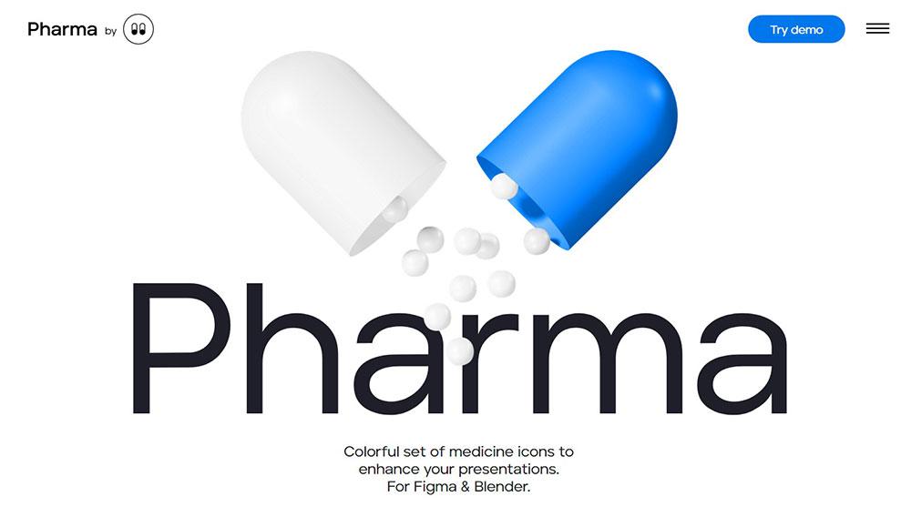
Some website owners utilize SVG to create animations. These may be used to scale tiny elements and ensure that they operate properly on all devices.
Logo animations
While the majority of the logo remains static, this is not required. The transition is certain to pique the interest of users, so have a look at what alteration is taking place in the logo and see the ultimate results. In such a scenario, it is critical that the change not persist too long.
Scrolling Animations
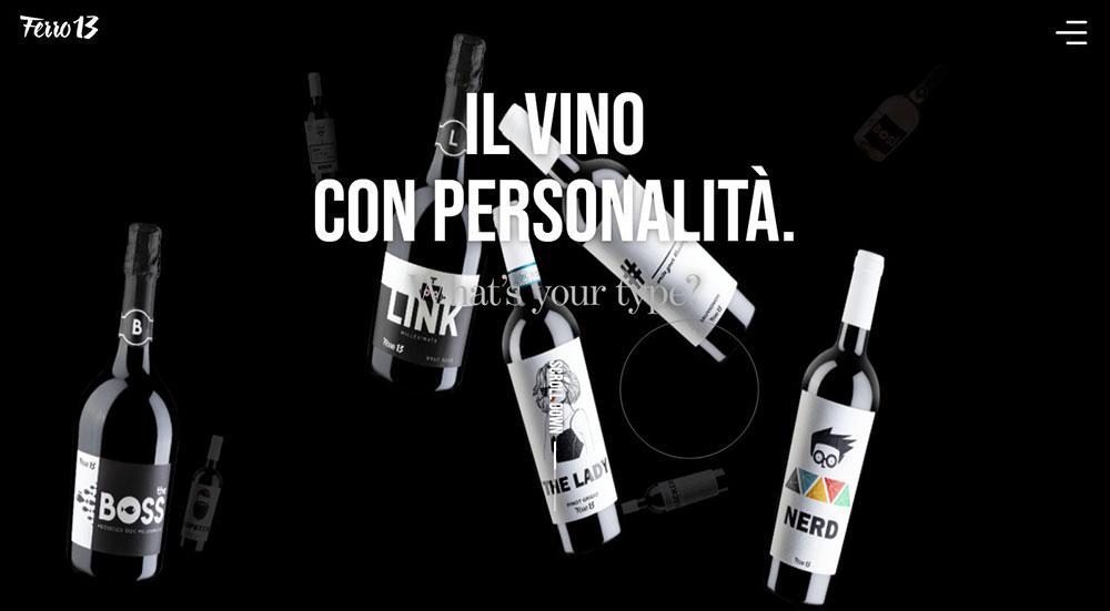
Scrolling animations have been included on nearly every page on the internet, and they are almost too common. But it doesn’t mean you shouldn’t use this fantastic feature in your web design. Think beyond the box and incorporate components that move gradually with the scroll if you wish to use this motion.
Whole Page Motion
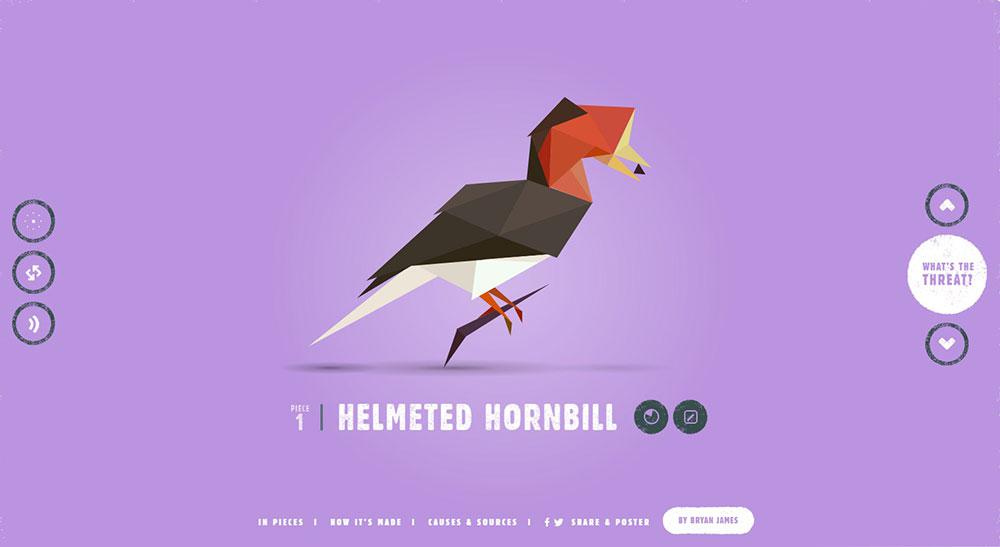
The majority of modern animation philosophies in web design tend toward realistic animation. They argue that the ideal approach to employ animation is to improve the user experience and make site navigation more straightforward.
More elaborate animations, on the other hand, may help your app or site stand out from the crowd, and sites that employ entire page animation are a fantastic alternative if you want something aesthetically stunning.
Image Gallery Animations
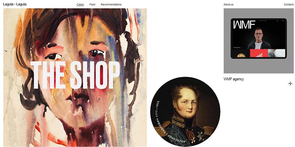
Users appreciate seeing an image gallery on a website’s front page without having to navigate any farther. This is an excellent usage of animation to draw the attention of visitors to your items. This works best for an architect’s website or on architect WordPress themes.
Elevation for Mobile
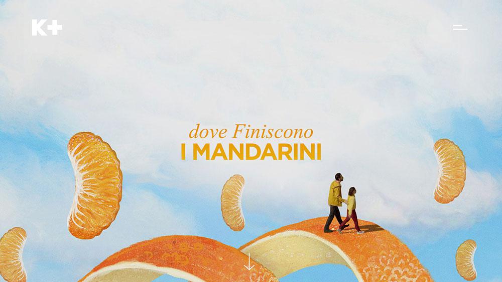
The hover option is not available to users on mobile devices. As a result, in such instances, interactive components must indicate what they do before the users tap on them. This aids in providing immediate feedback following the encounter.
Progression
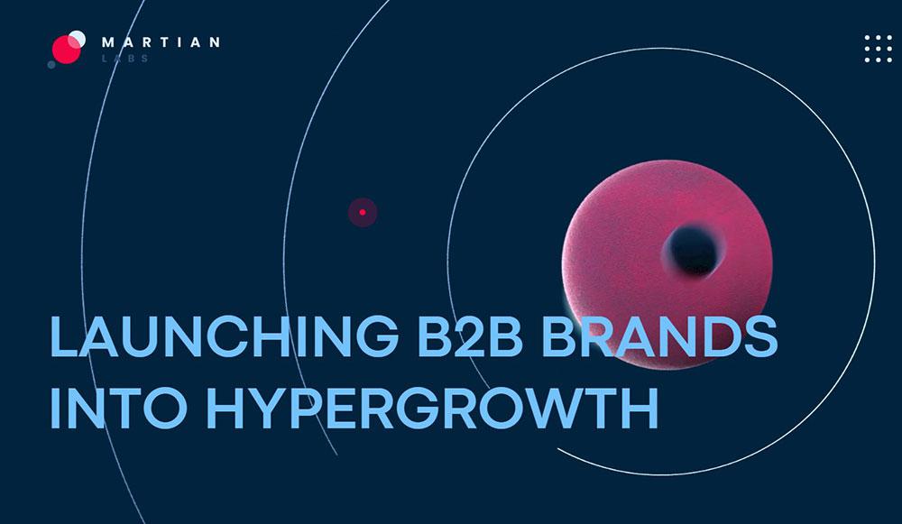
Some users may find the loading time to be inconvenient. It is not always viable to minimize it because it may severely limit your website design options.
To address this issue, a website designer might employ progression animations. It is an excellent approach for removing bad user experiences caused by lengthy loading times. When information is being loaded, progression animations delight the user. It contributes to the perception that the waiting time is shorter.
Flowchart Animations
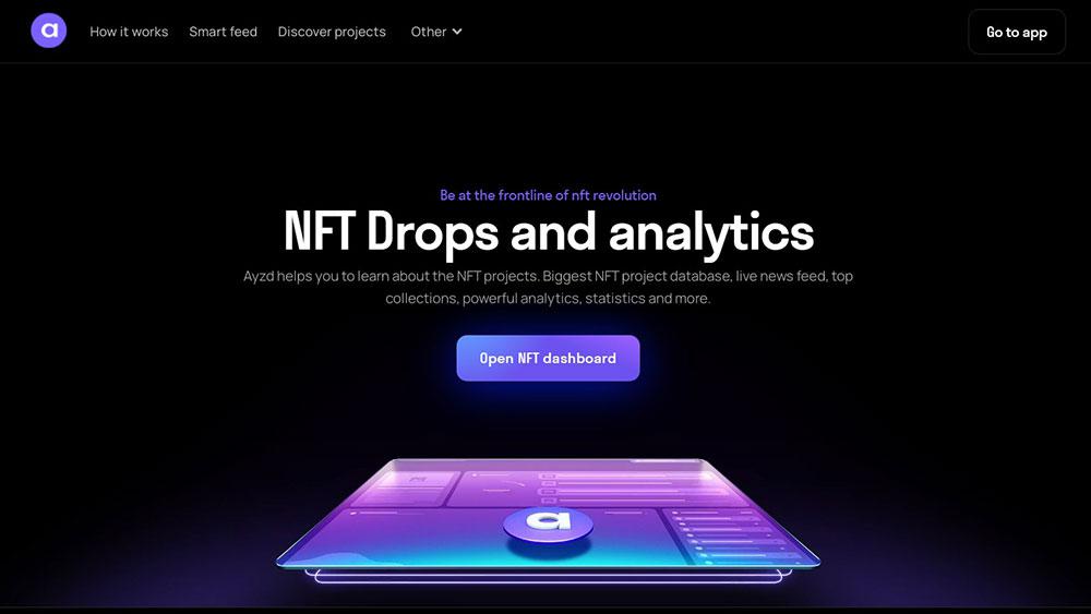
This procedure is a subset of the micro-interactions phase. Users will be alerted not just of completed jobs, but also of the processes involved in each assignment.
Dynamic Menus
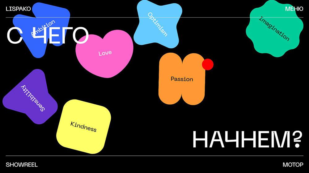
One of the most significant advantages of animation is that it allows you to accomplish more with less. A clear goal is essential in web design, and most designers are adopting a philosophy of utilizing as few needless transitions as possible while visitors navigate through information.
Ideally, all inboard links should open without landing on the same basic page, and more intuitive animated menus can assist you in making the most of your real estate. Sliding menus are one of the most common variations of these.
Attracting attention
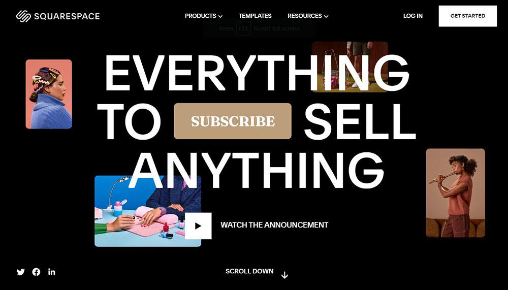
By incorporating motion into your website, you enhance your chances of capturing the user’s attention. So why not incorporate it into your website? Customers are generally motivated to take the required action when they see animations that are meant to catch their attention.
Simple animations for a website can be utilized, such as a nod or a shake on an icon. Attractive animations may be utilized in many areas of your design.
Skeleton screens
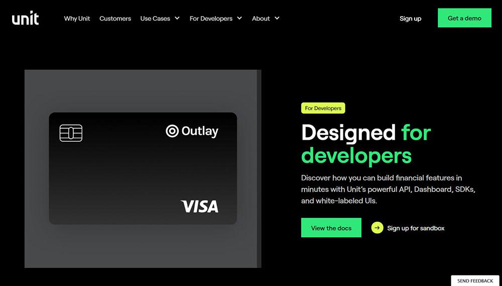
Skeleton screens may be used to entice visitors to engage with your website. Skeleton screens are empty sectioned pages into which content is progressive, although not always instantly, inserted. When loading information on a web page, animations should be employed for better outcomes.
The purpose of utilizing animations on a website is to keep the user interested. The lack of animations will make this feature uninteresting and ineffective since the user will feel as though time is being spent while the information is loading.
Visual Feedback

Visual feedback is one of the easiest and most efficient methods to communicate motion on a website. Feedback is based on the idea that the site should reflect the activities of its users, and this might manifest itself in a variety of ways. Sign-on or registration displays can indicate incomplete forms, or simple symbols can light up and display extra information to the user as the mouse is moved over them.
Transition without hard cuts
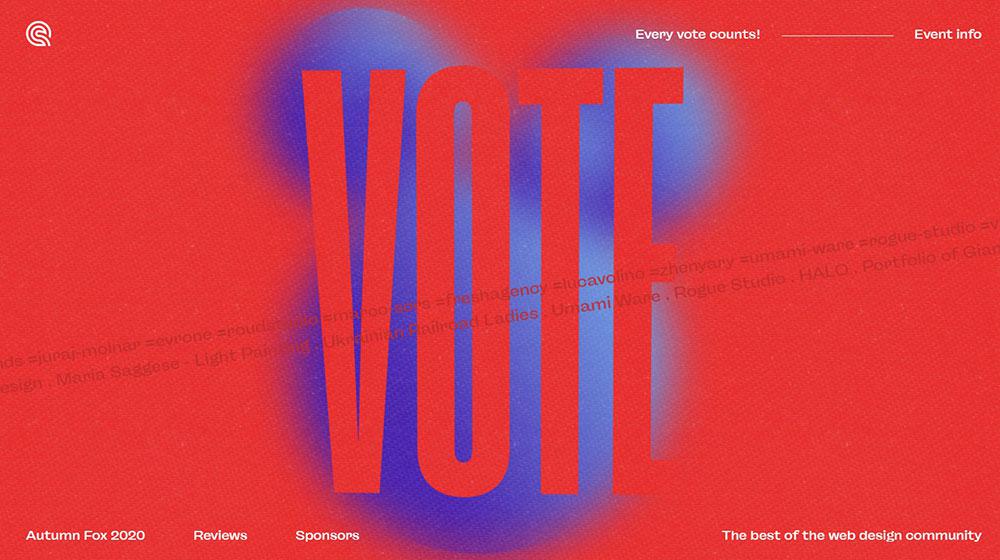
Transitions on a website should not only be seamless but also serve as an indicator of a change in status. By default, state transitions in the User Interface involve harsh cuts, which might create certain issues. Users may be frustrated by hard-cut transitions because they are too rapid.
To address this issue, animation methods might be used. Viewers can use this feature to navigate to a different part while remaining on the same page.
Creative effects
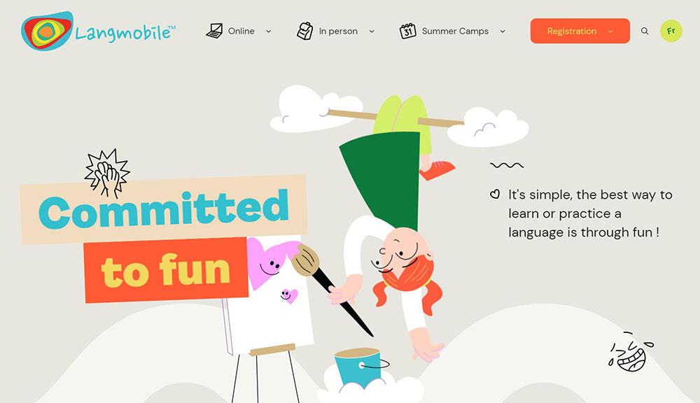
Your objective is to build a one-of-a-kind digital experience in addition to creating a great presentation that attracts viewers. Creative effects enable you to include unique elements that will make your site stand out. It enables you to include interactive features that pique the interest of viewers every time they watch.
Conclusion
Animation has already shown its worth in mediums far older than web design. Because of its durability, it will continue to permeate the design business; the only difference will be whatever new prospects future technology offer.
Animation may be a useful tool in your design toolbox, but it is not appropriate for every project. Smooth and seamless animation, rather than jumpy or mechanical, is preferred. It must have a function for the user and not obstruct the information.

