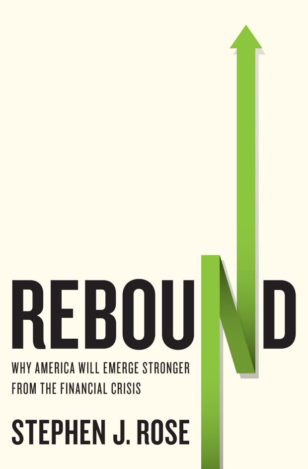
Rebound by Stephen J. Rose; design by Jason Ramirez (St. Martin’s Press May 2010)
The cover design is a great piece of marketing and is the main attraction that has power to fascinate everyone and drive them to buy or read your book. It’s the first thing that everyone is introduced to in your book and if it is impressive enough then you can generate your ROI. There are several ways through which you can make you cover look awesome but at the moment like Dan said in his blog, I am also pretty inspired by a vintage cover design by Elaine Lustig and Jay Maisel that uses arrows as a part of their design.
The cover design of your book helps to drive user actions and conversions and what could best illustrate it than an effective arrows? If you do not believe then look at the given pictures to determine it by your own:
The Arc of War by Jack S. Levy & William R. Thompson; design by Isaac Tobin (University of Chicago Press October 2011)

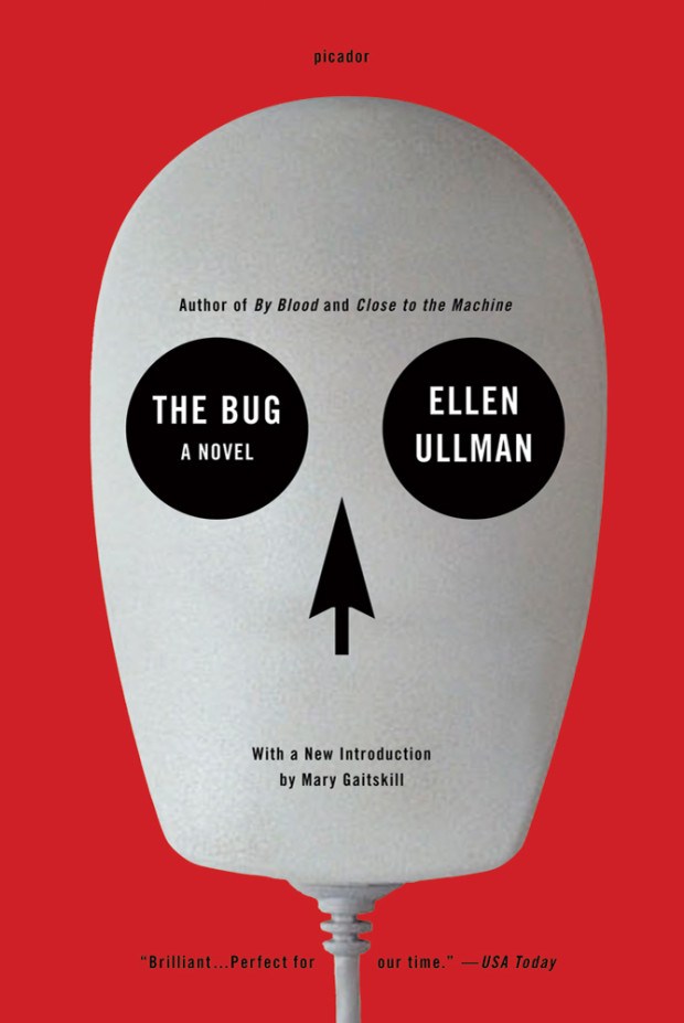
The Bug by Ellen Ullman; design by Jamie Keenan (Picador February 2012)
Busted by Edmund L. Andrews; design by Gray318 (W. W. Norton July 2009)

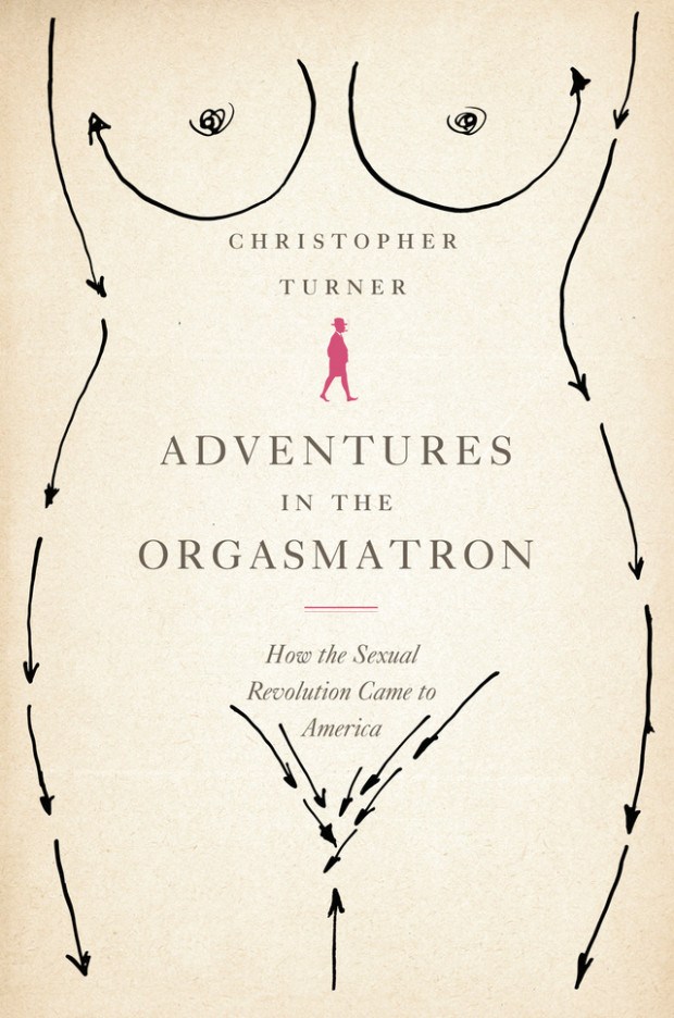
Adventures in the Orgasmatron by Christopher Turner; design by Marina Drukman (Farrar, Straus & Giroux June 2011)
The Enchanted Wanderer by Nikolai Leskov; design by Peter Mendelsund (Knopf March 2013

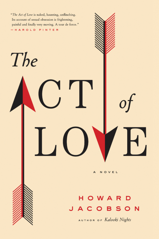
The Act of Love by Howard Jacobson; design by Catherine Casalino (Simon & Schuster March 2009)
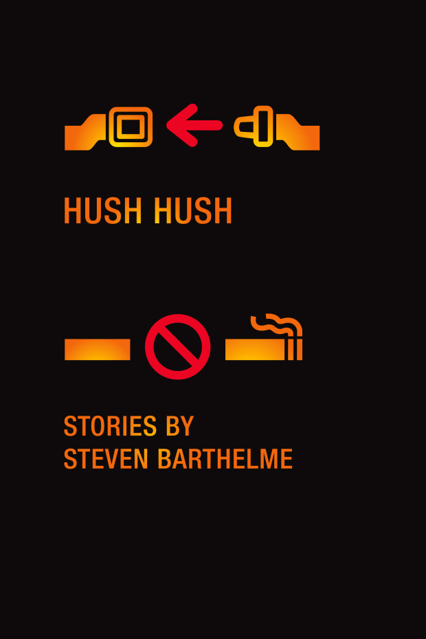
Hush Hush by Steven Barthelme; design by Christopher Brian King (Melville House October 2012)
