The internet is a great place to shop. You can have access to almost any product and goods in the world. With a simple tap on the screen, you can visit any store and buy anything your heart desires.
For business owners, this is why it is essential to have a good web design.
The page layout is the first thing people notice when they open a page. That is why websites need to follow and adapt to new trends.
Good website design can affect the buyers’ decisions. It can have positive and negative repercussions. It is an essential element that delivers the whole user experience. Today, it is not only important to show your product to your customers. It is also to engage them in your brand’s story and make them your loyal followers.
With new competition emerging every day, it is essential to optimize your website. So how to do that with only web design?
Here, in this article, we compiled a list of beautiful ecommerce websites.
Bliss
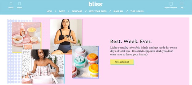
Bliss is a company that has earned its credibility. Not only do they offer unique products, but their page also has a unique twist to it. Their website design compiles of vibrant colors. The fun graphics and colorful gifs allow users to engage in website exploration.
Everlane
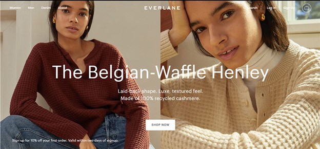
Everlane is a clothing store with detailed, high-quality photography of their goods and products to prove their brand’s sincerity. The website first offers them insight into why the clothes they’re selling are worth buying. Then they provide quality pictures of their clothes and their features.
Their website is clean and well organized. It even has a store locator to see where the closest location to you is.
Target
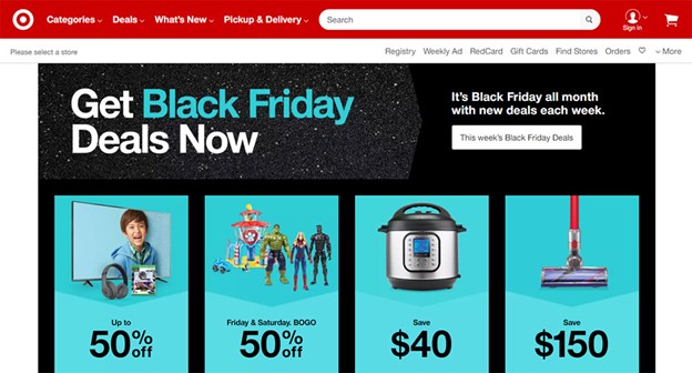
Target is one of the best online stores that offer the best design. When you first open their website, you’re immediately greeted with a homepage that shows their unbelievably cheap products. What makes Target great is also having a great mobile version. It has a Metro theme. This theme showcases how much money you can save by buying their products. They show their works in vivid images with a little description text next to them. The book is colored in eye-catching tiles. You can click on them to see more details about the product itself.
Dress up
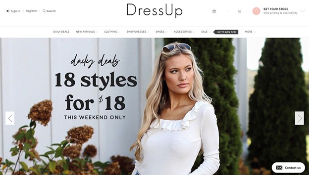
This is a website that offers a vast line of clothes for women. Unlike many fashion selling stores, this isn’t boring to look at. It uses a big, bold text to emphasize relevant promotions that are happening in their business. With this type of text formatting, they also promote their new clothing arrivals. The website shows the clothes in vibrant images. They specifically use this type of color psychology to attract attention and get more sales. And they also have a homepage slider to show various offers.
PowerOnPowerOff
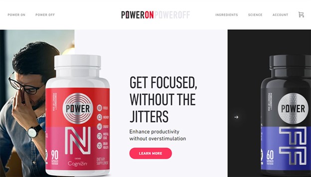
What sets this brand’s design from the rest is its focus on its benefits as a company offer. They don’t jump into sales right away. What makes them unique apart from that is that they use an extended type of scrolling. This is a good technique. It doesn’t tire the user. Instead, new information is continually coming up, keeping the user attentive. You can use this design type to optimize your page performance and keep your visitors engaged continuously.
Kaekoo
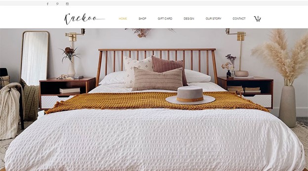
This site offers comfort and coziness within the first page. It has a hand-lettered logo. The photography is chosen with a taste. Not only that, but it has a constant and calm color palette. It is packed with a tyle that delivers a clear message. This is a business that clearly understands how branding works. They showcase their products in various dioramas, thus helping the users find a perfect product.
New York Times Store
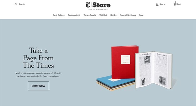
New York Times is a brand whose website is one of the best in the world. It has a contemporary style with a non-cluttered page layout. It is simple. It doesn’t have many images, but it has information that makes the whole UX faster and smoother. It is easy to navigate. It is not cluttered. Instead, it is packed with relevant elements – the key to a successful website.
Nova Smart Home
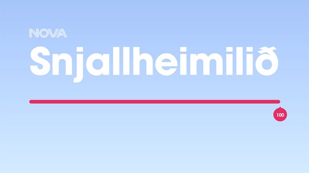
This brand uses an animated 3d house model. This model is an interactive method to demonstrate products and goods. Once you open a consequence, the website explains where exactly the product is used in the house.
Once you open the website, it will show you a wide range of products. They are all smart-home products.
Outdoor Voices
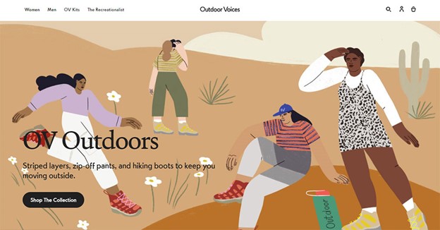
This company has a unique web design trick to optimize its webpage traffic. The menu and the background photo aren’t separated. Instead, the picture extends into the menu itself. This is to make the visitors feel as if they are experiencing the product in the designed environment. It is a website that allows easy browsing. not only is it easy to navigate, but you can almost instantly find the call-to-action button. The color sticks out to the front page, and so you can’t miss it.
Bohemian Traders
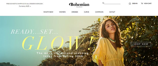
This website incorporates bohemian touch to its design. The visitors can navigate the page with little to none effort. Not only that, but they also have easy access to various categories. The color this brand uses aren’t vibrant. Instead, they are muted. They keep the focus exclusively on clothes.
Rebecca Atwood
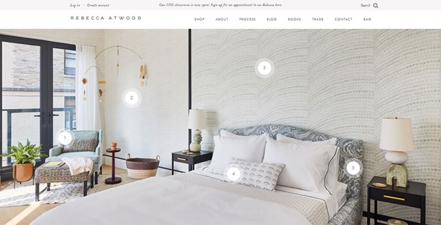
Rebecca offers an excellent eCommerce experience. Her website comes in a great desktop and mobile version. The design showcases the products in use, which builds an aspirational picture in the user’s head, as they can see the work in action.
RYDER
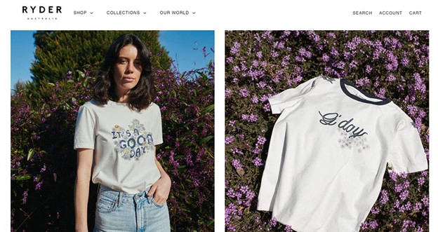
Penny and Georgie Brown offer a completely new take into the world of web design. They offer a completely new and creative design, which makes them stand out from the competition. You can study their system to see which elements you can steal from them to improve yours.
Cottons Jaipur
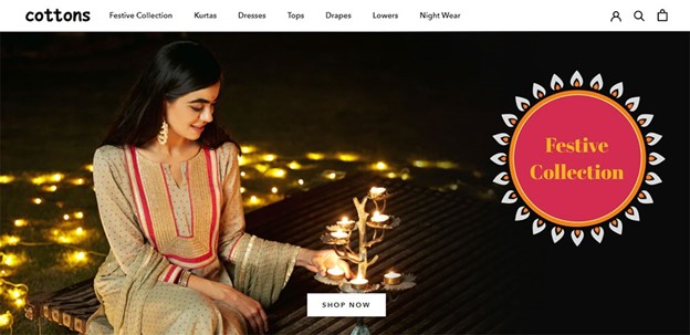
This is an Indian clothing site. It joins Indian traditional fashion with western trends. This is what makes them so original. Their website’s homepage is elegantly designed. It has a white background behind their detailed photography images. You can access the product categories in the sidebar of the page. The products come with a clear image and a text description.
Owl
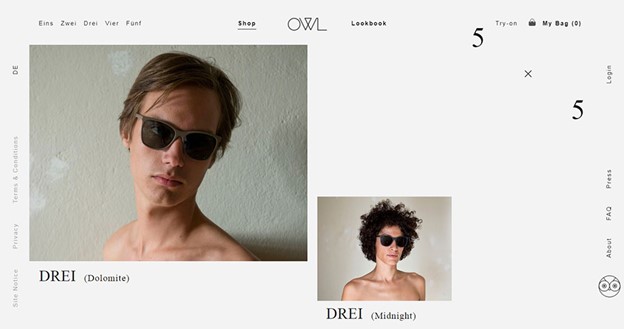
This is a site that displays serious products such as glasses and other eyewear. This website design offers high-resolution pics of their products. in the pictures, there are people wearing eyewear to show the work in human dimensions. The system is overall understandable and straightforward.
Welly
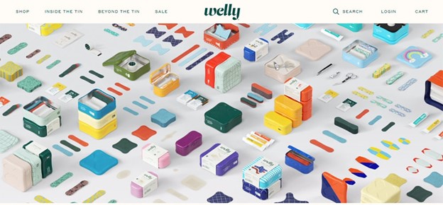
Welly has a lot of white space in the background. They have a written regime that makes the website to be read easily. This adjustment helps users more easily understand the business. What’s also great about this website is that it has a direct, transparent color scheme. It uses mostly white with an orange to highlight text. With such a creative websites, this company will surely not appear on any failed startups list in the near future.
Hard graft
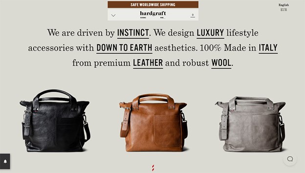
Hard graft is a luxurious fashion company designed for men. It is excellent for men that want to express their personality with style. This website uses mostly text to attract visitors and to promote the brand. The brand uses bold language to capture the attention of many users. It symbolizes power and masculinity – everything a man should have.
Mulberry
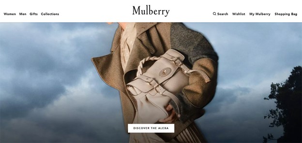
Another company that is also known for its boldness is Mulberry. Its design is stunning. It has lively photos meant to draw attention to the story the brand is selling. You can find little to no text in this layout. This is a store that sells with their image. If you want your visitors to think of your website highly, use Mulberry as a primary source to draw inspiration from.
The Horse
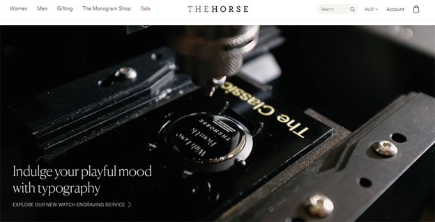
This is among the unique websites out there. It is an eCommerce website that uses gigantic pictures to make bold statements. It has fewer words yet more graphics. This a great page to excerpt ideas from. The Horse never fails to impress.
Plastic Freedom
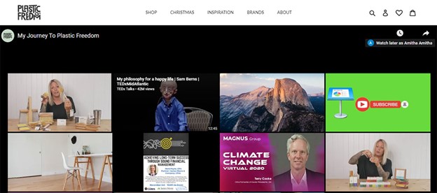
This is a store that sells environmentally-friendly products. It has an animated logo that subtly delivers an activist message to its customers. The branding is subtle, and you can barely notice it. What’s also great about this store is that it plants a tree for every product one buys. It is a great store that keeps buyers happy with their purchase. It also makes them return to buy more products.
Two Chimps Coffee
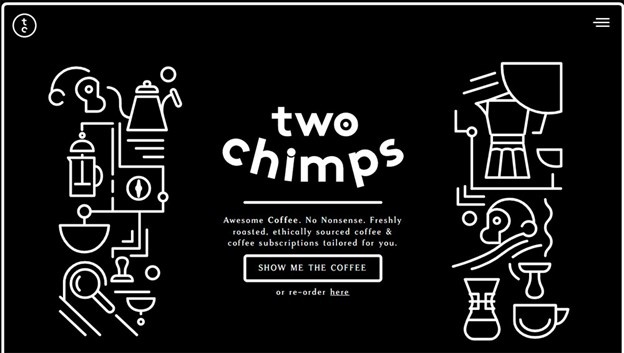
This brand has different integrity than most brands. When you open the website, you are welcomed with a fresh layout. You can instantly notice this company’s creativity. This is why this brand’s rating is so high. The whole page is finely designed. It has an engaging UX – a hamburger menu standing out. It makes you wonder what else this website offers, leading you to spend more time on the website itself.
Bite Toothpaste
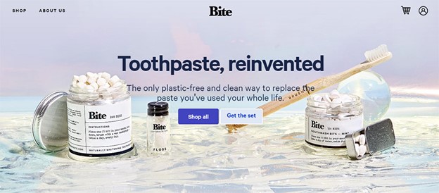
If you’re wondering what great online store you can copy, wonder no more! The bite has an astonishing page that interacts and communicates with you. It will convince you in no time why you should buy their product. They have a whole page dedicated to their publications. Not only that, but they have an entire section for users to read and leave comments and reviews.
Chubbies
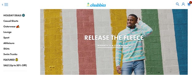
This is a swimwear company. For its page design, it uses rich and intense colors to get visitors’ attention. It makes them excited to buy their products. The background is also vibrant, often with tropical imagery.
Jackie Smith
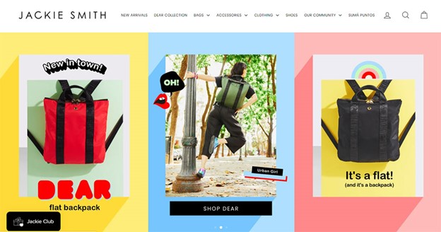
Jackie Smith is another fantastic store. It also uses bright colors to show off their products and design. The color scheme contains radiant colors and does use the palette quite well. This website has a pleasant aesthetic and unbelievable user experience.
ESQIDO
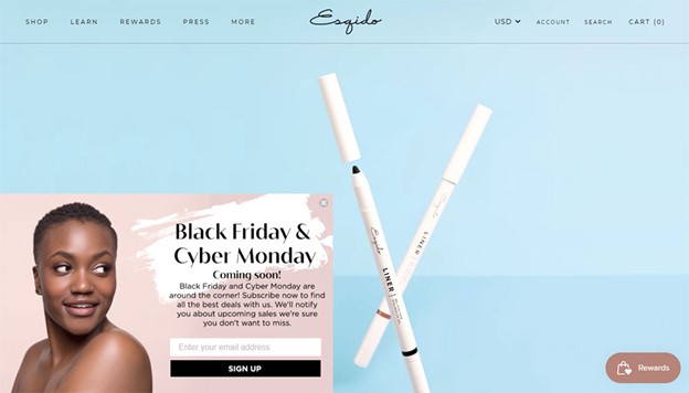
This is an eCommerce site that brings attention to their main product. They provide close imagery of the lashes they are selling. The package they come with is equally as durable as the product itself. The home page also has a short video giving better insight into lash applications. This is a way to have your audience engaged with the content you’re offering.
Simply Chocolate
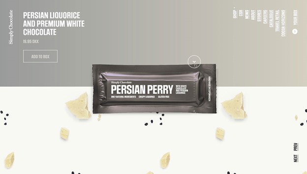
This is a Danish website. It is designed for die-hard chocolate lovers. You can see the creativity and innovation implemented in their web design. It has a rich layout and visuals meant for anyone that loves chocolate. The whole website has a chocolate based-theme.

