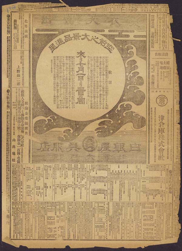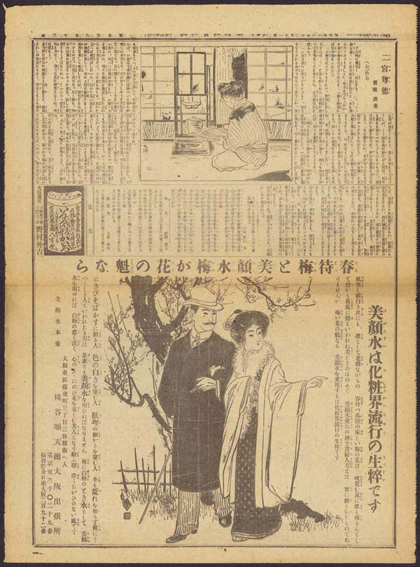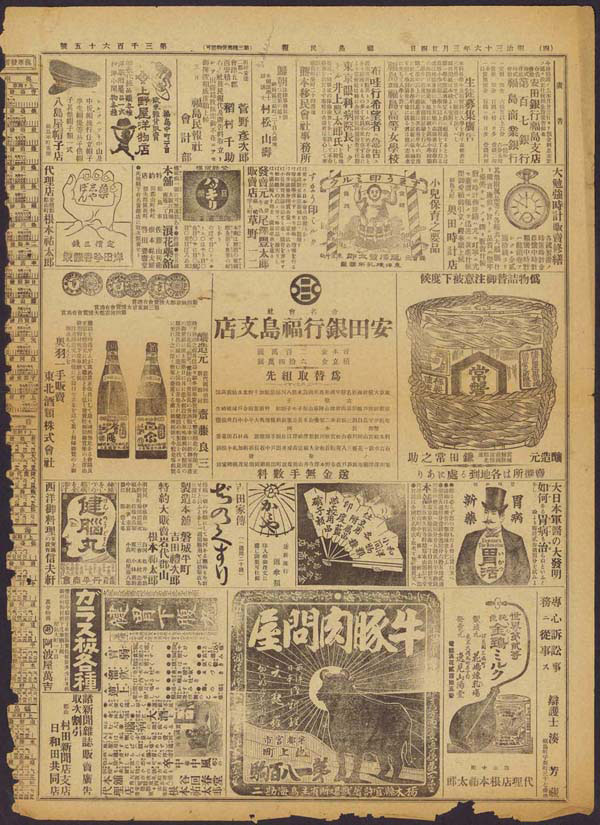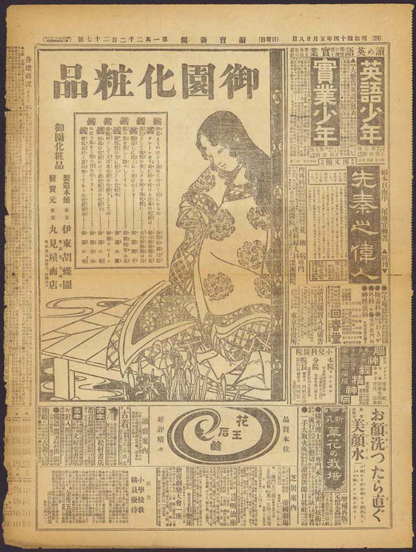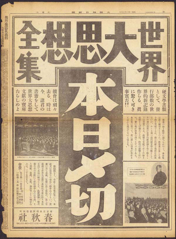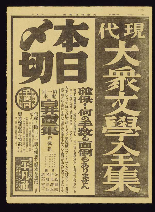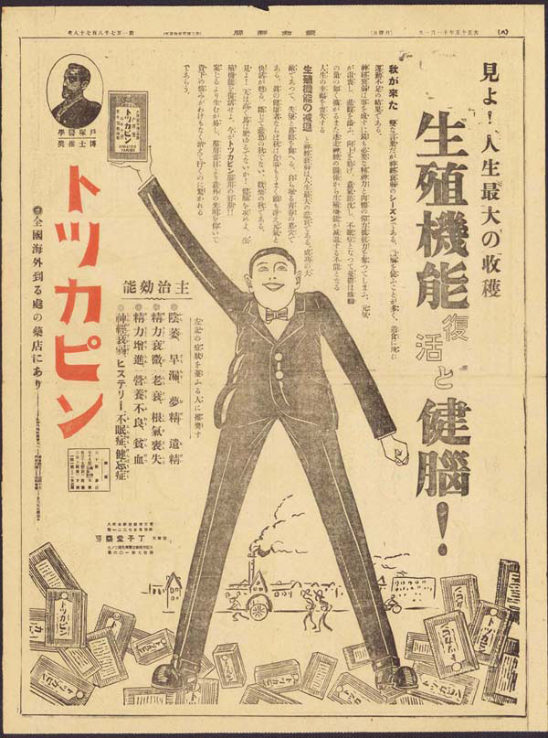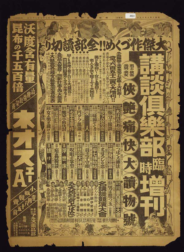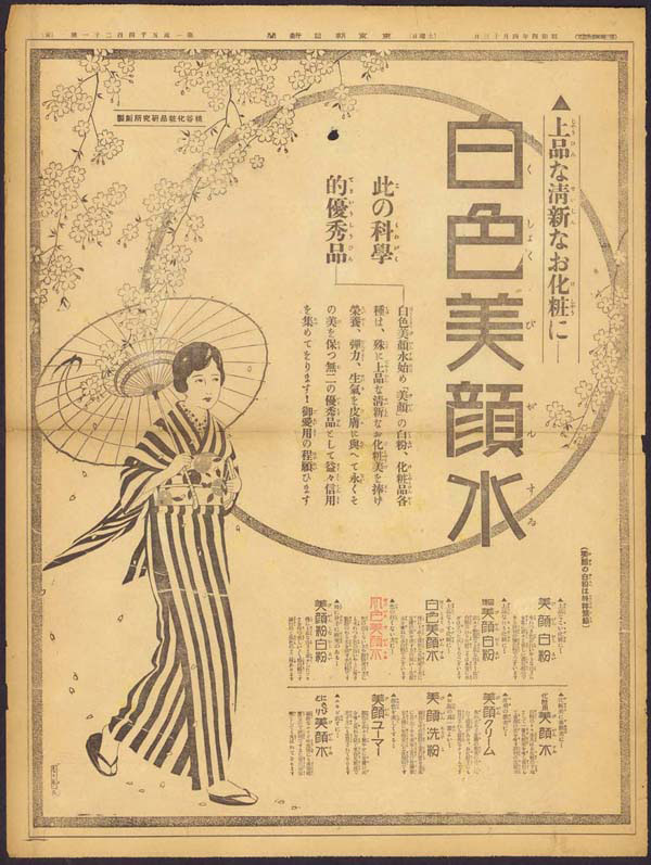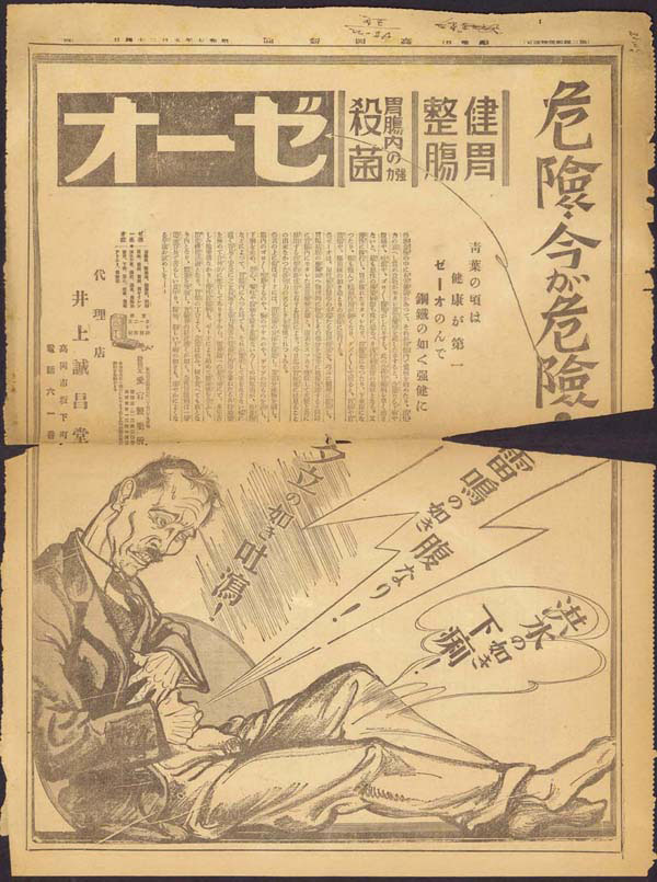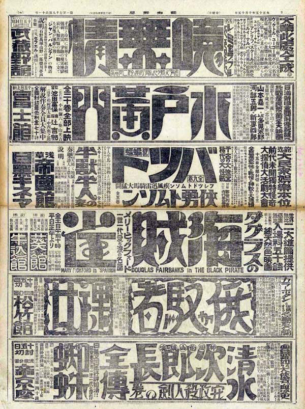
Big, bold typography is one of the web design trend I’ve enjoyed the most recently. If you look at these vintage newspapers from Japan, it seems that the trends dates from quite a while ago.
Although apparently white space wasn’t really a consideration in the design of the time, these ads and layouts have a charm that is probably lost if you understand Japanese. The drawings and caricatures included are also interesting to observe.
For more, you can check out this page (in Japanese).
