Among all of the design agencies’ headaches, artwork proofing is probably one of the most acute ones. Forwarding countless numbers of requests, following up your approvers with reminders that they have a file to check, searching for their feedback in the endless pile of emails or messages… Quite daunting, to say the least, and quite expensive too – the amounts of time and, as a result, money spent on this back-and-forth game are quite significant. However, there is a solution that would allow you to cut your turnaround time by up to 35% – a specialized proofing software.
One of such programs is Approval Studio. It is a proofing tool developed specifically to help designers and creative teams spend less time on boring and repetitive processes and make the whole workflow more organized and efficient. There are quite a few features with which Approval Studio helps you to streamline proofing of visual assets, so let’s create a project, upload some file, and see what we can do with it.
№1: Sharing files
After the upload, users can start sharing their artwork with other reviewers. There are two types of reviewers: internal – they can access your dashboard or even get tasks assigned to them in Approval’s Pro version – and external ones. Let’s concentrate on the latter.
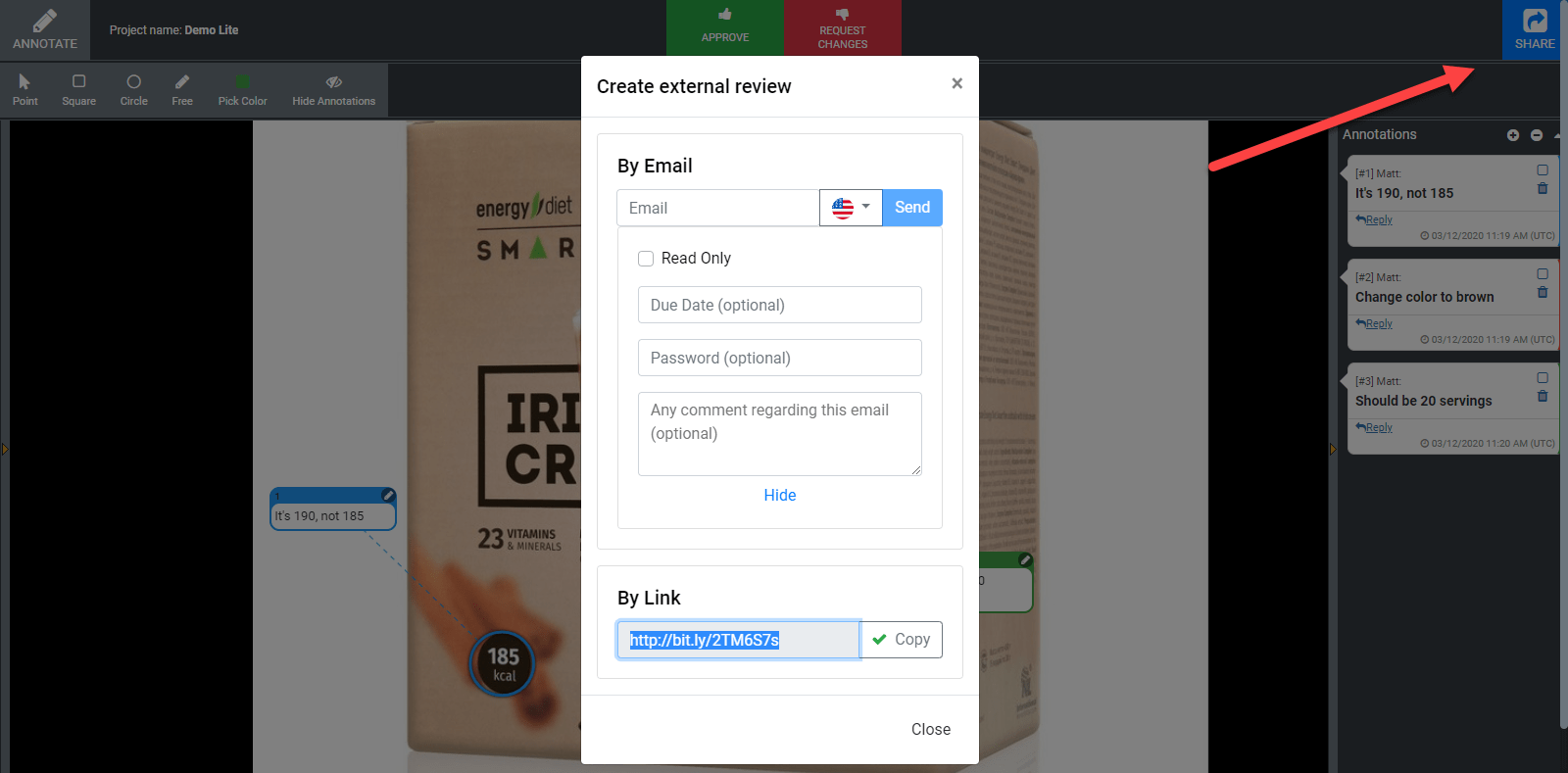
A big blue “Share” button in the upper right corner is the starting point of your cooperation with the clients. You can send the invitation to Approval Studio to their email or share a short link via your messenger chat – with a password or making the file read-only if you like. Your reviewer will be able to see the same thing you see and add annotations.
№2: Online review tool
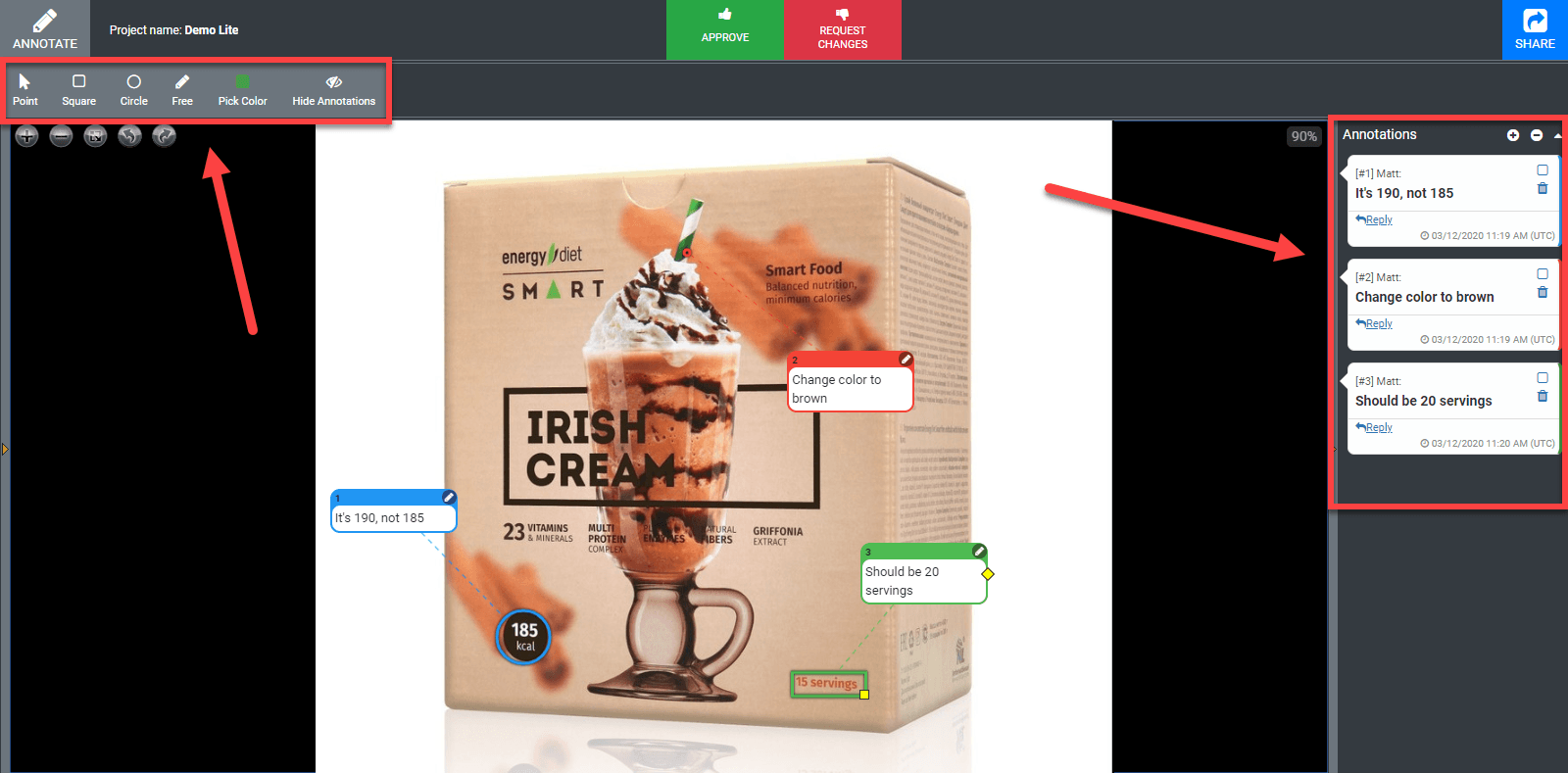
Approval Studio offers advanced annotation possibilities that include a set of different shapes, namely a point, a circle, a square, and a free-form (if you need to draw something by hand). Users can pick a color for each annotation, which is helpful when there are several reviewers. Also, there is a possibility to bind one annotation to several places in the artwork if there is the same repeated mistake or if you need to apply similar changes, let’s say, to the fonts or colors. Annotations will appear on the mockup itself and on the comments panel to the right.
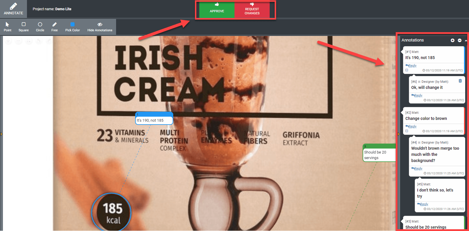
If you need to check the artwork from another angle or annotate a much smaller detail, it is not a problem at all. Approval Studio allows rotating the image as much as you like and zooms it without descaling or quality loss so that you can read even the tiniest text.
The main thing is that the system is totally live – whenever they add a comment, you will see it instantly on your screen with no need to refresh the page. It works like a built-in messenger to make your review sessions more convenient.
After the discussion is over, the last thing that’s left is approving or rejecting the file. At this stage, it’s important to be careful, because you will not be able to add any new annotations to this version after you confirm your verdict.
№3: Versioning and 4 unique compare modes
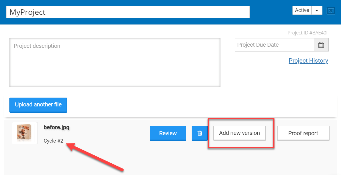
The annotations were added, the artwork was discussed, and now it’s high time for a designer to upload a new version of the artwork. When it is done, the cycle on a dashboard will switch to №2, and the review process will repeat, although there will be one small difference. Starting with the second cycle, you will be able to compare the versions of the file to find out if all issues were fixed.
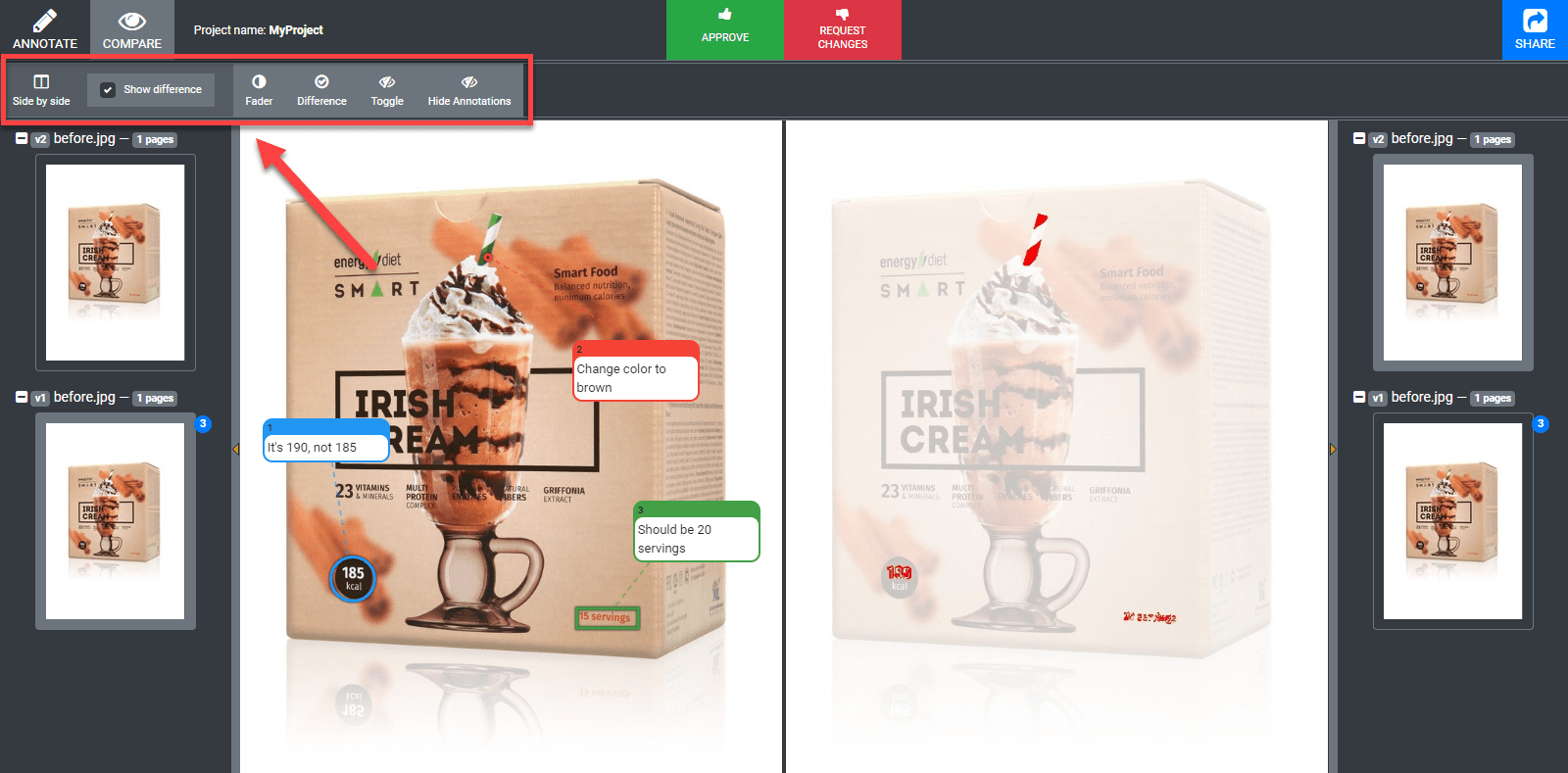
Approval Studio helps you with it significantly with 4 AI-driven compare modes. First, let’s choose the version that we want to compare – the ones that were annotated will be marked by the number of comments added to them. By the way, you can turn on annotations in the compare mode if you need them.
Side-by-side shows you two images next to each other with the ability to highlight differences if you tick the necessary checkbox. Fader will let you manually switch from one version to another moving the slider with edits highlighted in the center. Difference will just cut out the things that were changed and show them to you. Toggle, which is by far my favorite one, will switch from one version to the other dynamically.
№4: Comprehensive reporting
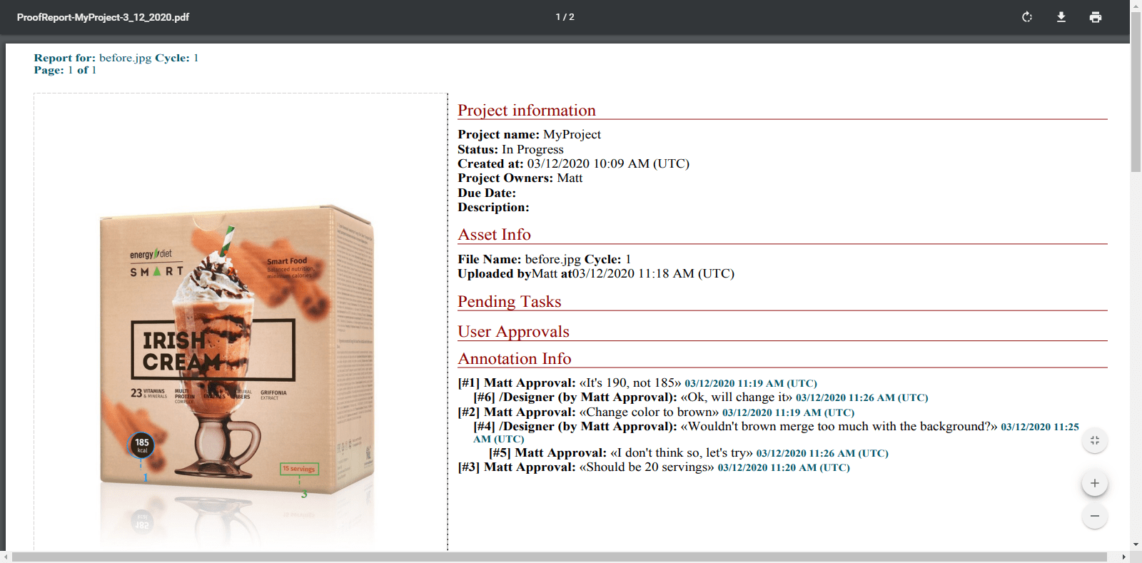
After the project is ready, many agencies need to deal with the accountancy thing. Clients often forget which requests they made, how long it all was supposed to take, and why these or those changes were applied at all. To avoid such confusion, Approval Studio provides full PDF reports on the whole project or each asset separately with the exhausting amount of information. The data provided range from time and date of each action completed by each user or reviewer and ending with thumbnails of each version with all annotations.
Also, users can check project history created for internal use to see the chronology actions committed within the project.
№5: Highly customizable user settings
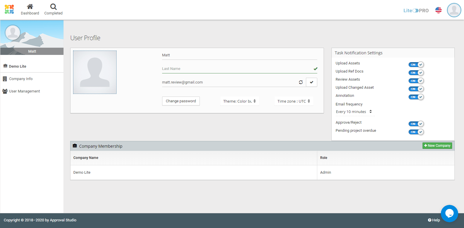
Every company has their own approaches and workflows. Approval Studio is a very flexible proofing tool that lets their users adjust the settings as much as possible. To begin with, it concerns the language choice – among a solid pack of 8 localizations, each user and even external reviewer can choose their own, which is especially beneficial when you are working with an international team.
Also, there are many different notification types, the ability to change the time zone, and add companies if you work on multiple projects with different clients.
Company info provides a range of important customizable features like a personalizable review invitation where you can replace the standard text with your own or custom approval confirmation that lets you make sure your reviewers follow your company’s policies.
Conclusion
Approval Studio is one of those tools that are a must for each design agency. All these features make the process of artwork approval significantly simpler and can save a lot of resources and nerve cells. The tool has much more cool tricks up their sleeve, so sign up if you want to check Approval Studio out! Also, there are brief and simple tutorials on their YouTube channel which you can check to see everything we’ve discussed here in motion!

