When did web design become an art form? We know it sure as heck wasn’t anywhere close to when sites really started hitting the World Wide Web in waves back in the 90s. With no CSS, ugly fonts (the polar opposite of these), brutal colors and a painfully slow loading time, calling websites art back then is like calling a jackhammer music. Thankfully, we now have a world where progression is expected, and much like every technological discipline out there, web design has moved forward so fast that we’re essentially playing catch-up.
It’s quite remarkable to think that we’re in an age where pre-designed website templates exist for those either unwilling or incapable of creating their own. But while what you can find here is useful for non-web designers in terms of templates, there are still those who desire to push the envelope in terms of web design and consequently change our perceptions of what makes a great website. Does it present information in a succinct and appealing manner? Yes, but how exactly does it do that? That’s what Designer Daily is all about, as we want to delve deeper and showcase the sites which take that information and make it art.
However, it’s not just us, as AWWWARDS.com does a great job of featuring brilliantly functional and gorgeously designed sites which can’t help but put a smile on your face. AWWWARDS gives out honors for site of the day, site of the month, and site of the year (alluding to design, creativity and innovation), and as that’s far too many to discuss in one article, we’re going to focus on our favorites from the site of the month category over the last 12 months.
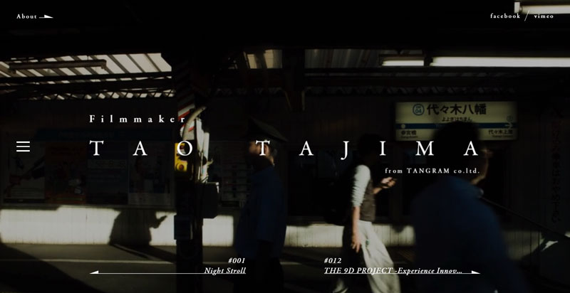
Tao Tajima
Filmmaker Tao Tajima’s site makes such a great use of space because as soon as it loads, the screen is filled with a full-size video of Tajima’s work while the necessary text is overlaid splendidly in white. What’s more, the transitions from one page to the next seem to shimmer and dissolve, making the whole site appear as one living, breathing entity. His videos can be accessed easily enough and come with a short and interesting backstory, while a ‘Play’ button simply begs you to click. A beautiful portfolio on a cutting-edge site.

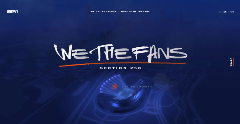
We The Fans
For ESPN’s upcoming documentary series following hardcore Chicago Bears season ticket holders, an accompanying website has been set up to add further detail and simply to hype the project. The user is greeted with a calming blue screen featuring a lit-up stadium, in addition to the typical sounds one hears in the midst of the action. After clicking ‘Start the experience,’ you can explore particular areas of the stadium and find out more details of the fans featured in the documentary. The overall experience is soothing, delightful and enjoyable, as we’re the ones who get to move around the (admittedly small) section of the digital stadium and read about the fans as and when we feel.

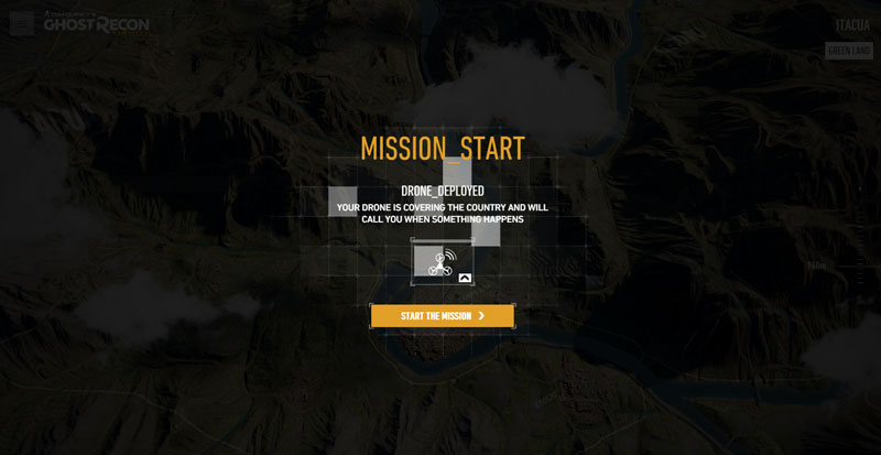
Ghost Recon Wildlands
This site is made for the new Ghost Recon video game, and after the intense and quite shocking video, we’re treated with a map view of Bolivia, where we can play side missions relating to the story. While the missions are mostly observation and don’t involve the user doing too much, it’s still an immersive experience and overall, makes you feel invested in the world. The map design is fantastic, and the moving elements such as cars and helicopters turn it into something so much more.
If you’re a web designer who wants to be a trailblazer and smash preconceptions of what a website is capable of, then the AWWWARDS are merely a way of simultaneously motivating you to try harder and be inspired by the work of others.


