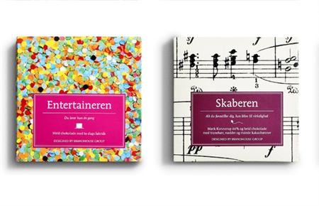
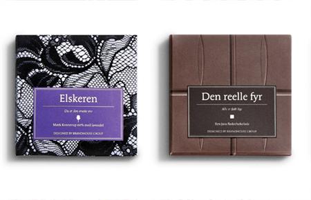
If you are like me, you buy your chocolate based on its packaging. That’s why designing great packages is so important for chocolate companies. In this post you’ll discover some awesome chocolate packaging. Many of these are just concepts, but they are still great inspiration for designers.
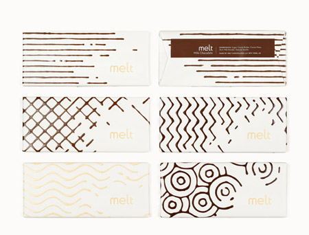
1. Melt
Packaging and logo design for a fictional gourmet chocolate shop. The characteristics of melted chocolate are used throughout, providing a tantalizing glimpse at the wonderfulness contained within. Created by JJAAKK Design.
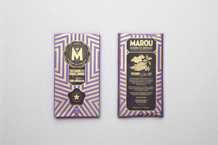
2. Marou
Special edition packaging for Marou “Faiseurs de chocolat”. Created by Rice Creative in Vietnam.
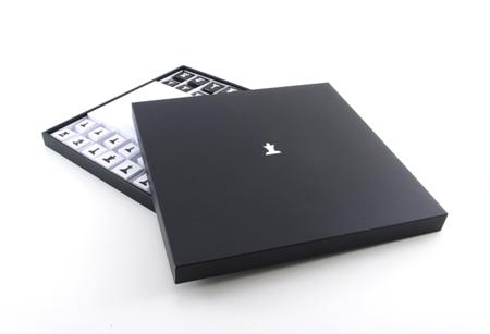
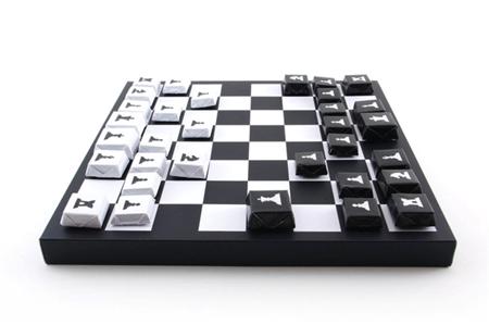
3. Chess chocolate
As a chocolate and chess fan, I approve this box’s packaging. There should be a rule where you can eat the opponent’s pieces once you catch it.
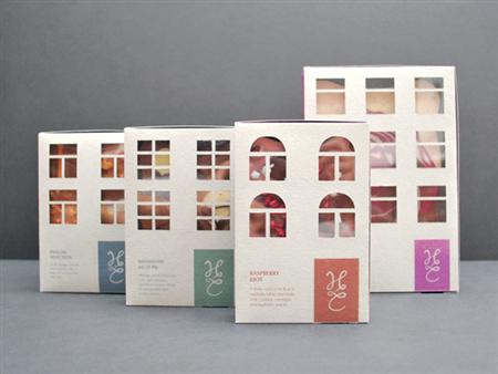
4. Hotel chocolate
A fun reinterpretation of the chocolate box made by a student, Lun Yau. I would empty those hotels pretty quickly though.
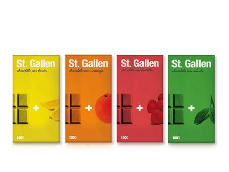
5. St. Gallen chocolate
Another concept packaging. This one mixes Swiss-style graphic design with great use of colors to indicate the flavors of the chocolate. The best design trick is probably the use of the Swiss cross as a plus sign.
6. Dallmayr
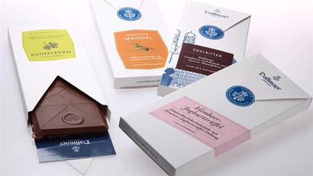
Packages that look like envelopes, a nice way to suggest that these chocolate packaging are a good gift. However, the best part is the product itself, a chocolate that looks just gorgeous and well designed.
7. Yellow chocolate
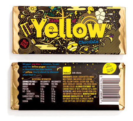
Chocolate packaging created for the Yellow pages, made me think of the Yellowsubmarine movie designs.
8. Elisabeth & Kate
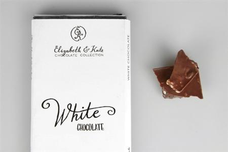
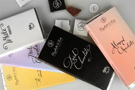
Another school project that uses calligraphy and a subtle color scheme to create some elegant chocolate packaging.
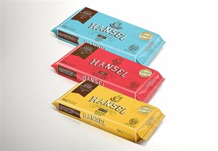
9. Hansel chocolate
A more standard, but very well designed package for these chocolates. Via Packaging of the World.
10. Henrik Konnerup Chocolates
Awesome chocolates designed in cooperation with chocolate artist Henrik Konnerup.
