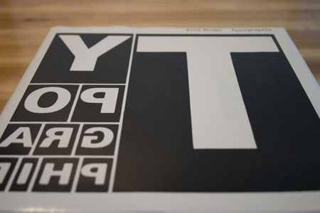
Typographie: A Manual of Design is a must-have book for every graphic designer. The author, Emil Ruder, is a Swiss typographer who thaught in that field for over twenty-five years and also became famous for his own design work.
As you can guess from the title of the book, this manual will teach you a lot about typographical design through history, theory and case studies. I bought this 273 pages best-seller when still in design school, and the least I can say is that changed my perspective on design. It is a very theoric book, so you shouldn’t buy it if you are just looking for great design showcases.
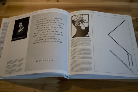
Writing and printing, a walk-through the apparition of printing and the relationship between the written and the printed elements.
Function and form, where the author talks about the importance of mastering technique, function and formal design for producing good typographic work.
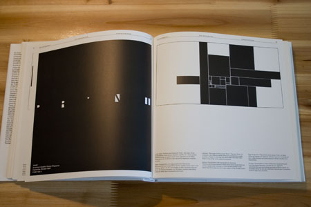
Form and counter-form, on the importance of white space, both whithin the letter itself and in the page layout.
The techniques of typography, is the most outdated section of the book because of the hug changes in the evolution of computers and printing techniques. Still interesting to understand some things like kerning.
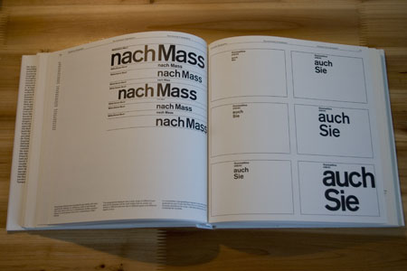
Arrangements, on distribution of text throughout pages of a book or magazine, readability, division and organization of text.
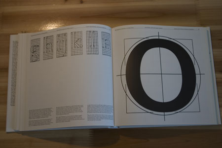
Geometrical, optical and organic aspects, on the importance of our visual perception over geometric construction. Great points on the fact that typography is not just a technical work but requires a real sense of balance.
Proportions, how to settle the relationship of length, breadth and depth. Understanding the necessary tension between elements of a layout so that harmony is not broken.
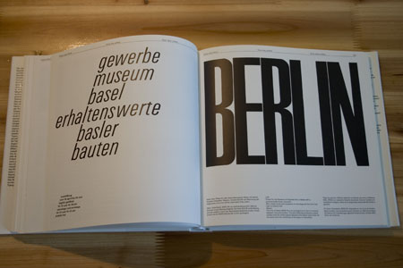
Point, line, surface, thoughts on the basic elements of graphic design.
Contrast, the importance of contrasting your work to create tension and break monotony.
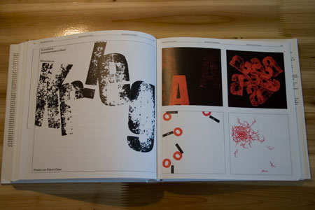
Shades of grey, creating grey effects with lines, typographic ornamentations and typefaces.
Colour, how to use colour to create contrast and tension between your elements.
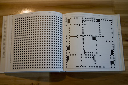
Unity of text and form, making reading easy with a typeface and in a form which is technically and functionally right for the work in question.
Rythm, handwriting is full of rythms, on the other hand, lining up letters to form a word, a line or a type area affords further opportunities for introducing rythm.
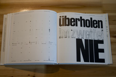
Spontaneity and fortuity, thoughts on the possibility for spontaneity and random effects.
And more to discover, I don’t want to expose the whole book here, but you probably noticed that It is worth buying.

