Typography continues to be overlooked by many designers yet it is a very important aspect of the design process as choosing the right typeface can make a real difference to the effectiveness of the design. Typefaces are just as important to the visual effect of the webpage as images.
Typography does not just involve choosing the typeface. This is the starting point though and consideration needs to be given to kerning, tracking and leading. Other aspects of typography include choosing the color of the text and deciding how the text will fit into the layout and design of the page.
The effectiveness of the message on the page is strongly influenced by the choice of typeface. A good typeface will engage the audience and influence their perception of the message. The key is to choose a typeface that will link the text with the graphics to achieve the objective of the page.
A good typeface can increase the reading pleasure of the viewer. It is important to choose the right typeface that is suited to the particular situation and even the best typefaces cannot be used effectively in every situation.
You can choose a signature font or a highly calligraphic one for your design, but that is limited to the audience that you have. It won’t work on a site for developers, for example.
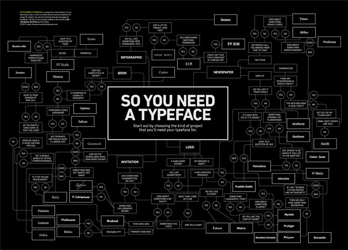
It is difficult to choose the right typeface because there are so many options available. There are no specific rules that can be followed to find the correct typeface but some principles can be applied to a number of situations and these may be worth following.
Legibility is very important
It is important for a font to be legible in order for the reader to be able to distinguish one letter from another. There are many factors that need to be taken into account when considering the legibility of the text. These factors include character shapes, size of counters, character width, weight, ascender and descender length and stroke contrast.
Picking a good font is a good starting point for making text legible. However, making this choice may be difficult because of the sheer number of fonts that are available.
Certain elements of the text will appear highlighted to the visitor if a font is chosen that has variations in height and weight. Helvetica Neue has other styles than bold and italic such as light or ultra light. Fonts such as these can be effective if focusing on the typography of the site.
A legible font will usually be one that has conventional letterforms and design characteristics which are consistent. These types of fonts are likely to be the ones which will deliver legible results.
The process of adjusting spacing between characters to make the font proportional is known as kerning. This improves the appearance of the font and quality typefaces will have built in kern pairs so this effect can be easily achieved. Letter spacing is also an important aspect of choosing a legible font and fonts that are too open should be avoided.
The most common question when picking a font: Sans or Serif?
The most widely used typography categorization is serif or sans serif. Fonts that are known as serif have feet at the end of the letterforms. This feature is not found in sans serif fonts.
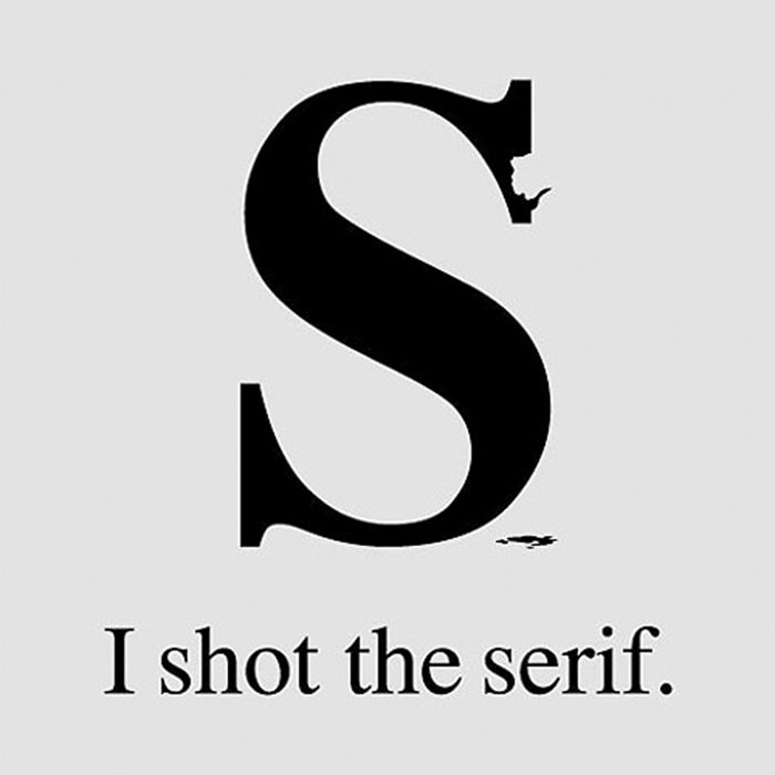
There is a wide range of different styles of fonts in both groups that can make them difficult to classify. As a general rule though serif fonts are more traditional and sans serif fonts are considered modern. Serif fonts are sometimes considered to be more readable.
There are a number of good fonts that are available in both categories. More can be learned about the different types of fonts by looking at a range of classifications such as humanist, modern, slab serif, geometric, old style and transitional. Designers may find it beneficial to develop their own classifications for different fonts as this will allow them to be able to easily access the type of font they need for a particular project.
Picking fonts for a website and using them properly
It is important for the typography used on a website to attract a viewer and retain their attention. In order to achieve this the font needs to be readable, appealing and clear.
Titles and subheadings can be used to attract a viewer’s attention and prevent them from leaving the page. Content can be prioritized through the use of feature such as bold and italic, and the use of color or the case of the font.
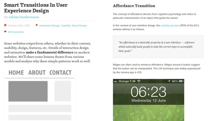
The size of the type is an important consideration to bear in mind when designing a web page. A larger type will be a better choice because this will be easier to read on lower resolution screens and smaller devices such as laptops and tablets.
There should be a good amount of contrast between the text and the background. If the background is dark then the text should be light or vice versa. This will ensure that the text is easy to read and the full impact of the text that has been chosen can be achieved.
A combination of different typefaces may be effective. It is important that these fonts are different in order to get the full effect of this. A good solution is to pick one serif font and one sans serif. This will create contrast and give the text a cohesive look, especially if fonts are chosen from the same designer.
Picking fonts for print
Choosing the right font for print is essential for creating a good first impression. Picking the right combination of fonts can ensure the printed designs stand out, whether it is a letterhead, business card or leaflet.
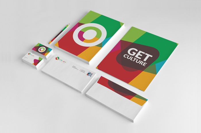
The typeface should not overpower the text as this may distract from the message. The purpose of the typeface is to make the text easy to read and if this is not the case then there is a risk that the reader will simply look at the typeface and not actually read the text.
When the font is being printed from a screen the contrast and brightness should be adjusted to enable the font to look as it will when it is printed. This can assist the designer in deciding whether the typeface that has been chosen is achieving the desired effect.
Once the font has been printed off it can be shown to friends and family to get their opinion. If more than one font has been used then they may be able to assist in choosing the final font to be used.
The ultimate decision about which font is chosen will depend on the personal preferences of the designer. There is no right and wrong font to use in print, but there are certain fonts that will work better than others.
You can choose a font for web or print from our articles with fonts that you can download. Most of the articles are with free fonts, but you will also find a few that showcase premium fonts.
Conclusion
The best typeface for the job will be the one that is the most appropriate. This may mean that the typeface that looks the best and is the most space efficient will not be the one that is chosen. The needs of the audience and the requirements of the client should always be taken into consideration and this is a good place to start.
The objective of choosing the right typeface is to engage the audience. This is the case no matter what product is being marketed or what information is being conveyed. The goals that are to be achieved through the piece should be kept clear in the mind and it should be geared towards the target audience. The age range and interests of the target audience should be taken into account.
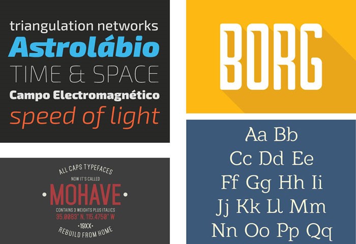
Designing for a high tech audience, for example, will come with its own specific requirements. The typeface that is used for this audience will almost certainly be modern but there may be a choice to make between a clean or edgy look to the text.
Typefaces cannot be categorized as good or bad, instead they should be named appropriate or inappropriate. A typeface should not be chosen until it is clear who will be reading the text and what message is trying to be got across.

