
While learning how to make your own website, ensuring it has an appealing design is also essential. Web design affects 94% of first impressions and accounts for 75% of your site’s credibility. It’s also an effective way to stand out from competitors.
However, there are many factors and elements in website design that make amateur designers confused. These include navigation, structure, and aesthetics, like images and fonts.
This article explains ten common web design mistakes. It also provides design tips, tools, and examples to help you avoid and solve these issues immediately.
1. No Website Planning
Most business owners and amateur web designers tend to jump straight onto the computer and start creating. They often overlook planning a website project, which includes designing the brand identity and planning the website layout.
Planning your website helps to map out web navigation and can save you from many trials and errors.
Essential points in website planning include:
- Objectives. Understand the website’s purpose, whether it’s an eCommerce site, a blog, or a business website.
- Visual identity. Design the logo, decide on the color palette and styles, like vintage or minimalist designs.
- Wireframing. Outline the website structure and elements, such as buttons and menus.
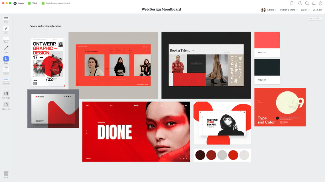
Some designers prefer planning the web designs using pencil and paper, but it’s possible to use digital tools too. For example, organize your notes and mood board with Milanote and plan the website layout with Wireframe.cc.
2. Cluttered Website Pages
Today, website platforms provide many tools and options, such as popups and embedded videos. However, it doesn’t mean you have to include everything on your website. Clutter can be disruptive to visitors and increase loading time.
A rule of thumb is to understand what you want to achieve with each page.
For example, a contact page provides visitors with information on how to reach you out. Therefore, the content on this page should include your contact details, like email and address. You may include a map and a contact form but avoid the truly unnecessary elements.
Another tip is to use ample white space for the area between design elements. It helps web pages look organized and clean.
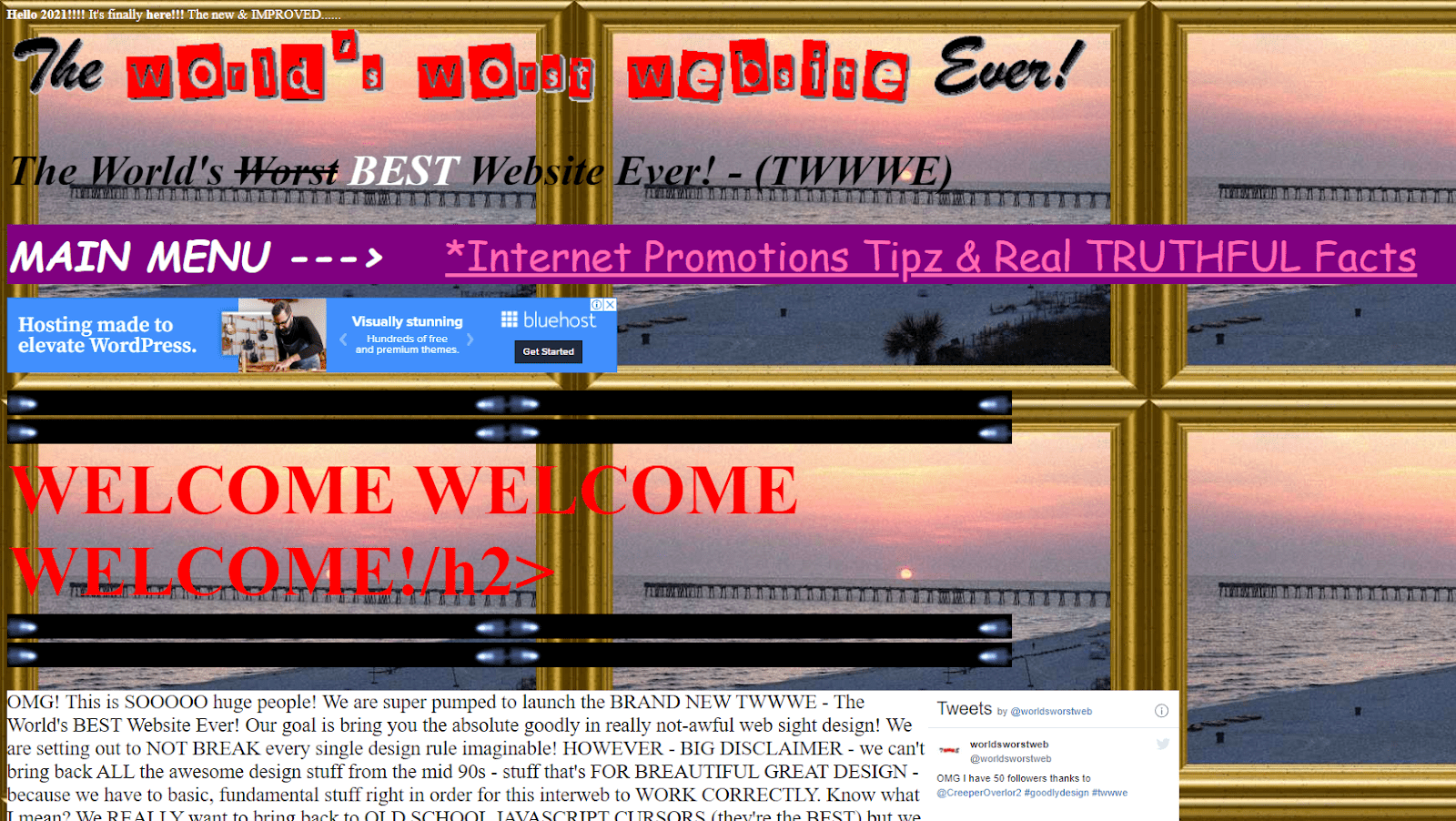
3. Outdated Website Design
Similar to fashion trends, web design trends also change over time. Using outdated web design may make a poor impression on visitors.
Here are some outdated web design trends and their alternatives:
- Flat design. This Windows 8 style makes important elements difficult to stand out because they all look so similar. Consider applying material design instead to make the designs more intuitive and attractive.

- Splash pages. They pop up when people enter a website, usually displaying promotions or disclaimers. These can prevent visitors from seeing the actual content. Instead, use popups that show after they scroll down to a particular depth.
- Image sliders. These slow down pages and are often seen as ads, so people skip them. Turn your sliders into photo galleries to display your images.
4. Poor Navigation
Website navigation includes menus, internal linking, and categories. Having poor navigation can make customers confused when trying to find what they’re looking for.
Follow these tips to optimize your website navigation:
- Limit the number of menus. Many options can overwhelm visitors, even if you use the drop-down menus. If you have many options, consider making a sitemap page or mega footer.
- Make site search visible. Help visitors find and buy products right away. In fact, visitors that use site search convert about two times more often than visitors who don’t.
- Order your menus strategically. Place the most critical menus at the beginning and end of your navigation bar. For example, AMP Agency’s business website puts the Industries menu first to show its social proof, then directs visitors to click Contact in the end to get in touch.

5. Overlooking Web Accessibility
Web accessibility helps all visitors use your website, including people with disabilities. Besides the moral reasons, making the website accessible can widen your target audience, resulting in more visitors and sales.
Learn Web Content Accessibility Guidelines (WCAG) to understand the accessibility standards. There are many points in the guidelines, but generally, an accessible website must be:
- Perceivable. Provide descriptions for non-text content.
- Operable. Avoid designs that cause seizures, like flashes and stripes.
- Understandable. Make the content readable by avoiding uncommon abbreviations and jargon.
- Robust. Check the website’s compatibility with assistive technologies.
6. Not Pay Attention to Images
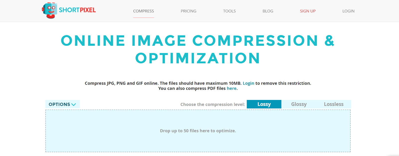
Wrong image format can result in large file sizes that slow website loading. A rule of thumb is to choose JPEG for photos and PNG for drawings and graphics. Use a compression tool like ShortPixel or Image Compressor if you still have large image files.
Another mistake is the overuse of stock images. They’re helpful and affordable, but using too many generic stock images can make your website look unprofessional because other sites in your industry may use them too.
Consider digging deeper instead of using the first results on the stock image sites. Alternatively, combine free and paid stock images from services like SC Stockshop and ColorJoy Stock.
7. Not Mobile-Friendly
70% of web traffic comes from mobile devices, and 61% of people won’t return to websites without a responsive design.
Avoid these common mobile web design mistakes to make your site mobile-friendly:
- Touch elements being too close. Mobile users may misclick buttons or links that are close to each other. Try keep the touch target size about 48 pixels or 9mm minimum. The number is about the size of a person’s finger pad area.
- Font size being too small. It forces visitors to pinch and zoom to read the content. Avoid font size smaller than 12px to make easily content readable on mobile.
- Missing content. If your mobile version is different from the desktop site, you may find that some content is missing. To avoid this, use HTML5 standards for animations and check the robots.txt file to see if it blocks some elements from web crawlers.
Also, use Google Search Console to receive alerts when Google detects any mobile-specific issues.
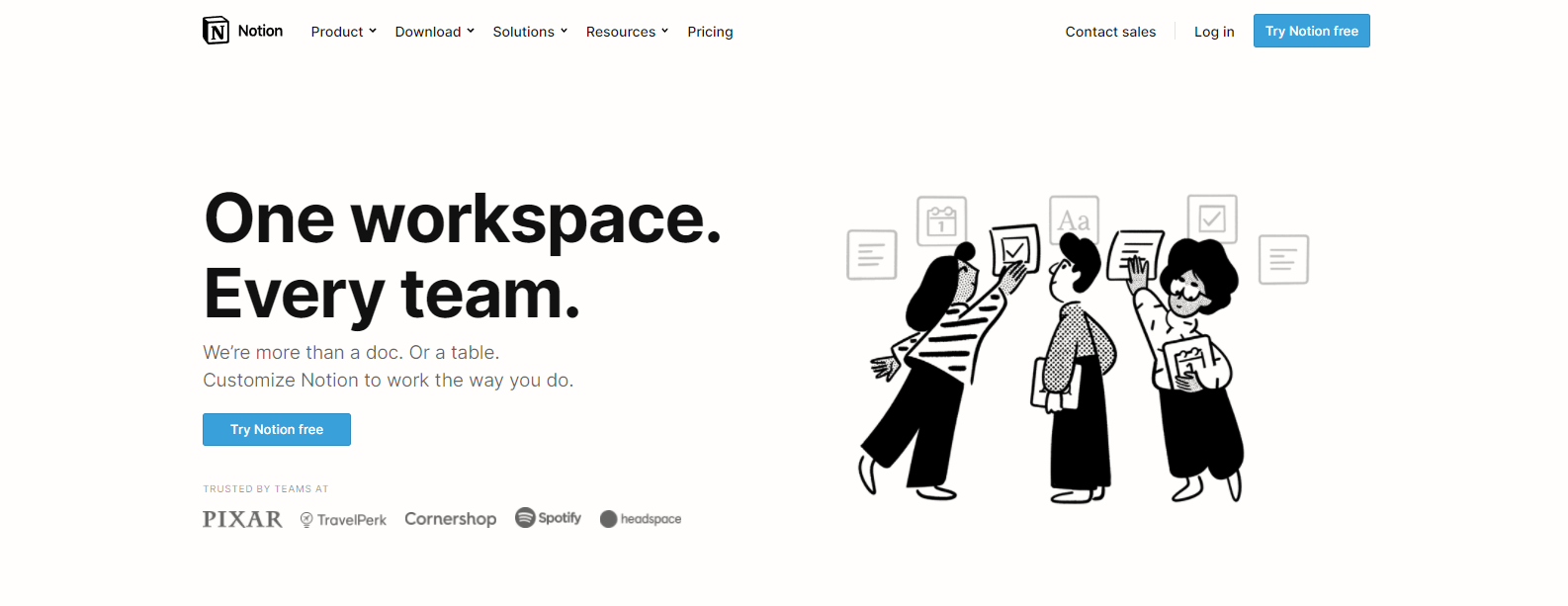
8. No Clear CTA
A call to action (CTA) refers to text intended to prompt visitors to perform a particular activity. It generally uses action verbs like “Sign up to our newsletter” and “Redeem your voucher code.” Therefore, not giving a clear CTA can confuse visitors on what to do next.
To have a compelling CTA, make it short and straightforward. You can also be more creative by using reverse psychology or creating urgency.
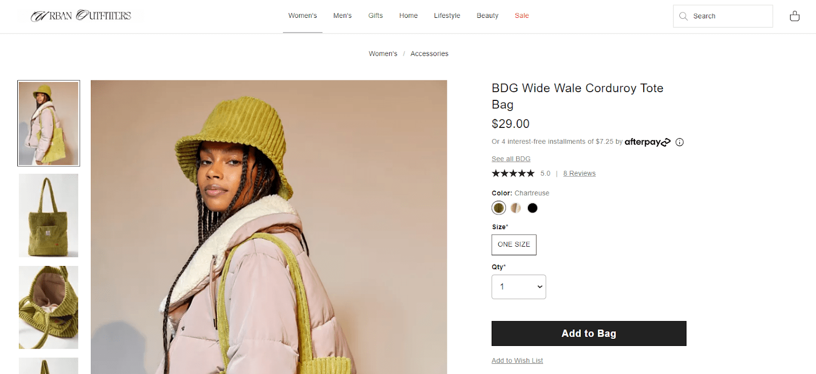
Also, ensure that you have a contrasting color matching your branding for the CTA buttons. For example, Coca-Cola uses red while Urban Outfitters uses black to contrast with the white background.
Another tip is to place the button where visitors can quickly notice it. Use a heatmap tool to show you how visitors interact with your website.
9. Inconsistency
Consistency in the web design world helps visitors navigate the site because all pages look familiar.
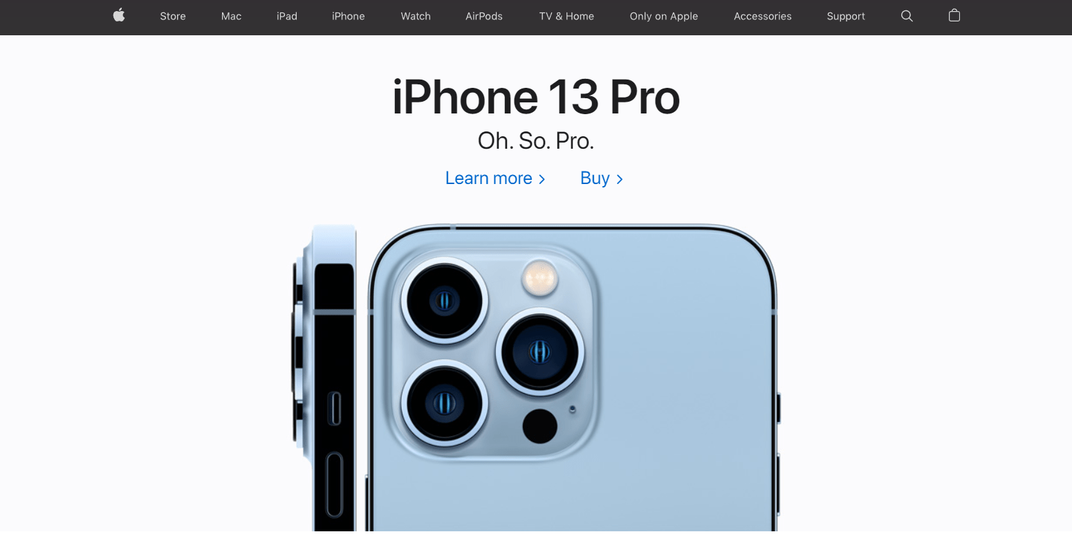
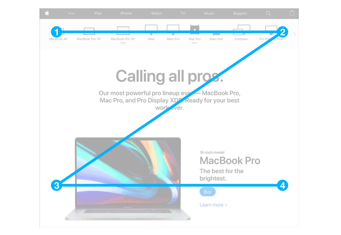
It can also reinforce the brand image. For example, Apple uses a black and white color scheme and highlights the product photos. The design gives a modern and minimalist look.
Web design consistency includes:
- Visual. Consistent design elements throughout the website, like fonts and colors.
- Functional. Consistency of action and meaning. For example, you place the site search in the same place across pages.
- Internal. The combination of visual and functional consistency. As you continue adding pages to your website, ensure that it remains consistent with the previous pages.
10. No Visual Hierarchy
Visual hierarchy refers to the arrangement of website elements based on their importance. It helps visitors navigate the page and avoid visual elements fighting each other to get attention.
Generally, large elements and contrasting colors make objects stand out.
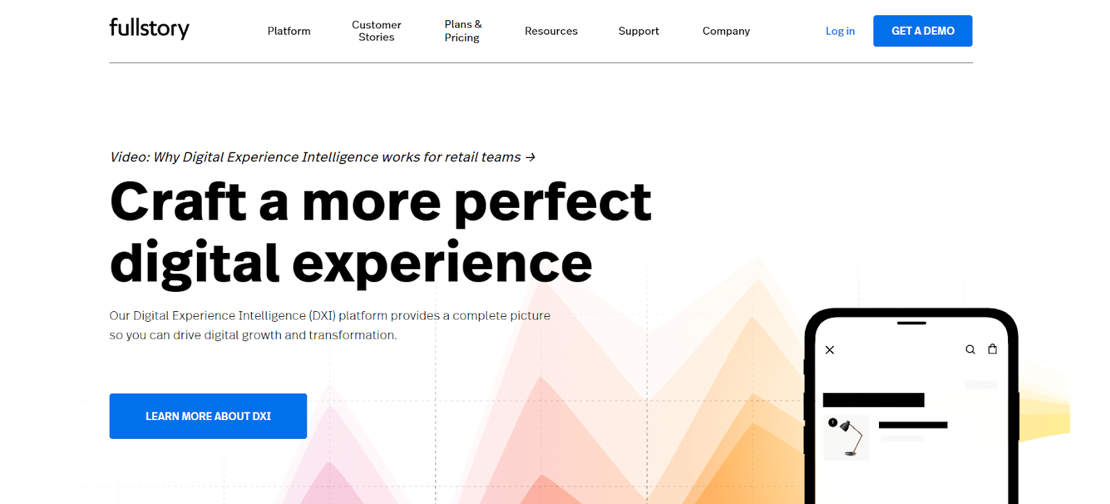
Fullstory’s homepage is an excellent example of visual hierarchy. To emphasize the importance, the designer uses blue CTA buttons to contrast them with the white background. It also applies a big font size for the headline.
A rule of thumb is to follow one of these most popular patterns:
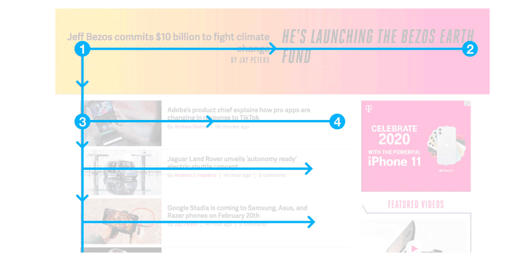
- F pattern. It follows a path from the top left to the top right, and down to the following line from left to right. Most web designers use this pattern for text-heavy pages.
- Z pattern. It directs people to read from top left to top right, then down to the lower left and lower right. It’s the best solution for content that is not text-heavy.
Conclusion
An attractive website design is key to a positive impression and better credibility. However, web design is a challenging field. Meaning, there’s plenty of room for mistakes that can make the website look unprofessional.
Here are common design mistakes we’ve covered in this article:
- No website planning
- Cluttering up website pages
- Outdated website design
- Poor navigation
- Not paying attention to web accessibility
- Overlooking images
- Neglecting mobile-friendliness
- Vague CTA
- Inconsistency
- No visual hierarchy
Make this list a guideline when you develop or redesign your website to improve the design quality. If you’re still unsure about your web design, consider asking for help from a professional web designer or a consultant.
About the Author

Mirko Humbert
Mirko Humbert is the editor-in-chief and main author of Designer Daily and Typography Daily. He is also a graphic designer and the founder of WP Expert.