This post is Julia Spangler‘s entry to the Design You Love group writing project.
I’m in college. Most of you, at this point, are probably not. But since I’m sure you miss it, we’re going to start with a quiz. Here are three clues; let’s see if you can identify the object of my designerly affection:
- He revolutionized movie title sequences.
- He said more with simple silhouettes and cutouts than can be said with the glossiest gradient mesh.
- His last name is also a fish.
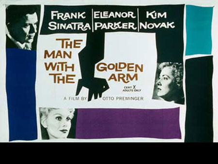
Because of a design history project my freshman year, I know that these three components add up to Saul Bass. For the project each student had to research the professional biographies of five designers. I learned a lot of valuable facts (Cipe Pineles could draw a mean potato; Paul Rand was the logo king; Michael Bierut enjoys the color yellow), but Saul Bass’s work was the stuff that stuck with me after I received my grade. I was particularly blown away by the impact he made in film. He introduced the idea of incorporating the themes of the movie into the title sequence. Can you imagine doing that today? Finding a perfectly adequate system—those old lists of names sure were legible—and introducing creative design to enhance the meaning of the project as a whole? Bass had a vision of “what could be” that I find hugely inspiring.
Of his work, the sequence that affects me the most is Bass’s titles for Psycho. Just those lines of black, white, and gray are enough to make me feel uneasy. The kicker for me is when the lines come together vertically, but unaligned, creating the tension of bared teeth across the center of the screen… shivers! And watch the way the word “Psycho” shifts back and forth: it’s not a drastic movement, but it tells you that something isn’t quite right here.
As he pioneered this new area of design, Bass tried to find and convey the real psychology of the film, often utilizing very little imagery. It would be foolish to think that Bass’s considerations were 100% aesthetic: he was no doubt limited by the methods and media of his time. But even as technology improved, Bass kept a stripped-down approach in some of his work (check out the opening of Goodfellas).
In a landscape of static title cards, Bass introduced movement and meaning. Every time I see the opening to a Spider-Man movie or to Catch Me If You Can, I think about Bass for just a second, grateful for his contribution to the film and design industries, as well as to my general movie-going experience. Hopefully you’ll let Bass inspire you to think about how design can transform merely adequate systems into meaningful and creative ones.

