There are many good web designers out there, thousands of them, but there aren’t so many great designers. The difference between a good and a great designer? Details! Just like for product design, where Apple makes its products better by paying attention to every little detail, you can make a big difference in web design by focusing on polishing details of your design. So if you want to become a better designer, make sure you are not too quickly satisfied and don’t give up the work too quickly. Too tired to keep on? Take a break and come back to your work with a fresh look later on.
But do you know what details are often overlooked by web designers? I know a few… To help you understand which details will bring your designs to a new level, I have listed some important ones. These are not rules of course, but advice that could help you make your next design better than the previous one. Be careful though, don’t put all your attention on the details and don’t forget the big picture, your design has to be good in the first place for those details to really enhance it.
1. Use smooth and consistent drop shadows
Drop shadows are a great tool for giving depth to your designs. However, if poorly used they can give your design an unprofessional look. Two things are important for creating good drop shadows:
- Make your shadow subtle: it will provide the desired effect in a subtle way, without being too obvious.
- Use consistent lightning source: for a coherent design if you use two shadows of more, make sure the source of the light is always the same.

2. Go easy on gradients
Same as for drop shadows. Don’t overuse gradients or it will kill the effect. Also, gradients should be subtle and use colors that degrade smoothly. For better results, try to avoid using more than two colors in your gradients, it will make it look more heavy but not more elegant.

3. Align, align, align
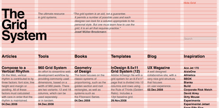
Give proper alignments to the elements of your designs. Well-aligned design elements make your web page look tidy and organized, it also helps create better white space. To do this, grid systems will make your life much easier. I personally recommend the Grid system or the 960 Grid System, but there are many others out there or you could even consider creating your own.

4. Think out of the box
A bit contradictory with the previous advice, you should some let elements or images of your design go out of the box. Grids are good to lay the base of your design, but they can quickly get quite boring if too rigid. Letting an element pop out makes the website design look more dynamic and lively. This effect is often used on titles or on some important images that need more attention than others.

5. Use icons
Icons help your visitors scan through your pages to find the information he is looking for, in that matter they are important to improve the usability of your website. Use icons and your content will be read much more. Even better, nice looking icons will make your design more elegant. The good news is that you can find tons of free high-quality icons on the web. As with anything else in modern web design, don’t overuse icons and make sure they are appropriate.
![]()
6. Use highlights
This has been quite a trend in web design for the past few years. Use a small 1px white line to highlight and provide smooth contrast between two colors and give a clean look. This also make the outlines stand out better and create a very welcome contrast.

7. Improve the typography of your design
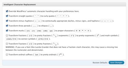
Start by chosing the right fonts, if possible no more than two. Hierarchy and scaling of fonts should be optimized to make the text easily scannable and have the text presented in easy-to-read chunks. Style the lesser used element such as quotes, lists,… Use well-balanced rags and keep good vertical rythm. An excellent plugin to take care of that if you are using WordPress is WP-Typography. Good typography will not be noticed by your average visitors, but it improves the readability of your site, its elegance and make it look more professional.

8. Use textures wisely
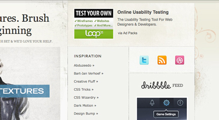
How many times have you seen websites that use huge wood textures in the background that totally overwhelm the web page? In those case, the background attracts all your attention and makes the page less readable. This is not how textures should be used. You should use textures to create an ambiance on your page and add some style, but they should stay unnoticed.

9. Use the right words for call-to-actions
Semantics is a very important part of your website’s design. For the search button, use the word “search”, not go or an icon. Another example that I always find confusing is blogs that use the words next and previous for the article navigation. Instead, use the words “older posts” or “newer posts”, they give some context and users will know where they are heading when clicking on those.


