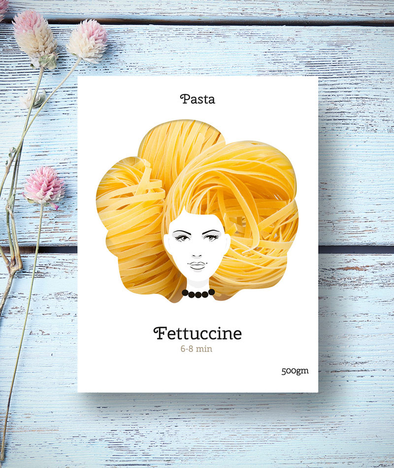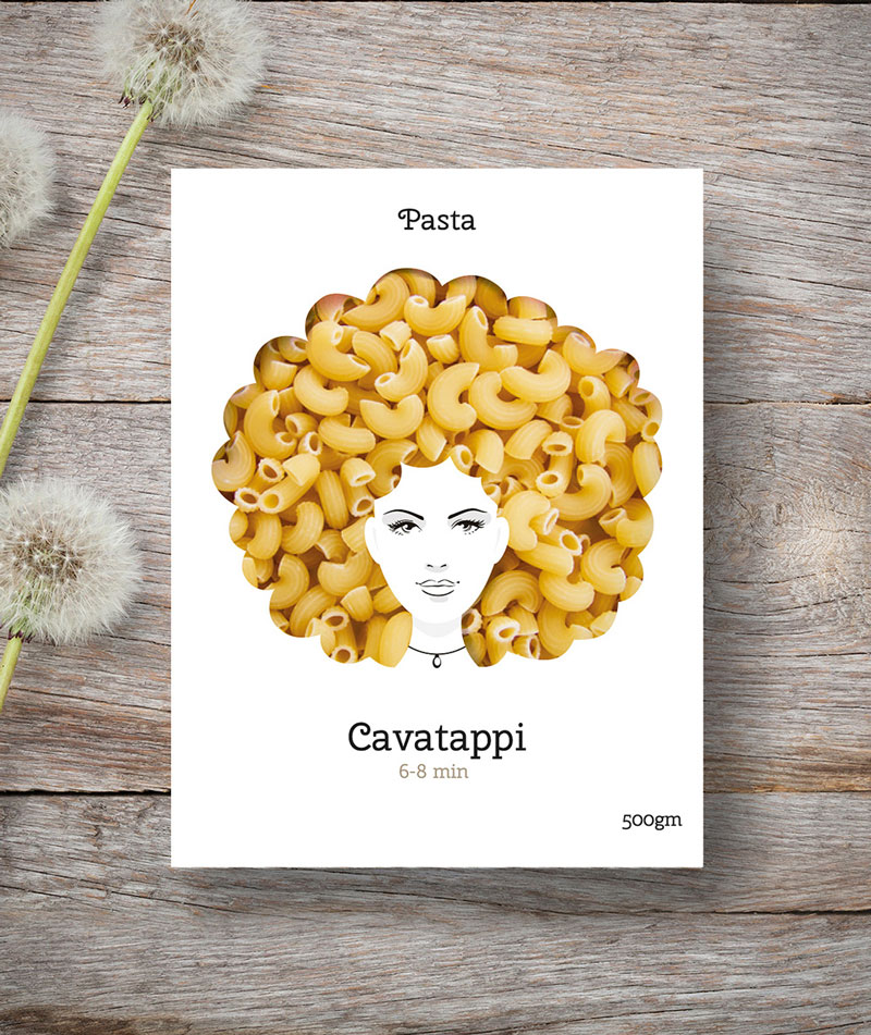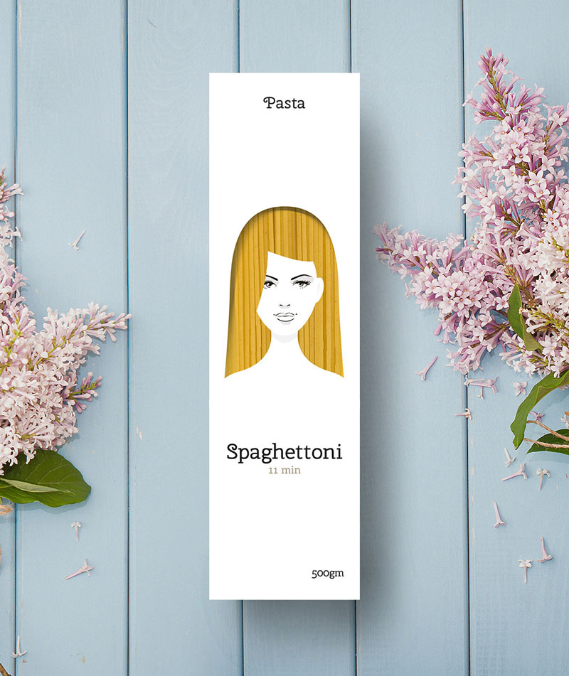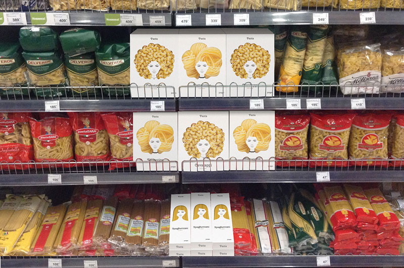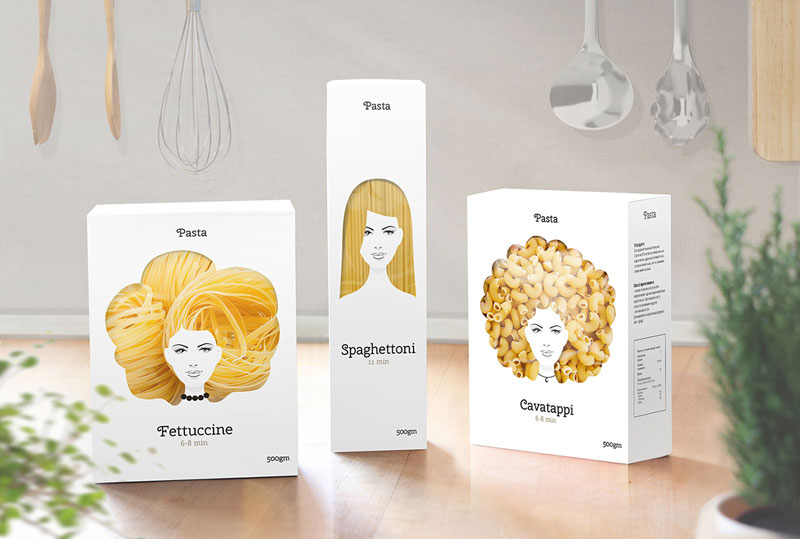
Russian graphic designer Nikita Konkin shared this packaging design concept on Behance without any comment to go with it. The pictures speak for themselves, so we’ll just enjoy the more minimalist approach to pasta packaging, a good way to stand out among products that usually feature simple but poor design.
The main feature in Konkin’s concept is to let the buyers see the product only in parts of the package, and to do so in a fun way that plays with the shape of the product itself.
